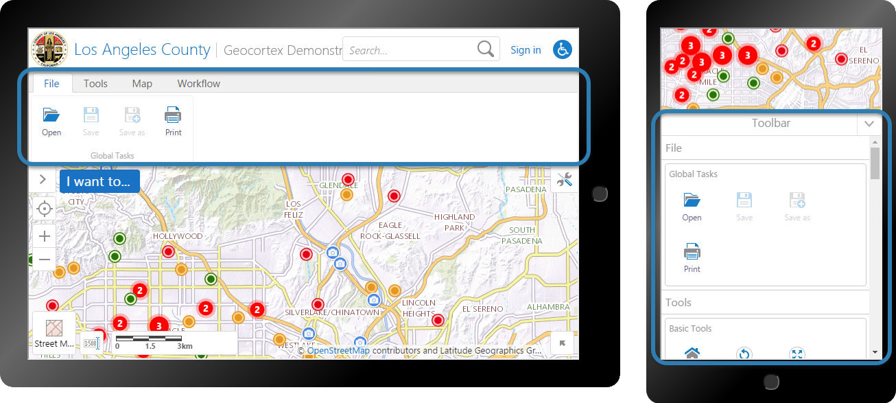
Toolbar
The toolbar is a configurable user interface element that provides access to a wide variety of functions in a viewer. By default, a toolbar has a few basic items in it to navigate the map, identify features, and print the map. This is the Standard (Default) toolbar. The HTML5 Viewer also has a Web GIS (Full) toolbar, which includes most of the predefined tools.
You can use the toolbar in its default configuration, or customize it by adding, modifying, and removing items. You can also create your own tools.
The toolbar is optional. You can remove it using the Remove Toolbar function.
Toolbar Formats
The toolbar is available in two different formats:
-
Tabbed Toolbar: The tabbed toolbar includes tabs and groups to organize the toolbar items. The tabbed toolbar is the default toolbar for the Desktop and Tablet interfaces.
Also included is a Tool Labels toggle that allows the user to show or hide tool labels. The toggle is in the desktop and tablet interfaces, but it is not available for the Compact Toolbar.
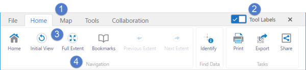
Toolbar with the Tool Labels toggle in the on position

Tab Labels

Toolbar label toggle in the on position 
Tool icons and labels 
Tool group labels Toggling the labels off:
-
Hides the labels identifying the tools.
-
Hides tool group labels.
-
Reduces the font size of the text on the toolbar tabs.
-
Increases the display area for the map.
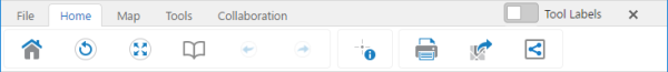
Toolbar with the Tool Labels toggle in the off position
Note that for keyboard users, when the toggle control button has focus, use the Space Bar for the keyboard shortcut to toggle the control on or off.
-
-
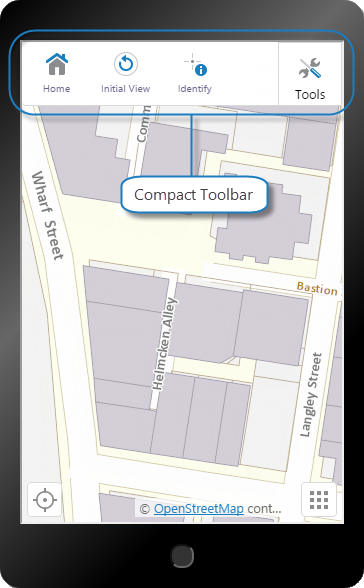
Compact Toolbar: The compact toolbar does not include tabs or groups and is designed to be simple and compact. The compact toolbar is the default toolbar for the Handheld interface.
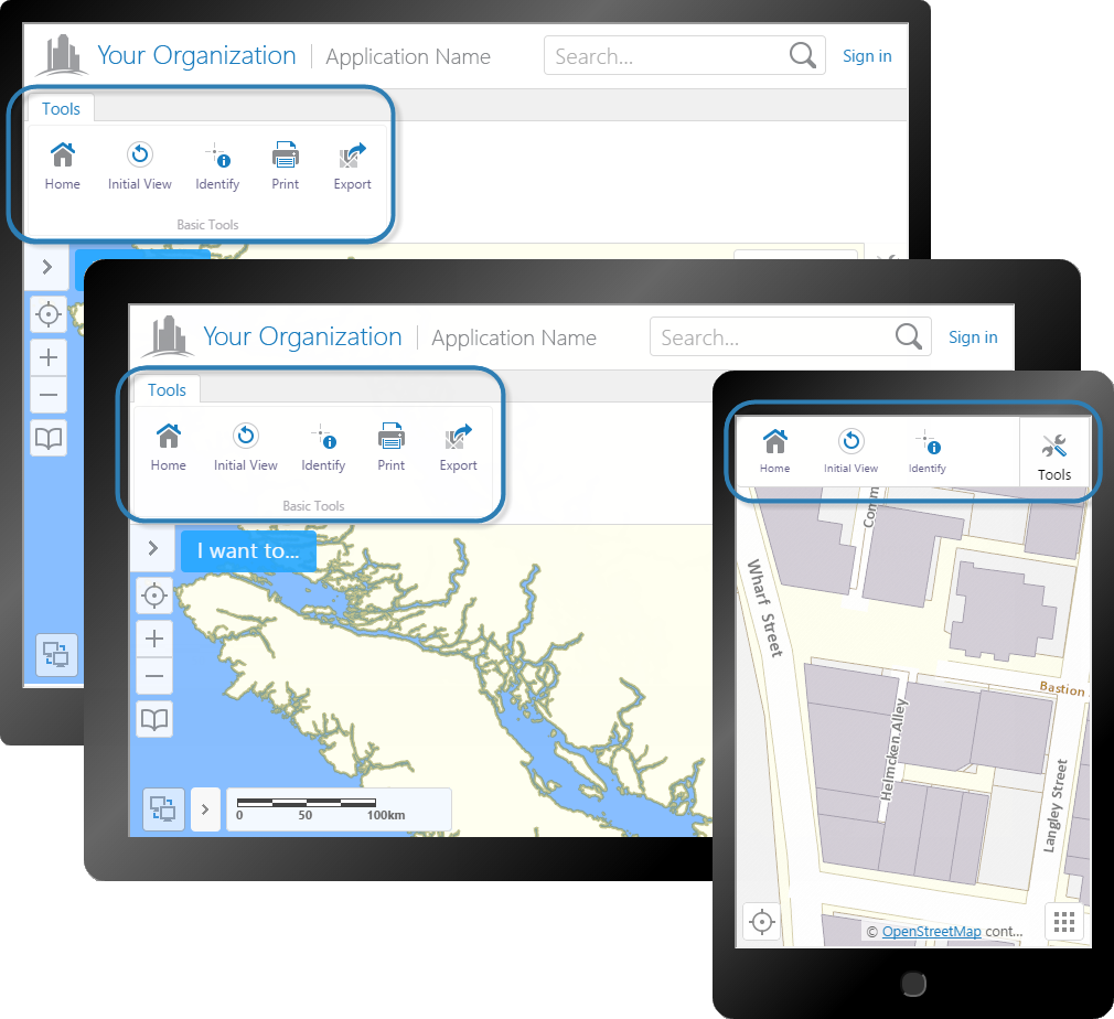
Tabbed toolbar on Desktop and Tablet (back and middle), and the compact toolbar on Handheld
Types of Toolbar Item
You can add the following types of item to the toolbar:
-
Tools: When clicked, a tool waits for the user to draw a shape on the map, and then runs its command using the geometry created by the user as its parameter. For example, draw tools, identify tools, and measure tools require the user to draw on the map.
-
Buttons: When clicked, a button immediately runs its command using the parameter that is configured for it, if it has one. For example, the Full Extent button immediately redraws the map at its full extent, without requiring the user to draw anything on the map.
-
Toggle Buttons: Toggle buttons are either on or off. When a user clicks a toggle button, the button turns on if it was off, or turns off if it was on. When a toggle button is turned on, a check mark appears on the button to indicate that it is on.

Toggle button turned on
Like buttons, toggle buttons immediately run a command when clicked. Because they have two states, toggle buttons can run two different commands—one when the button is on, and another when the button is off. Alternatively, the commands may be identical but have different parameters.
For a list of viewer commands, see Viewer Commands and Events.
Toolbar Organization
You can organize toolbar items using:
-
Tabs: (tabbed toolbar only) In the tabbed toolbar, you can organize toolbar items, groups, and multitools into tabs.
-
Groups: (tabbed toolbar only) In the tabbed toolbar, you can group toolbar items and multitools into groups. Groups are contained in tabs.
-
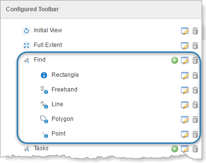
Multitools: Multitools are sets of related tools that open in a flyout when the user opens the multitool's menu. The user can click the multitool itself instead of the menu to invoke the tool. Both the tabbed toolbar and the compact toolbar can contain multitools.
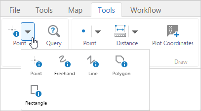
Example of a multitool opened in a tabbed toolbar in the Desktop interface
-
Regions: A region is an area in the toolbar that contains custom content. For information on adding custom content to a toolbar region, contact VertiGIS Studio Support or your local reseller.
Open the Toolbar Page
To open a viewer's Toolbar page in Manager:
-
In
 beside the viewer.
 -
In the side panel, click Toolbar.
Configure the Tabbed Toolbar
The tabbed toolbar is the default toolbar for the Desktop and Tablet interfaces. In the Desktop and Tablet interfaces, the tabbed toolbar opens below the banner. In the Handheld interface, it opens in a panel at the bottom of the screen, below the map.
Tabbed toolbar shown in the Tablet interface (left) and the Handheld interface (right)
In the tabbed toolbar, toolbar items are arranged in groups, and groups are arranged on tabs. In the following example, the Home tab contains three groups—Navigation, Find Data, and Tasks. In the Handheld interface, tabs are stacked on top of each other.
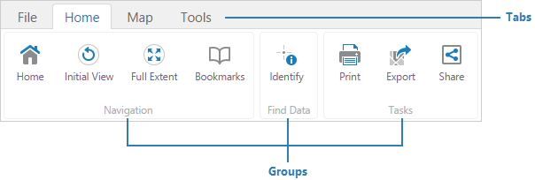
Example of a tabbed toolbar with four tabs, shown in the Desktop interface
There are two predefined ("preset") toolbars:
-
Standard (Default): The Standard (Default) toolbar contains a few tools to perform basic operations like print, export, and identify operations. When you create a new viewer, it has the Standard (Default) toolbar.
-
Web GIS (Full): The Web GIS (Full) toolbar contains most of the predefined tools. This toolbar is designed for GIS implementations.
The Web GIS (Full) toolbar does not include the Offline Maps tool because taking the viewer offline requires the Geocortex Mobile App Framework. If you are using the Geocortex Mobile App Framework, you may want to add the Offline Maps tool to the toolbar.
Main Steps to Configure the Tabbed Toolbar
The main steps to configure the tabbed toolbar are:
-
Create the toolbar's structure by adding tabs, groups, and multitools.
-
Configure toolbar items like tools and buttons.
Select the Tabbed Format
To select the tabbed format:
-
On the Toolbar page, beside Active Toolbar, select Tabbed Toolbar.
-
If you want the toolbar to open automatically when the viewer launches, select the Open Toolbar by Default checkbox.
-
If you want to use one of the predefined toolbars, click Load Preset Toolbar, and then click the button for the predefined toolbar you want to use.
By default, new viewers have the Standard (Default) predefined toolbar. The Web GIS (Full) toolbar contains most of the predefined tools. You can modify the predefined toolbars in any way you want.
-
Customize the toolbar by adding, removing, and reorganizing toolbar items and organizational elements.
If you add the organizational elements first, you can add the toolbar items directly where you want them so you do not have to move them afterwards.
Create the Toolbar's Structure
To organize the toolbar, you add tabs, groups, and multitools.
You can also add regions to the toolbar. Regions hold custom-developed content. For information on adding custom content to a toolbar region, contact VertiGIS Studio Support or your local reseller.
To configure the toolbar's tabs, groups, and multitools:
-
Configure the tabs, groups, and multitools that you want to use to organize the toolbar:
-
Add a Tab to the Toolbar:
-
In the Configured Toolbar area, click Add Tab.
-
Enter a display name.
-
Click OK.
-
-
Add a Group to a Tab:
-
In the Configured Toolbar area, click the
 icon beside the tab that you want to add a group to.
 -
Enter a display name.
-
Make sure the Multitool check box is cleared.
You can convert a group into a multitool by selecting the Multitool checkbox.
-
Click OK.
-
-
Add a Predefined Multitool to a Tab or Group:
-
Drag a multitool from the Available Tools area and drop it in the Configured Toolbar area.
Predefined multitools are represented by the multitool icon
 .
. -
To modify the configuration for a tool, button, or toggle button in a multitool:
-
In the Configured Toolbar area, click the multitool's icon
to show the multitool's contents. -
Click the Edit icon
beside the toolbar item. -
Configure the item's settings.
-
Click OK.
-
-
-
Create a New Multitool:
-
Click the
icon beside the tab that you want to add the multitool to. -
Enter a display name.
-
Select the Multitool checkbox.
You can convert a multitool into a group by clearing the Multitool checkbox.
-
Click OK.
-
-
Move a Tab, Group, or Multitool:
-
In the Configured Toolbar area, drag the tab, group, or multitool to its new location in the Configured Toolbar and drop it.
As you drag the item, highlighting shows you where it will be located when you drop it.
-
-
Rename an Existing Tab, Group, or Multitool:
-
In the Configured Toolbar area, click the Edit icon
beside the tab, group, or multitool. -
Change the display name.
-
Click OK.
-
-
Remove a Tab, Group or Multitool:
Removing a tab, group, or multitool also removes all of its contents.
-
In the Configured Toolbar area, click the Remove icon
 beside the tab, group, or multitool that you want to remove from the toolbar.
 -
Click OK to confirm.
-
-
-
Configure the default tab:
The first time in a user session that the user opens the toolbar, the toolbar opens to the default tab. If the user closes the toolbar and then reopens it, it opens to the tab that the user was last on.
-
In the Configured Toolbar area, click Set Default Tab.
-
Select the tab that you want to open by default, and click OK.
-
-
Click Apply Changes.
Configure Toolbar Items
To configure the tools, buttons, and toggle buttons that you want in the toolbar:
-
Configure the items that you want included in the toolbar:
-
Add a Tool, Button, or Toggle Button to a Tab or Group:
-
Drag an item from the Available Tools area and drop it in the Configured Toolbar area.
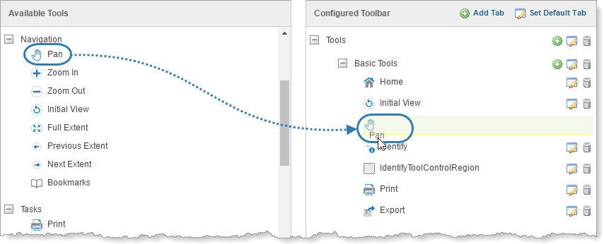
Drag and drop a toolbar item from the Available Tools to the Configured Toolbar
You can also add tools, buttons, and toggle buttons by clicking the
icon beside the group that you want to add the item to. This opens the dialog box to configure the item's settings and then adds the item to the bottom of the group. -
To modify the item's configuration, click the Edit icon
beside the item and then configure the item's settings. -
Click OK.
-
-
Add a Tool, Button, or Toggle Button to a Multitool:
A multitool cannot contain other multitools.
-
In the Configured Toolbar area, click the
icon beside the multitool and select the option for the type of item you want to add—tool, button, or toggle button. -
Configure the item's settings.
-
Click OK.
-
-
Change the Tools in a Multitool:
-
Add the multitool to the toolbar.
-
In the Configured Toolbar area, click the multitool icon
beside the desired multitool.The multitool expands to show the toolbar items it contains.
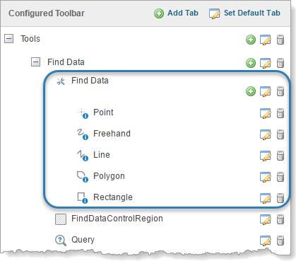
Multitool in tabbed toolbar configuration, expanded to show its tools
-
Add, move, remove, and edit the items as desired.
-
-
Move an Item:
-
In the Configured Toolbar area, drag the item to its new location and drop it.
As you drag the item, highlighting shows you where the item will be located when you drop it.
-
-
Remove an Item:
-
In the Configured Toolbar area, click the Remove icon
beside the item that you want to remove from the toolbar. -
Click OK to confirm.
-
-
-
Configure Tool Stickiness:
Most tools in the HTML5 viewer are sticky by default—they remain active (selected) until deselected by the user. This allows the user to use a tool repeatedly without having to reselect it each time. You can turn off stickiness in the configuration. Each tool has a setting for stickiness, so you can make some tools sticky, and others not sticky.
Stickiness applies to tools only. It does not apply to buttons or toggle buttons.
-
In the Configured Toolbar area, click the Edit icon
beside the tool. -
To disable stickiness, clear the Is Sticky checkbox.
-
To re-enable stickiness, select the Is Sticky checkbox.
-
-
Click Apply Changes.
Configure the Compact Toolbar
The compact toolbar is made up tools, buttons, toggle buttons, and multitools. In the Handheld interface, the compact toolbar appears at the top of the screen. In the Desktop and Tablet interfaces, it appears below the banner.
Compact toolbar shown in the Handheld interface
Main Steps to Configure the Compact Toolbar
The main steps to configure the compact toolbar are:
-
Create multitools, if desired.
-
Configure toolbar items like tools and buttons.
Select the Compact Format
To configure the compact toolbar:
-
On the Toolbar page, beside Active Toolbar, select Compact Toolbar.
-
If you want the toolbar to open automatically when the viewer launches, select the Open Toolbar by Default checkbox.
-
To limit the number of tools to display at one time, type the number of tools in the # of Tools to Display box.
The minimum is 3 and the maximum is 9. The default is 4.
The # of Tools to Display setting only applies to the Desktop and Tablet interfaces. It does not apply to the Handheld interface.
-
Customize the toolbar by adding, removing, and reorganizing toolbar items and multitools.
If you add the multitools first, you can add the toolbar items directly where you want them so you do not have to move them afterwards.
Add Multitools
To help organize the toolbar, you can add multitools (flyouts) that contain multiple tools.
You can also add regions to the toolbar. Regions hold custom-developed content. For information on adding custom content to a toolbar region, contact VertiGIS Studio Support or your local reseller.
To add multitools to the toolbar:
-
Configure the multitools that you want to use to organize the toolbar:
-
Add a Predefined Multitool:
-
Drag a multitool from the Available Tools area and drop it in the Configured Toolbar area.
Predefined multitools are represented by the multitool icon
. -
To modify the configuration for a tool, button, or toggle button in a multitool:
-
In the Configured Toolbar area, click the multitool's icon
to show the multitool's contents. -
Click the Edit icon
beside the toolbar item. -
Configure the item's settings.
-
Click OK.
-
-
-
Create a New Multitool:
-
Drag a predefined multitool from the Available Tools area to the Configured Toolbar area.
-
Change the multitool's display name:
-
In the Configured Toolbar area, Click the Edit icon
beside the multitool. -
Change the display name.
-
Click OK.
-
-
Change the items in the multitool:
-
In the Configured Toolbar area, click the multitool icon
beside the desired multitool.The multitool expands to show the toolbar items it contains.
Multitool in compact toolbar configuration, expanded to show its tools
-
Add, move, remove, and edit the items as desired.
-
-
-
Move a Multitool:
-
If you want to move the item to a multitool, click the multitool icon
beside the multitool in the Configured Toolbar area.The multitool expands to show the toolbar items it contains.
-
In the Configured Toolbar area, drag the multitool to its new location in the Configured Toolbar and drop it.
As you drag the multitool, highlighting shows you where it will be located when you drop it.
-
-
Rename an Existing Multitool:
-
In the Configured Toolbar area, click the Edit icon
beside the multitool. -
Change the display name.
-
Click OK.
-
-
Remove a Multitool:
Removing a multitool also removes all of its contents.
-
In the Configured Toolbar area, click the Remove icon
beside the multitool that you want to remove from the toolbar. -
Click OK to confirm.
-
-
-
Click Apply Changes.
Configure Toolbar Items
To configure the tools, buttons, and toggle buttons that you want in the toolbar:
-
Configure the items that you want included in the toolbar:
-
Add a Tool, Button, or Toggle Button to the Toolbar:
-
Drag an item from the Available Tools area and drop it in the Configured Toolbar area.
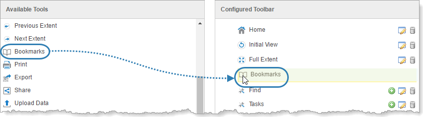
Drag and drop a toolbar item from the Available Tools to the Configured Toolbar
-
To modify the item's configuration, click the Edit icon
beside the item and then configure the item's settings. -
Click OK.
-
-
Add a Tool, Button, or Toggle Button to a Multitool:
A multitool cannot contain other multitools.
-
In the Configured Toolbar area, click the
icon beside the multitool and select the option for the type of item you want to add—tool, button, or toggle button. -
Configure the item's settings.
-
Click OK.
-
-
Change the Tools in a Multitool:
-
Add the multitool to the toolbar.
-
In the Configured Toolbar area, click the multitool icon
beside the desired multitool.The multitool expands to show the toolbar items it contains.
Multitool in compact toolbar configuration, expanded to show its tools
-
Add, move, remove, and edit the items as desired.
-
-
Move an Item:
-
If you want to move the item to a multitool, click the multitool icon
beside the multitool in the Configured Toolbar area.The multitool expands to show the toolbar items it contains.
-
In the Configured Toolbar area, drag the item to its new location and drop it.
As you drag the item, highlighting shows you where the item will be located when you drop it.
-
-
Remove an Item:
-
In the Configured Toolbar area, click the Remove icon
beside the item that you want to remove from the toolbar. -
Click OK to confirm.
-
-
-
Configure Tool Stickiness:
Most tools in the HTML5 viewer are sticky by default—they remain active (selected) until deselected by the user. This allows the user to use a tool repeatedly without having to reselect it each time. You can turn off stickiness in the configuration. Each tool has a setting for stickiness, so you can make some tools sticky, and others not sticky.
Stickiness applies to tools only. It does not apply to buttons or toggle buttons.
-
In the Configured Toolbar area, click the Edit icon
beside the tool. -
To disable stickiness, clear the Is Sticky checkbox.
-
To re-enable stickiness, select the Is Sticky checkbox.
-
-
Click Apply Changes.
Settings
The settings for toolbar items are organized by the type of item:
Tools
Tools have the following settings:
-
Name: The name that you want to appear on the tool. You can use a text key or the literal text.
For example, @language-toolbar-markup-rectangle or Draw rectangle.
-
Tooltip: The text for the tooltip that opens when the user positions the pointer over the tool. You can use a text key or the literal text.
For example, @language-toolbar-markup-rectangle-tooltip or Draw a rectangle on the map.
-
Hide on Disable: When this checkbox is selected and the tool's command cannot run, the tool does not show in the toolbar.
If the checkbox is cleared and the tool's command cannot run, the tool shows in the toolbar, but it is grayed out.
-
Image URI: The URI for the icon that you want to appear on the tool. The icon should be sized to fit on the tool. The image must be an appropriate size to fit on the button. Valid file formats are PNG, BMP, JPG, and JPEG.
-
Command: The command that the tool runs after the user has drawn the geometry for the command to operate on. Click in the Command box to open a drop-down list of commands, and then select a command from the list. For a list of commands, refer to "Viewer Commands and Events" in Developer Help.
-
Draw Mode: The type of geometry that the user will draw.
-
Status Text: Optional text to display on the map to provide guidance to the user. You can use a text key or the literal text. For example, @language-toolbar-markup-rectangle-desc or Click and drag on the map to draw a rectangle on the map.
-
Is Sticky: When this checkbox is selected, tools remain active (selected) until deselected by the user—the tools are "sticky". This allows the user to use a tool repeatedly without having to reselect it each time.
If you do not want a tool to remain selected after it is used, clear the Is Sticky checkbox.
For a list of commands, see Viewer Commands and Events.
Buttons
Buttons have the following settings:
-
Name: The name that you want to appear on the button. You can use a text key or the literal text.
For example, @language-toolbar-markup-clear or Clear markup.
-
Tooltip: The text for the tooltip that opens when the user positions the pointer over the button. You can use a text key or the literal text.
For example, @language-toolbar-markup-clear-tooltip or Clear all drawings from the map.
-
Hide on Disable: When this checkbox is selected and the button's command cannot run under the current configuration or run-time conditions, the button does not show in the toolbar.
For example, if the Include Home Panel checkbox is cleared, a command to show the Home Panel cannot run because the viewer does not have a Home Panel. In this case, selecting the Hide on Disable checkbox for the Home Panel button hides the button.
If the checkbox is cleared and the button's command cannot run, the button shows in the toolbar, but it is grayed out.
-
Image URI: The URI for the icon that you want to appear on the button. The image must be an appropriate size to fit on the button; for example, 24 x 24 pixels. Valid file formats are PNG, BMP, JPG, and JPEG.
-
Command: The command that the button runs when the user clicks the button. Click in the Command box to open a drop-down list of commands, and then select a command from the list. For a list of commands, see "Viewer Commands and Events" in Developer Help.
-
Command Parameter: The value for the command to use as its parameter, if it has a parameter. Parameters may either be simple strings or complex objects containing any number of parameters.
See Viewer Commands and Events for more information.
Toggle Buttons
Toggle buttons have settings to turn on the button's feature, and separate settings to turn off the feature. You can also optionally associate an additional state with a toggle button.
-
Toggle On Settings: Configure the toggle-on button, which turns the button's feature on.
-
Name: The name that you want to appear on the toggle-on button. You can use a text key or the literal text.
For example, @language-toolbar-home-sub or Home.
-
Tooltip: The text for the tooltip that opens when the user positions the pointer over the toggle-on button. You can use a text key or the literal text.
For example, @language-toolbar-navigation-home-tooltip or Return to introductory page.
-
Hide on Disable: When this checkbox is selected and the toggle-on button's command cannot run under the current configuration or run-time conditions, the toggle-on button does not show in the toolbar.
For example, if the Include Home Panel checkbox is cleared, a command to show the Home Panel cannot run because the viewer does not have a Home Panel. In this case, selecting the Hide on Disable checkbox for the toggle-on button hides the toggle-on button.
If the checkbox is cleared and the toggle-on button's command cannot run, the toggle-on button shows in the toolbar, but it is grayed out.
-
Image URI: The URI for the icon that you want to appear on the toggle-on button. The image must be an appropriate size to fit on the toggle-on button; for example, 24 x 24 pixels. Valid file formats are PNG, BMP, JPG, and JPEG.
-
Command: The command that the toggle-on button runs when the user clicks the toggle button to turn it on. Click in the Command box to open a drop-down list of commands, and then select a command from the list. For a list of commands, see "Viewer Commands and Events" in Developer Help.
-
Command Parameter: The value for the command to use as its parameter, if it has a parameter. Parameters may either be simple strings or complex objects containing any number of parameters.
-
-
Toggle Off Settings: Configure the toggle-off button, which turns the button's feature off.
-
Name: The name that you want to appear on the toggle-off button. You can use a text key or the literal text. For example, @language-toolbar-markup-clear or Clear markup.
-
Tooltip: The text for the tooltip that opens when the user positions the pointer over the toggle-off button. You can use a text key or the literal text. For example, @language-toolbar-markup-clear-tooltip or Clear all drawings from the map.
-
Hide on Disable: When this checkbox is selected and the toggle-off button's command cannot run under the current configuration or run-time conditions, the toggle-off button does not show in the toolbar.
For example, if the user hasn't drawn any markup, a command to clear the markup cannot run because no markup exists. In this case, selecting the Hide on Disable checkbox for the toggle-off button hides the toggle-off button.
If the checkbox is cleared and the toggle-off button's command cannot run, the toggle-off button shows in the toolbar, but it is grayed out.
-
Image URI: The URI for the icon that you want to appear on the toggle-off button. The image must be an appropriate size to fit on the toggle-off button; for example, 24 x 24 pixels. Valid file formats are PNG, BMP, JPG, and JPEG.
-
Command: The command that the toggle-off button runs when the user clicks the toggle button to turn it off. Click in the Command box to open a drop-down list of commands, and then select a command from the list. For more information about commands, see "Commands and Events" in Developer Help.
-
Command Parameter: The value for the command to use as its parameter, if it has a parameter. Parameters may either be simple strings or complex objects containing any number of parameters.
-
-
-
Toggle State: A optional toggle state to associate with the toggle button.
For a complete list of states, see the State Reference.
-
See also...
Revert to the Default Toolbar
To revert to the default toolbar:
Reverting to the default toolbar permanently deletes your custom toolbar.
Follow the instructions for the type of toolbar you are using:
-
Tabbed Toolbar:
-
Click Load Preset Toolbar.
-
Click Standard (Default).
-
-
Compact Toolbar:
-
Click the Revert to Default Toolbar button.
-
Remove the Toolbar
To remove the toolbar:
If you do not want the viewer to have a toolbar, you can remove the toolbar.
Removing the toolbar permanently deletes any customizations you have made to the toolbar.
-
On the Toolbar page, click the Remove Toolbar button.
You are prompted to confirm.
-
Click OK.
Add Back the Toolbar after Removing It
To add back the toolbar if you have removed it:
Follow the instructions for the type of toolbar you are using:
-
Tabbed Toolbar:
-
Click Load Preset Toolbar.
-
Click Standard (Default).
-
-
Compact Toolbar:
-
Click the Revert to Default Toolbar button.
-
See Also...