Basemap Module
The Basemap Module implements the Basemap Switcher and basemap transparency sliders. The Basemap Switcher provides a quick way for users to make a single basemap visible. Transparency sliders allows users to transition the map smoothly from one map service to the next. For instructions on configuring basemaps and transparency slider groups, see Basemaps.
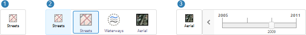
Examples of the Basemap Switcher closed ( ), open (
 ) and with a transparency slider (
 )
)
In the Desktop and Tablet interfaces, the Basemap Switcher is on the map. When the user clicks the Switcher, a list of the available basemaps opens. The user clicks a basemap to make it visible. If the basemap contains a transparency slider group, the slider opens. The user drags the slider to transition between the map services in the slider group.
In the Handheld interface, switching basemaps is an option in the I Want To menu. When the user taps the menu option, the list of available basemaps opens so the user can change the basemap.
The Desktop and Tablet interfaces use BasemapView. BasemapView groups BasemapSwitcherButtonView (the Switcher) and BasemapSliderView (the Slider). If you move BasemapView to a different region, the Switcher and Slider move with it, provided BasemapSwitcherButtonView and BasemapSliderView are in BasemapRegion. BasemapRegion inherits its region from BasemapView.
In the Desktop and Tablet interfaces, the BasemapsListController widget controls the number of rows and columns to show in the Basemap Switcher when the Switcher is open. A widget is a view component, such as a checkbox form item, that can be re-used across modules.
Configuration Properties
Module
No configuration properties
Views
-
BasemapView: Noconfigurationproperties -
BasemapSwitcherButtonView:-
hideIfNoBasemapsAvailable: If this property is set totrueand there are fewer than two basemaps available, the Basemap Switcher does not display. The default istrue.
-
-
BasemapSwitcherView: Noconfigurationproperties -
BasemapSliderView: Noconfigurationproperties
View Models
-
BasemapSwitcherViewModel: Noconfigurationproperties
Widgets
-
BasemapsListController:-
grid:The basemaps and basemap groups are presented in a grid with the following dimensions:-
numberOfRows: The maximum number of rows to display in the grid. The HTML5 Viewer will not display more than 5 rows. The default is1. -
numberOfColumns: The maximum number of columns to display in the grid. The HTML5 Viewer will not display more than 5 columns. The default is4.
The grid that you configure must be able to accommodate at least 2 items (1x2 or 2x1). If the Switcher does not need the full grid to display the basemaps, it shrinks to the appropriate size. If the Switcher contains more basemaps than specified in the widget, the user can scroll the list.
-
-