Charting
The Essentials Charting feature is only available for ArcGIS Server feature layers.
Charts represent feature data on a single feature layer. For example, you could have a chart for a layer containing data about hurricanes, or a different chart for a layer containing census data.
Chart Types
Charts are divided into two high-level types:
-
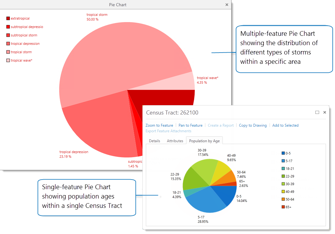
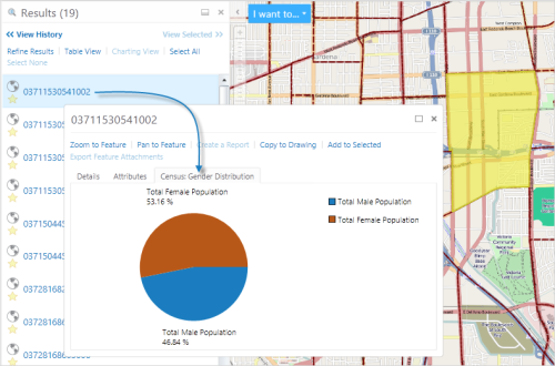
Pie charts show the breakdown of data into divisions like slices of a pie. In Geocortex Essentials, you can configure pie charts to represent the data of multiple features on a map or to represent the data of a single feature.
-
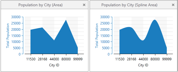
Linear charts visualize data by plotting data points onto a chart containing an X- and Y-axis. A linear chart contains a single horizontal axis (X-axis) but may contain multiple vertical Y-axes that represent different data sets. The data sets shown on the Y-axis are called series. Each series can be represented as a different chart type, including bar, line, area, and scatter charts.
You can also configure and display separate chart types side-by-side to compare data.
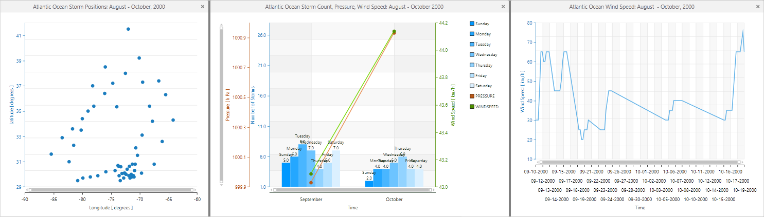
A scatter chart, multiple series chart (bar and two linear) and a line graph
Match the Chart Type to Your Data
To extract the most benefit from charting, you need to select the best chart type for your data. For example, bar charts are good for comparing data, line graphs are better for examining trends over time, but pie charts are useful for examining how different parts make up a whole.
Chart Types
|
If you want to... |
Use this chart type... |
For example... |
|---|---|---|
|
Compare data
|
Bar chart |
Compare one or more categories of data, particularly if each category has sub-categories. |
| Show trends in data |
Line chart or Area chart |
Examine trends over a period of time, particularly if the number of data points is high - like population trends. |
| Show the composition of data |
Pie chart for static data, column or area charts for data that changes over time. |
Indicate several types of data (nominal or ordinal) and the percentage of the whole each represents - like the ethnicity breakdown within a census tract. |
|
Show the distribution or relationships between data |
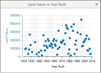
Scatter chart to show relationships with two or three attributes. Column or Bar charts for many data points. |
See the relationship between two different attributes, particularly if there are many data points – like the correlation between crime incidents in a city and average income per person. |
Data Sources for Charts
In Geocortex Essentials, you can use the fields in a layer or a data link as source data for a chart.
The fields configured on a layer provide the data used to create charts. The charts you can make are therefore dependent on the field data for that layer, unless you configure data links to extend the layer data.
To use a data link as a source for a chart, you would first need to set up the data link for the layer. Once the data connection is set up and the data link is working, you can use these external data sources in charts. This allows you to incorporate data from a relational database into a chart.
About Series
A series in a chart is a way to represent a field or an attribute of one or more features on the map. In a pie chart, each series becomes another slice of the pie. In a linear chart, each series is added as a separate Y-axis and can be represented as a different chart type, for example, a bar or line graph. The X-axis represents the data set that is shared with the other features in the chart.
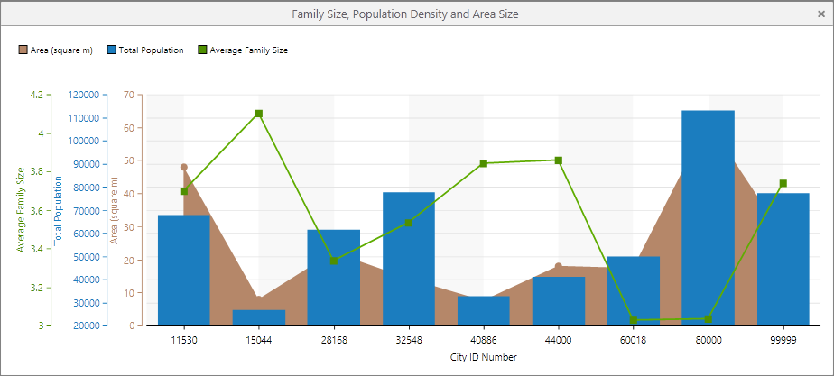
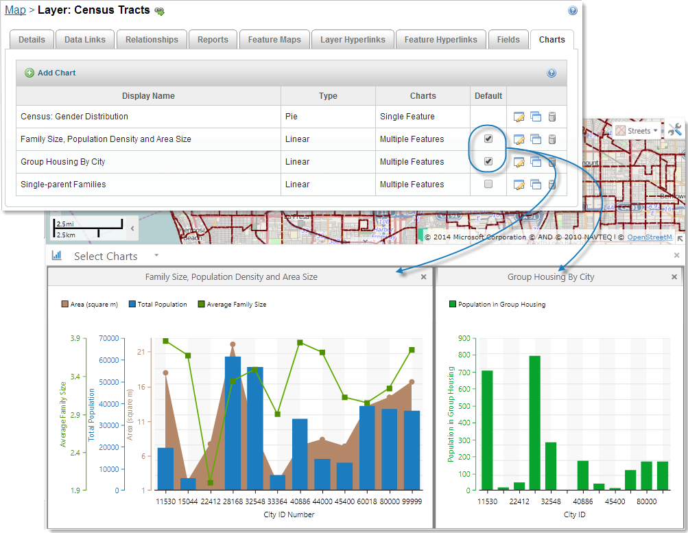
For example, the chart below contains three series that each use a different chart type. The blue bar chart shows the Total Population of each city. The brown area chart shows the area of each city in square miles. The green line chart shows the average family size in each city. While the X-axis, City ID, remains constant, the three series—Average Family Size, Total Population and Area—represent how these attributes change for different cities. Using multiple series and different chart types makes it easier to visualize and analyze the relationship between the given attributes of each city.
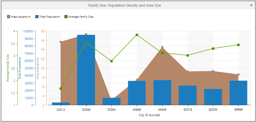
Chart with the X-axis Cities and a series of Y-axes for Family Size, Total Population and Area
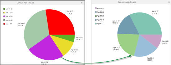
You can also use multiple series in a single pie chart. For example, you could have a pie chart that contained a different series for each age group in the population. The chart would then display a slice for each age group, with the size of the slice indicating the relative number of individuals within the population for each given age. There is no limit to the number of series you can have in a pie chart, although too many might make the chart difficult to understand.
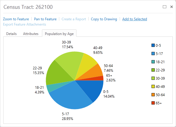
Chart Settings
The following chart configuration settings are available when you add or edit a chart on the Charts tab of a layer. Some settings only appear when you select a particular chart type. For example, pie charts have fewer settings than linear charts, and single-feature charts have fewer settings than multiple-feature charts.
Chart settings are organized as follows:
-
Category setup (horizontal axis)
-
Series setup (vertical axis)
Chart Setup
The chart setup settings are:
-
Chart Title: The name of the chart. This appears in drop-down menu, title bars, feature details, tabs, and dialogs to identify the chart to both administrators and end users.
The Chart Title is also labelled as the Display Name when you set up a new chart.
-
Type: Sets whether the chart is a linear or pie chart. When you select Linear in this field, it activates options that allow you to set up Bar, Line, Spline, Area, Spline Area and Scatter Point charts. You configure the settings for linear charts under More Options, Category Setup (Horizontal Axis), and Series Setup (Vertical Axis).
-
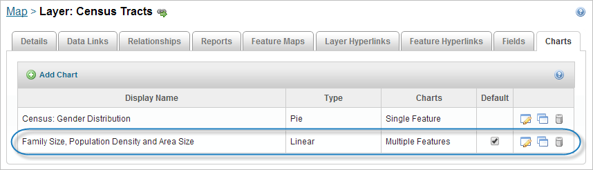
Charts: Determines whether the chart displays information about a single feature or multiple features.
-
Single Feature: A single-feature chart displays information about only one feature. A single-feature chart opens in a tab in the Feature Details dialog box when you select one feature in the Results List or when you click View Additional Details in a map tip.
-
Multiple Features: A multiple-feature chart displays information about any number of features in the Results List that you find using an Identify tool or Search. The chart region opens below the map when you click Charting at the top of the Results List. In the chart panel, you can use the Chart Selector to enable or disable the visibility of configured multiple-feature charts.
-
-
Visible: Determines if the chart is visible in the viewer or not. The Visible setting makes it possible to disable a chart instead of deleting it permanently.
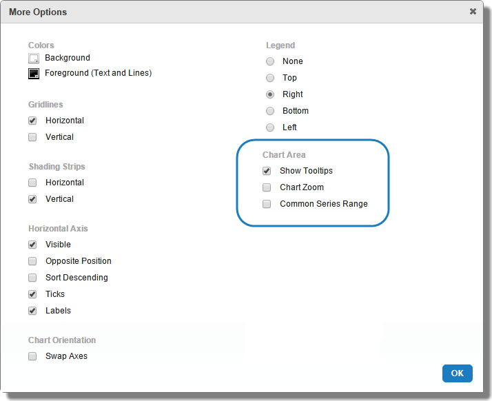
More Options
These option are available when you select More Options.
When you select a pie chart, fewer options are available than when you select a linear chart.
-
Colors: Determines the Background color of the chart and the Foreground color of text and lines in the chart.
-
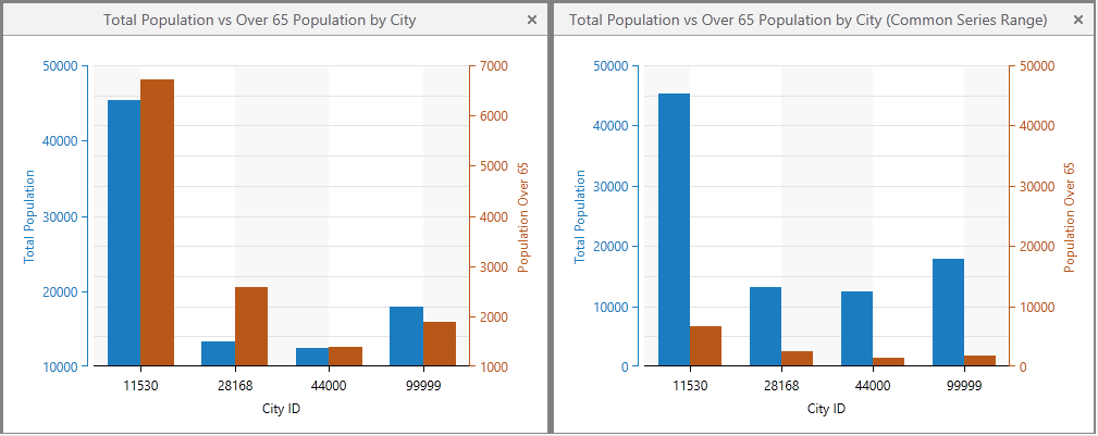
The effect on a chart of setting the Common Series Range unselected or selected
-
Gridlines: For linear charts only. Adds Horizontal and Vertical grid lines to the background of a Linear chart.
-
Shading Strips: For linear charts only. Adds translucent Horizontal and Vertical strips to the background of a Linear chart.
-
Horizontal Axis: For linear charts only.
-
Visible: Sets the visibility of the X-axis of the chart.
-
Opposite Position: Places the X-axis in the opposite position at the top of the chart rather than along the bottom.
-
Sort Descending: Sets whether to display data on the X-axis in ascending or descending order.
-
Ticks: Sets whether or not small lines appear on the X-axis to indicate key points along the axis.

-
Labels: Sets whether or not the ticks should have labels to identify them on the X-axis. You can select either All Labels or Smart Labels, but not both.
-
All Labels: All of the axis labels are displayed.
-
Smart Labels: The number of labels adjusts to fit in the current view. Labels that overlap are removed.
-
-
Maximum: Specifies the maximum value to use for the chart's horizontal axis. You can only set a maximum value if the horizontal axis's Field is numeric. If you leave the Maximum box blank, the maximum is determined from the data.
-
Minimum: Specifies the minimum value to use for the chart's horizontal axis. You can only set a minimum value if the horizontal axis's Field is numeric. If you leave the Minimum box blank, the minimum is determined from the data.
-
-
Chart and Map Synchronization: Defines interactions between the chart and the map. When you click a data point on the chart, it performs all of the actions you enable in this section.
-
Select: Sets whether or not those features are added to Selected in the Results List when you click on a data point in the chart. When you have selected several features, you can then click View Selected to display only those features in the Results List.
-
Pan: Pans the map to show all the features clicked on the chart.
-
Zoom: Zooms the map in or out to show all the features clicked on the chart.
-
Feature Details: Opens the Feature Details dialog box, which displays details about a feature when that feature is clicked on the chart. If more than one feature is selected, details about only the first one display.
-
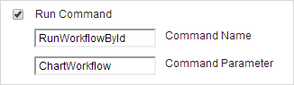
Run Command: Runs a command with the specified command parameter. When you select the Run Command option, the Command Name and Command Parameter boxes open for you to enter the information.
-
-
Chart Area:
-
Show Tooltips: Sets whether a tool tip appears when you hover over data points on the chart.
-
Chart Zoom: Sets whether the chart can be zoomed or panned horizontally.
-
Show Labels: Available for pie charts only. Sets whether to show labels for chart data.
-
Common Series Range: For linear charts only. Sets all chart series to use the same range. You can use this option when you have multiple series that you want to display with a common scale. The common series range is determined from the overall minimum and maximum value found in all chart series.
-
- Chart Orientation: For linear charts only.
Swap Axes: Swaps the X-axis and the Y-axis so that the information from the Y-axis is horizontal and the information from the X-axis is vertical.
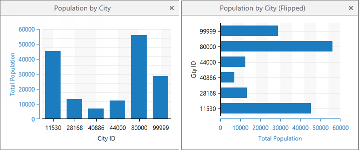
Charts showing the effect of swapping the axes in a linear chart
Category Setup (Horizontal Axis)
These settings appear when you select Linear in the Type field under Category Setup. The Horizontal Axis settings determine the appearance and data sources for the X-axis in linear charts.
-
Category Title: Sets the label that appears under the X-axis in the chart.
-
Data Source: Sets the source of the data for the X-axis to be either a field on the layer or a data link. To use a data link, you would first need to set up the link to the database or spreadsheet and link it to the layer. For more information, see Data Links.
-
Field: Sets which field in the layer to use as the source of data for the X-axis. The data type of the field you select affects which options appear in other settings. For example, if you select a time-based type in Field, a Plot Continuous option appears. If you select a numerical type in Field, a Plot Numerical option appears.
-
Value Format: Sets the format to use when interpreting DateTime or Numeric values on the selected field. The options in the Value Format drop-down list change depending on the field type.
For example, if you select a DateTime field, the list shows options to read the field value as Day, Month, or Year. If you select a Numeric field, the list shows options to read the field value as a decimal value, currency, or a percentage. Specifically, if you select Currency, data points display in the chart with a currency sign in front of them. If you select Percentage, the value is multiplied by 100 and displays with a percentage sign.
-
Decimal Places: Sets the number of fractional digits to display. This setting appears when you select one of the predefined (non-custom) formatting options for the Value Format setting, like Currency or Number.
This precision setting cannot exceed the maximum representable IEEE 754 floating point. This is specified in the IEEE 754 standard. See double-precision floating-point format and significant figures for more information.
-
Currency: Sets the currency type, such as United States Dollar (USD) or Euro Member Countries (EUR). The Currency setting appears when you select Currency for the Value Format setting. The currency type is specified using ISO 4217 currency codes.
-
Display Format: Activates when you select either the Custom Number Format or the Custom Date Format option in the Value Format drop-down list. You can then specify a custom DateTime or Numeric format to sort and interpret the field data.
Custom formats must comply with the MSDN Formatting Types standards:
-
DateTime: Custom Date and Time Format Strings
-
Numeric: Custom Numeric Format Strings
Note that the following numeric format strings are not supported:
- The per-mille placeholder (‰).
- Exponential (scientific) notation.
- Literal characters appearing in the middle of the format string (for example, "00ABC0.##").
-
-
-
Plot Continuous/Plot Numerical: These options appear only if you select a particular type of data in the Field setting. For Example, for Plot Continuous to appear, you must select a time-based field type. For Plot Numerical to appear, you must select a numerical field type.
-
Select Plot Continuous if you want to plot the data to display chronologically and continuously over time.
-
Select Plot Numerical if you want to plot the data to display linearly and continuously.
To create a Scatter Point chart, you must select a numerical field for the category and then enable Plot Numerical. This is because a Scatter Point chart can only represent numerical values.
-
Series Setup (Vertical Axis)
These settings appear when you click Add Series. Use the series settings to define the Y-axes in a linear chart or the segments of a pie chart. You can have multiple series in both linear and pie charts.
When you select Linear in the Type field in Category Setup, many more options are available under Series Setup than when you select Pie. Other options may appear or disappear based on the type of data source selected.
-
Series Setup: Settings that control the type and appearance of a series.
-
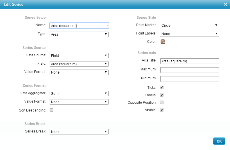
Name: Sets the name of the series as it appears on the legend and the label of a segment in a pie chart.
-
Type: For linear charts only. Sets the type of series to display. Type choices include Bar, Line, Spline, Area, Spline Area, and Scatter Point.
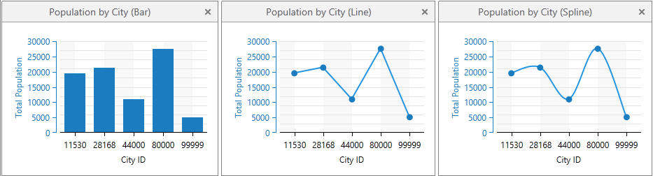
A Bar, Line, and Spline chart showing the same population data
An Area and Spline Area chart showing the same population data
A Scatter Chart showing numerical data
-
-
Series Source: Sets the source and format of the series data.
-
Data Source: Sets whether to use a Field on the layer or a data link as the data source for this series. If you want to use a data link, you would need to set it up before it can be available for selection here.
-
Field: Sets which field to use as the source of data for this series.
-
Value Format: Sets the format to use based on the type of data you selected in the Field above. Use this setting to create a custom format for either Date/Time or Numeric values. For more information about Custom Formats, see the Value Format under Category Setup.
-
-
Series Format: Defines how a series is formatted.
-
Data Aggregator: Determines how to aggregate the cumulative values for this series. Choices include:
-
Sum: Calculates the total of all the values for the selected field. For example, the total population of the selected counties.
-
Count: Ignores the actual value of a field and simply counts the number of features. Use this aggregator when the field is a string and can take on multiple values. For example, the available census data of the selected counties.
-
Min: Finds the minimum value of all the selected features. For example, the lowest population of a single county within the selected counties.
-
Max: Finds the maximum value of all the selected features. For example, the highest population of a single county within the selected counties for a selected year.
-
Average: Calculates the average value of all the selected features. For example, the average population of the selected counties.
-
-
Value Format: Sets the format to use for the aggregated series value based on the type of data you selected in Field. Use this setting to create a custom format for either Date/Time or Numeric values. For example, a value of
20be formatted as$20or20%. For more information about Custom Formats, see Value Format under Category Setup. -
Sort Descending: For linear charts only. Sets whether to display data on the Y-axis in ascending or descending order.
-
-
Series Break: For linear charts only. Sets whether or not to break apart the aggregated series data by the specified method. If you select the Unique Value method, it separates the data into groups based on unique values for the selected field.
Data broken apart by the unique value method is often best represented as a bar chart.
-
Series Style: For linear charts only. Controls the appearance of the series markers and labels.
-
Point Marker: Sets the shape of the points used to represent nodes in this series. You can select either None, Circle, Square, Triangle, or Diamond.
-
Point Labels: Sets whether or not to display text labels for the nodes in this series. You can select either None, Smart or Smart with Collectors.
If you use Smart Labels, the labels are placed next to each node in the series so that the labels do not overlap.
If you use Smart with Connectors, the labels are arranged so they do not overlap but each label is connected to its corresponding chart node with a thin line.
Smart Labels and Smart with Connectors for labelling the points in linear charts are only fully supported by the Silverlight Viewer. In the HTML5 Viewer, both Smart Labels and Smart with Connectors display point labels that may overlap, without connectors.
-
Color: Sets the color of the nodes and lines on the Y-axis.
-
Series Axis: For linear charts only.
-
Axis Title: Sets the title of this Y-axis.
-
Maximum: Manually sets the maximum value of the y-axis for this series. If you do not specify a Maximum, it is determined from the data.
-
Minimum: Manually sets the minimum value of the y-axis for this series. If you do not specify a minimum value, the range on the axis is calculated to include the available data within a series of equal intervals. In some cases, the resulting data point intervals represent negative values even though the data does not include negative values.
-
Ticks: Sets whether or not to display ticks (small bars) to demarcate data points on the axis.
-
Labels: Sets whether or not to display labels for each of the ticks, which are small bars that designate key points on the axis.

-
Opposite Position: Places the series Y-axis in the opposite position on the right side of the chart rather than the left side.
-
Visible: Sets the visibility of the Y-axis for this series.
-
Create Charts
There are different ways to approach how you create a chart:
-
Create an empty chart and configure it.
Before you create an empty chart, examine the options and select the chart type you plan to use to view and analyze your data.
Follow the instructions in Create a Single-Feature Chart or Create a Multiple-Feature Chart. Refer to Chart Settings for additional information about settings.
-
Copy an existing chart and modify its configuration.
The Existing chart must be on the same layer as the one you want to create.
This method saves you configuration effort if you already have a chart that is similar to the one you want to create.
Follow the instructions in Copy a Chart and Edit a Chart, and then refer to Chart Settings to modify the configuration.
Create a Single-Feature Chart
You can configure pie charts or linear charts as a single-feature chart. A single-feature chart opens in the feature details when the user clicks on a single feature in the Results List, or when the user views additional details from a map tip.
Although it is possible to create single-feature charts that are linear, it is more likely that you will use a data link configured on the layer in order to populate a linear single-feature chart with meaningful data.
To create a single-feature pie chart:
-
In
 next to the layer.
 -
Click the Charts tab and select the Add Chart button.
-
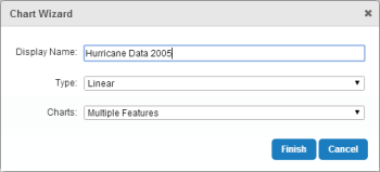
In the Chart Wizard, type in a Display Name for the chart.
-
In the Type drop-down menu, select Pie and then Finish.
The new chart appears in the chart list.
-
Click the Edit icon
 to open the chart settings page.
 -
In the Charts drop-down menu, select Single Feature.
-
Open More Options, select the Show Tooltips checkbox, and then use OK button to save the configuration.
You can also change other elements of appearance of a chart, including the colors, gridlines, shading strips, horizontal axis, chart orientation, legend position, zoom, and common series range.
-
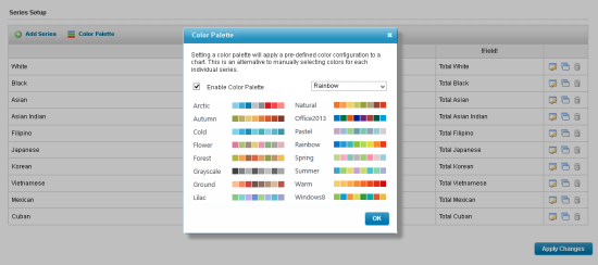
To choose a color palette for the chart series, select Color Palette in the Series Setup section and then Enable Color Palette.
-
Select a palette from the drop-down menu, and then click OK.
-
Click Add Series.
-
To create a series, in the Edit Series window, set the following:
-
Name: The label you want to use as the name of this series.
-
Data Source: Whether the data source is a field in the layer or a data link.
-
Field: The field on the layer to use as the source data for this series.
-
Value Format: What formatting to use when this field is sorted.
-
-
Data Aggregator: How to treat this data in the series.
-
Value Format: How to format each data point in this series.
-
For more information about these settings, see Series Setup (Vertical Axis).
-
-
Create at least one more series.
-
Click Apply Changes.
When you click on a single feature in the Results List, or View Additional Details in a map tip, the chart appears as a new tab in the Feature Details dialog box.
Create a Multiple-Feature Chart
Multiple-feature charts display data about all the features currently in the Results List. When a chart is open, the user can search for or identify other features and the chart updates to show the new data.
You can create both pie and linear multiple-feature charts and in each case, they can have multiple series. In a linear chart, the series on the Y-axis can include multiple series using different chart types, for example, a mix of line, spline or bar types.
If you have several charts set up for a layer, you can set which charts open by default when a user views charts.
To create a multiple-feature chart:
-
In
next to the layer. -
Click the Charts tab and select the Add Chart button.
-
In the Chart Wizard, type in a Display Name for the chart.
Because both administrators and end users will use the Display Name, choose a descriptive name that states what data the chart displays.
-
In the Type drop-down menu, select Linear or Pie, and then select Finish.
The new chart appears in the chart list.
The new chart is currently the only multiple-feature chart, so it is set as the default chart to open.
-
Click the Edit icon
beside the new chart to open the chart settings. -
Set up the data to display on the X-axis:
In the Category Setup area:
-
Category Title: Type in the label to appear under the X-axis on the chart.
-
Data Source: Select whether to use a Field on the layer, or a Data Link as the source of data for this axis.
-
Field: If you selected Field as the Data Source, select the layer field you want to use as the data for this axis, for example, City ID.
In the Chart Setup area:
-
Use the More Options button.
-
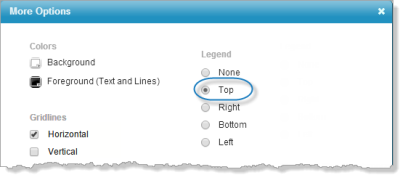
In the Legend area, select Top.
-
Click OK.
-
-
To use a color theme, select Color Palette in the Series Setup area, then Enable Color Palette, configure a palette, and click OK.
-
To add three series that use different chart types, in the Series Setup area do the following:
-
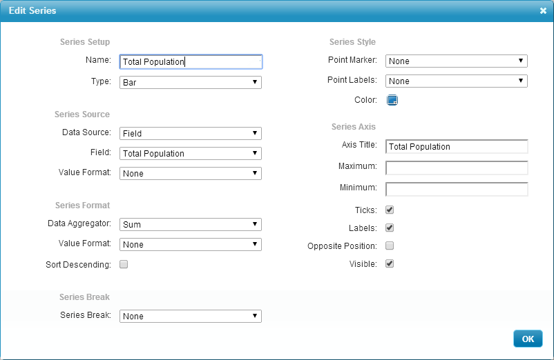
Click Add Series to add the first series as a bar type chart.
-
In the Name field, type the label for this series, for example, Total Population.
-
Set the Type to Bar.
-
Set the Data Source to Field, and select the layer field, for example, Total Population.
-
Set the Data Aggregator to Sum, so that all the values for the population fields are added together. Click OK.
-
Set None for the Point Marker as it is not visible with the Bar chart type.
-
Type in the Axis Title, for example, Total Population.
-
-
Click OK.
-
Click Add Series to add the second series as an area chart type.
-
In the Name field, type the label for this new series, for example, Area Size.
-
Set the chart Type to Area.
-
Set the Data Source to Field, and select the layer field, for example, Area (square m).
-
Leave Data Aggregator on Sum.
-
Set Point Marker to None.
-
-
Click OK.
-
Click Add Series to add the third series as a line chart type.
-
In the Name field, type the label for this new series, for example, Average Family Size.
-
Set the chart Type to Line.
-
Set the Data Source to Field, and select the layer field, for example, Average Family Size.
-
Set the aggregator to Average, so that the average value of all the selected features is calculated.
-
-
Click OK.
-
-
Click Apply Changes.
When the end user select a group of features and views charts, the chart displays.
Copy a Chart
You can only copy charts on the same layer. Currently, you cannot copy charts from a different layer or site.
To copy a chart:
-
In
next to the layer. -
Click the Charts tab.
-
Click the Duplicate Chart icon
 beside the chart that you want to copy.
An exact copy of the chart appears at the bottom of the list of charts with the word Copy added to the Display Name.
-
To edit the copied chart, click Edit
beside the copied chart and change the chart settings. -
Click Apply Changes.
Create an Empty Chart
To add a chart to a layer in Manager:
You can add charts to feature layers only.
-
In
next to the layer. -
Click the Charts tab.
-
Click Add Chart.
-
In the Chart Wizard, type in a Display Name for this particular chart.
The Display Name appears on this page in the list of charts, in the drop-down box in the viewer where end users select a chart to display and in the feature details dialog for single-feature charts. Choose a descriptive name that makes it clear what data the chart displays.
-
From the Type drop-down list select Pie or Linear.
-
From the Charts drop-down list select Multiple Features or Single Feature.
A single-feature chart displays information about only one feature. A multiple-feature chart displays information about any number of features in the Results List.
-
Click Finish to create the new chart and add it to the list of charts.
You now need to configure the chart.
-
Click Apply Changes.
To reorder list items, click and drag the Sort handle ![]() .
.
Edit a Chart
To edit a chart:
-
In
next to the layer. -
Click the Charts tab.
-
Click the Edit icon
beside the chart. -
Configure the Chart Settings.
-
Click Apply Changes.
Configure Series
You can add series to both pie and linear charts. In pie charts, each series is represented as a slice of the pie. In pie charts, the slice indicates what percentage of the overall pie that slice represents. In linear charts, series are represented on the Y-axis and can be rendered as many different chart types, for example, bar, line, spline, etc.
To make it easier to create multiple series that are relatively similar, you can copy an existing series and edit it rather than create each one from the beginning. You can also select a palette of colors to use to ensure that the colors used in multiple series contrast both contrast and blend with each other.
Add a Series
To add a series:
-
In
next to the layer. -
Click the Charts tab.
-
Click the Edit icon
beside an existing chart. -
If the chart does not contain an X-axis, define the X-axis in the Category Setup (Horizontal Axis) section.
-
In the Series Setup (Vertical Axis) section, click Add Series.
-
In the Edit Series dialog box, do at least the following:
-
Type a Name for this series. The name appears in the Series list.
-
If this is a linear chart, select the chart Type from the drop-down list.
-
Select a Data Source that is either a Field or a Datalink.
-
Select the layer Field to use as the data set for this series.
-
Select a Data Aggregator to indicate the aggregation method to use on the data.
-
Ensure that the Axis Title is the exact wording you want to appear as the label on the Y-axis.
For more information on these settings, see Series Setup (Vertical Axis).
-
-
Click OK to add the new series and add it to the Series list.
-
Click Apply Changes.
To reorder list items, click and drag the Sort handle ![]() .
.
Copy a Series
To copy a series:
-
In
next to the layer. -
Click the Charts tab.
-
Click
beside the chart that contains the series you want to copy. -
In the Series Setup section click the Duplicate icon
beside the series.A exact copy of the series appears at the bottom of the list of series.
-
To edit the copied series, click Edit
beside the copied series and change the Name and any other settings. -
Click Apply Changes.
To reorder list items, click and drag the Sort handle ![]() .
.
Edit a Series
To edit a series:
-
In
next to the layer. -
Click the Charts tab, and then click
beside the chart you want to edit. -
In the Series Setup section, click
beside the series you want to change. -
Edit the series by changing any of the Edit Series settings.
-
Click Apply Changes.
Use a Color Palette for Multiple Series
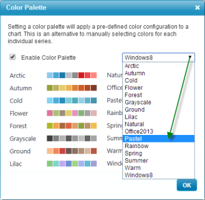
When you create charts, you can select the colors for each series individually. When you have multiple series within a chart, it can be difficult to ensure that the colors contrast well but also blend with each other. To make it easier to create series that contain multiple colors, you can enable palettes and then select one of the 8-color palettes to use in your series.
Once you have enabled palettes, the selection of individual series colors is disabled.
To use a color palette for multiple series:
This procedure assumes that you have already created the chart.
-
If the chart does not contain any series, add the series you want.
As you add each series, they form a list in the Series Setup area.
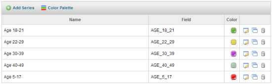
List of series with individual colors selected.
-
To apply a color palette to all of the chart series, click
 in the Series Setup section.
 -
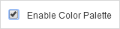
Select the checkbox to enable the Color Palette.
-
From the drop-down list, select the palette you want to use.
The Color Palette dialog shows a preview of each palette. Colors are used in order from left to right.
-
Click OK and then Apply Changes.
When you open the chart in a viewer, it displays the new set of colors from the selected palette.
Remove a Series
To remove a series:
-
On the Charts tab, in the Series Setup section, click Remove
 beside the series you want to delete.
The series disappears from the list.
-
Click Apply Changes.
Configure Charts to Open by Default
You can set one or more charts to open initially when the map's chart region opens. In most cases, you would not set more than three charts to open by default.
To set the default charts to open in the chart region.
-
In
next to the layer. -
Click the Charts tab.
-
In the Default column, select each chart that you want to open when the user views charts.
-
Click Save Site.
Remove a Chart
To remove a chart:
-
In
next to the layer. -
Click the Charts tab.
-
Click the Remove icon
beside the chart you want to delete. -
When the Delete Chart dialog box opens, click OK to confirm the removal of the chart.
The chart disappears from the list.
-
Click Apply Changes.