Forms
Forms allow users to enter data for the workflow to operate on.
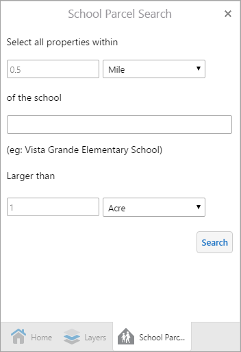
Example of a form for a School Parcel Search workflow
Form Designer
Essentials Workflow Designer includes a designer for designing forms to display to users in order to inform, instruct, request a response, or display outputs. Form Designer is a key element in creating workflows that require interactions with users.
Form Designer is contained within the Display Form activity, which is in the Common Client section of the Activities panel. The Display Form activity contains a number of features that help you to create forms to add to a workflow.
|

|
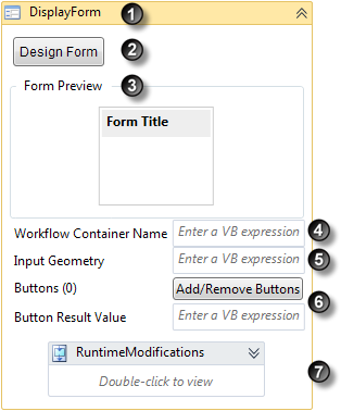
The DisplayForm activity is the shell inside which you create a form. |

|
The Design Form button opens Form Designer, where you design and configure the form. |
|

|
The Form Preview displays the form as the user will see it. As you enter properties, the Form Preview updates to include them. |
|

|
The Workflow Container Name displays the name of the container surrounding the form. It must first be configured in the Viewer. |
|

|
The Input Geometry is an option that specifies a spatial extent, for example, a polygon, for a form to act on. |
|

|
The Buttons feature opens the Button Editor where you add buttons and define button properties and outputs - the Button Result Value. |
|

|
The RuntimeModifications is a sequence activity within the Display Form that can modify the form as it executes. |
Open Form Designer
To open Form Designer:
-
Drag a Display Form activity from the Common Client section of the Activities panel to the design area.
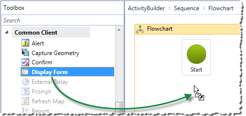
Form Designer is contained in the Display Form activity
-
Click Design Form.
Form Designer Interface
Form Designer is where you design and build forms to use in your workflow. First you select a Form Item—the type of form you plan to use in your workflow. For each form item, you then define the properties and parameters to control the flow of data into and out of your form.
|
|
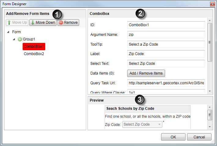
The Add/Remove Form Items area is where you add and arrange items such as fields and controls to your form. As you add items, they appear in the Form tree view. You can click the Move Up and Move Down buttons to change the order of the Form Items, or click Remove to delete them. |
|
|
The properties/parameters of a form element appear in this panel when you select the Form Item in the Form tree. The properties change depending on the type of Form Item selected. |
|
|
|
The Preview of the Form Item updates as you change any properties that will be visible on the final form, for example, the Label. |
|
Form Items
There are a number of different types of form that you can create in Form Designer. Each is listed in the Forms drop-down list when you click the plus icon ![]() beside Group1.
beside Group1.
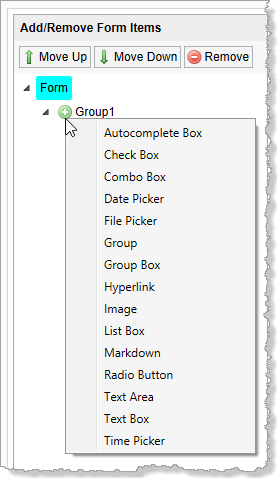
List of Form Items in Form Designer
You can include several different kinds of items in a form, including:
Autocomplete Box
Autocomplete boxes automatically present a narrower selection based on what the user types in.
For example, if a text field asks you to select a country, you can input ca to see the countries beginning with the letters Ca, such as Canada, Cambodia, and Cameroon. If you input Ce, the list narrows to a single country, Central African Republic. This makes selection in long lists much easier for the user.
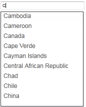
Autocomplete box to select a country
The result of an autocomplete box form item is a System.String containing the user selected text.
Checkbox
A square box that is selected or cleared to turn an option on or off. When you select it, a check mark appears inside the box. You can select more than one. A label that describes what the checkbox does is shown beside the checkbox.
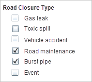
Checkbox to select road closure type
The result of a checkbox form item is a System.Boolean matching the checked state of the input.
Combo Box
A drop-down list that allows you to select an item from the list. More than two combo boxes can be set in a cascading chain.
A List Box can be substituted for a Combo Box in a cascading chain, on condition that it is only a single-select List Box. You can also use an autocomplete box in a cascading chain as the source.
The result of a Combo Box form item is a System.Object containing the user selected value.
Combo Boxes can be used to create complex forms that collect data from users by asking them to select a value from a given list, or to type in a value, for example, a zip code. One advantage of Combo Boxes is that they can be used in combination with List Boxes and Autocomplete Boxes in a cascading set that moves users through a series of options to narrow or broaden the information you want to collect from them.
An example of a combo box used in a cascading set is the SearchSchools.xaml workflow that ships with Essentials. In the default Essentials installation, the workflow is here:
C:\Program Files (x86)\Latitude Geographics\Geocortex Essentials\Default\REST Elements\Sample Sites\Resources\Workflows
In the Search Schools workflow, users can search for one school, or all the schools, within a particular zip code. In the first Combo Box, users are asked to select a zip code. Based on their response (a zip code), the workflow populates the second Combo Box with all the schools in that zip code. Users then have a choice of either displaying a list of all the schools, or selecting the one school they want from the drop-down list.
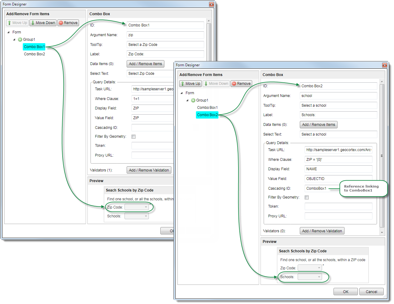
Cascading Combo boxes in Form Designer
You can add the list of values to the combo box in two ways:
-
Data Item Editor: You add items manually in the Data Item Editor dialog to form the list of items to select. This method works well if the list is known and not likely to change.
-
Query: You create a query to find and load the data from a map service. This method works if there is an unknown amount of data that could potentially change. Form queries return distinct values.
To create a combo box:
-
In the DisplayForm activity, click Design Form.
Form Designer opens.
-
To add a new Combo Box, below Form, click the plus icon
 and select Combo Box.
 -
In the ID box, type in the specific ID to use for this Combo Box.
The ID can be used by other elements in the workflow to refer to this Combo Box.
-
In the Argument Name box, type in the argument name to use, for example, zip.
-
If you want a tool tip to appear when the user hovers the pointer over the Combo Box, enter the ToolTip text.
-
If you want text in front of the email box, type it into the Label field.
You can also add instructional or other text, above the Combo Box by placing it within a Group. The Group must be above the ComboBox under Form.
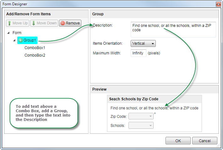
Add text above a ComboBox
-
If you want to add text to appear inside the Combo Box as an example, type it into the Select Text field.

Default text inside the text box can show an example
Remember that the workflow will attempt to use this default entry if the user does not replace it with their own information.
To add list items to a combo box manually:
-
With the combo selected in Form Designer, click Add/Remove Items.
The Data Item Editor opens.
-
In the Display box, type in the item as you want it to appear in the list.
-
In the Value box, type in the actual data value of the item, and then click Add.
Each time you click Add, the item appears in the box below as list.
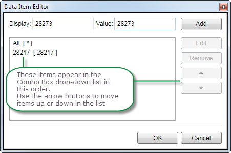
Items for the ComboBox entered manually
-
To edit an item already in the list, select the item, click Edit, make the changes in the Edit Item dialog, and then click OK.
-
To remove an item in the list, select it, and then click Remove.
-
To change the order an item in the list, select it, and then click either the up or down arrows to move the item up or down in the list.
-
Click OK to save and close the dialog.
To add list items to a Combo Box using a query:
-
In the Query Details section, copy the URL to the REST endpoint for the query service into the Task URL box.
Remember to include the map layer to query in the URL, for example, in the following URL,
/6specifies the layer:http://server.domain.com/ArcGIS/rest/services/CharlotteOperational/MapServer/6
-
In the Where Clause box, type in the statement you want to use to return the data.
For example, if you want to add only zip codes that begin with 28, add ZIP Like "28%". If you want to add all the possible items to your list, use 1=1 as the WHERE clause. Any SQL syntax works in this field.
It is also possible to use tokens in the WHERE clause. For more information about tokens, see Tokens in Form Item Queries.
-
In the Display Field, type the name of the Field you want to use to populate your list, for example, ZIP.

Field names shown in the REST API
-
In the Value Field, type the name of the actual data value of the field.
In the ZIP example, this would be the same (ZIP) as both the name and the Alias for this data is ZIP.
-
If you are using cascading Combo or List Boxes, and you need to refer to the previous box, type the ID of the box into the Cascading ID.
-
If you want to limit the number of items in your list using a geometry, select the Filter By Geometry checkbox.
If you use a geometry, you need to store the value of the geometry in a variable in the Input Geometry box in the Display Form.
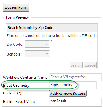
Variable to store the input geometry
-
If the ArcGIS task server you want to use is secured, paste the long-lived token for the server into the Token box.
A token configured in Form Designer is a literal value, not a variable. You cannot use workflow variables in Form Designer interface. If you wish to use a variable to assign a token you must use the Runtime Modifications feature of the Display Form activity instead.
-
In the Proxy URL box, paste in the URL of the proxy to access the secured task server.
-
If you want to add validation to the Combo Box to ensure that the user enters the expected value into the box, see Add Validation to Form Items.
Date Picker
A control used to display a calendar so that you can select a date. There is a time component option, so this control can include a time picker as well as the date picker. You can set the current date as the default date for the date picker control, or you can specify a particular date to use as the default.
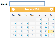
Date picker for selecting a date
The result of the date picker form item is a System.Nullable<System.DateTime> containing the date selected by the user. If the user does not select a date, the result is Nothing.
File Picker
An input that allows the end user to select files from their local machine or mobile device. Depending on the device's capabilities, the end user may be able to use a camera to capture file input.
The result of a file picker form item is a System.Collections.Generic.IList<Geocortex.Forms.Client.FileItem> containing the selected file data.
The Geocortex.Forms.Client.FileItem type exposes the following properties:
FileData: ASystem.Byte[]containing the raw byte data of the file.FileName: ASystem.Stringcontaining the name of the file.
The File Picker is not supported by all HTML deployments. The File Picker requires a browser that supports the HTML5 FileReader API (see http://caniuse.com/filereader for a list of supported browsers). The File Picker is fully supported by Silverlight.
Group
A container form item that provides the ability to group several controls under a heading and arrange them horizontally or vertically. You can use groups to dynamically control the visibility of form items.
Group Box
A frame or box that encloses a group of fields or options, usually with a faint gray line and a caption. It is a visual marker only, used to set apart a group of controls that work together. It indicates where a group of controls should or must be treated as one entity. You can dynamically control the visibility of the form items in a group box.
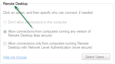
Group box around a set of radio buttons
Hyperlink
The hyperlink form item displays a hyperlink. When clicked, the hyperlink, navigates to an external web page. The URI for the hyperlink is set in the Navigate Uri property. The Target Window property specifies the target window or frame that the page should open in.
he hyperlink form item returns a Boolean value to the server indicating the user navigated to the link or not.
Image
A form item that is a control to display an image. The height and width of the image can be configured. If the height and width are not set, the image displays using the dimensions of the source image file. If the height and width set are different from the original image, it is scaled to fit and the aspect ratio maintained. You only need to set one of the height or width properties to control the image size. Setting both the height and width at the same time is not recommended. If the Source Uri property is set to an invalid location, the image is not displayed. This Image form item does not return any value to the server.
List Box
Any type of box containing a list of items that the user can select. The user cannot type a selection into the list box like you can with an autocomplete box. In some list boxes you can select only one item. In others you can select several items. In workflow, both single and multiple selections are supported. To select multiple items, hold down the Ctrl or Shift key while selecting the items.

List Box to select an image format
The result of a List Box form item is a System.Object containing the user selected value or values. If the selection mode of the input is Single the object will be a single value, otherwise the object will be a System.Collections.Generic.IList<System.Object> containing the multiple selected values.
Markdown
A form item that supports Markdown syntax. Markdown is an easy-to-read, easy-to-write plain text format that will be rendered as rich formatted content in the form. For more information see the official Markdown: Syntax at Daring Fireball.
For example:
# text: produces a level 1 heading## text: produces a level 2 heading### text: produces a level 3 heading**text**: produces bold text_text_: produces italic text
The Markdown form item does not return a result to the server.
Radio Button
Radio buttons are also referred to as option buttons. You can only select one at a time. They are usually round buttons that darken when selected.
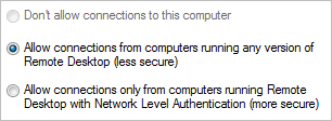
Radio buttons allow the selection of only one option
The result of a Radio Button form item is a System.Boolean matching the selected state of the input.
Text Area
A multi-line text field. Some text areas limit the amount of text to a set number of words.
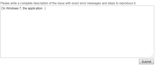
Text Area to collect information about issues with software
The result of a text area form item is a System.String containing the user supplied text.
Text Box
A single-line text field that allows the user to input text to be used by the program. Text boxes do not accept line breaks or new paragraphs.
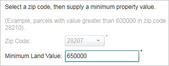
Text box to get the minimum property value from the user
The result of a Text Box form item is a System.String containing the user supplied text.
Text Boxes are useful for collecting information from users when you cannot anticipate the information users will enter, but you can predict the layout and format of the information, for example, an email address, home address, name etc. The possibilities for this type of entry are infinite, yet the consistent format means that you can validate to see if the entry is correct.
Text boxes in the Workflow Designer include the option to validate the user's input, so it is possible, for example, to validate that an email has been entered in the expected format.
An example of a Text Box used in a workflow can be found in the ExtractAndEmail.xaml workflow that is shipped with Essentials. You can find a copy of this workflow in:
C:\Program Files (x86)\Latitude Geographics\Geocortex Essentials\Default\REST Elements\Sample Sites\Resources\Workflows\CharlotteOperational
In the ExtractAndEmail workflow, the user is asked to type in the email address to use to receive a hyperlink to the data they want to extract.
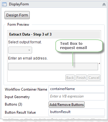
Example of a Text Box in a workflow
To add a Text Box to a workflow:
-
In the DisplayForm activity, click Design Form.
Form Designer opens.
-
To add a new Text Box, below Form, click the plus icon
 and select Text Box.
 -
In the ID box, type in the ID for this specific Text Box.
This ID can be used by other elements in the workflow to refer to this Text Box.
-
In the Argument Name box, type in the argument name to use, for example, emailAddress.
-
If you want a tool tip to appear when the user hovers their cursor over the Text Box, type in the ToolTip text.
-
If you want text in front of the email box, type it into the Label field.
If you prefer the label text above the Text Box, click the plus icon
 , create a Group, and type text of the label into the Description box. The Group must be above the TextBox under Forms.
 -
If you want to add text to appear inside the Text Box as an example, type it into the Default Text field.

Default text inside the Text Box can show an example
Remember that the workflow attempts to use this default entry if the user does not replace it.
-
To set the Width of the Text Box, type in the number of pixels wide that it should be.
The Input Scope field has no application currently but will be used for tablets.
-
If you do not want to set validation for the Text Box, click OK.
-
If you want to add validation to the text box, continue the process below.
See also...
Time Picker
The time picker enables users to select a time of day within a form. It contains an editable text box that allows the user to input the time of day. The time of day can be selected from the suggestion list found in the drop-down. The Time Format can be configured to be either Short or Long.

Time picker control
The result of a time picker form item is a System.DateTime containing the user-selected time.
Add Buttons to a Form
Within the DisplayForm activity, there are two fields that make it possible to add buttons to forms and control their behavior.
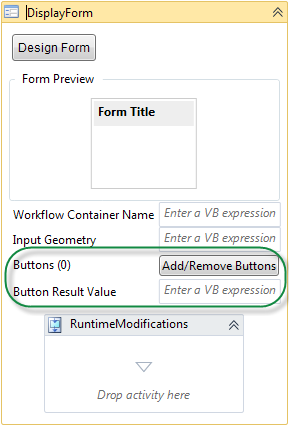
Button fields in the DisplayForm activity
The properties of buttons are set up in the Button Editor where you define how each button is to look and function. Each button is given an output Value. The output from whichever button is clicked on the form is passed to the Button Result Value to populate a variable, which then becomes available to other activities in the workflow.
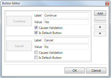
Continue and Cancel buttons in the Button Editor
To add a button to a form:
-
In the DisplayForm activity, click Add/Remove Buttons.
The Button Editor opens.
-
To add a new button, click Add.
-
In the Label box, type the text to display on the button.
-
In the Value box, type the text that is to be the output value of the button.
This value is not seen by the user but serves to populate the variable that is set in the Button Results Value box if the user clicks this button. The Button Results Value is then available to other activities in the workflow.
-
If you want the user's form entries to be validated when they click this button, select the Causes Validation checkbox.
If you select this option, the form is only submitted if it passes validation.
-
If you wish to set a default button, select the Is Default Button checkbox.
When a default button is set and the user presses the Enter key while on a text area, the form is submitted as if the user had clicked the button.
-
To remove a button from a form, select the button box, and then click Remove.
-
To change the order of the buttons in the form, select a button box, and then use the up and down arrows.

Dynamically Show or Hide Form Items
You can control the visibility of a form's items based on how the user completes the form. For example, you could show additional input fields when the user makes a particular selection.
To configure conditional visibility, you must place the items that you want to show or hide in a group or group box. Groups and group boxes have a Visible When property that enables their visibility to depend on another form item's value. To configure the Visible When property, you specify a condition of the form FormItem = Value, where FormItem is the form item that you want the visibility to depend on and Value is the value that the form item must have for the group or group box to be visible. The condition that you configure is evaluated using a case sensitive string match. When the condition evaluates to true, the group or group box shows on the form. When the condition evaluates to false, the group or group box is hidden.
You cannot move existing form items into a group or group box. To dynamically control the visibility of form items, you must first create the group or group box, and then create the form items within the group or group box.
Example 1: Show an Additional Input Field When the User Selects a Checkbox
Suppose you want an Email Address text box to appear on a form when the user selects the Send me an email checkbox. To configure this, you put the Email Address text box in a group and set the group to be visible when the checkbox is true.
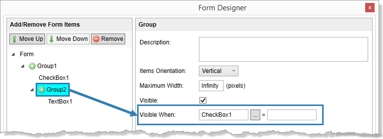
Configuration to show Group2 when CheckBox1 is selected
Note that there is no value specified in the condition shown above. To test whether a Boolean form item (checkbox or radio button) is selected, you do not need to configure the right operand.

To test whether a checkbox or radio button is cleared, you must enter false for the right operand.
Example 2: Show Different Input Fields Based on a Radio Button Selection
Suppose you are creating a parcel search workflow. You want to give users the choice of searching by address or by assessor's identification number (AIN). If the user selects the Locate by address radio button, you want the form to show two input fields—Address and City. If the user selects the Locate by AIN radio button, you want the form to show a field for the AIN.
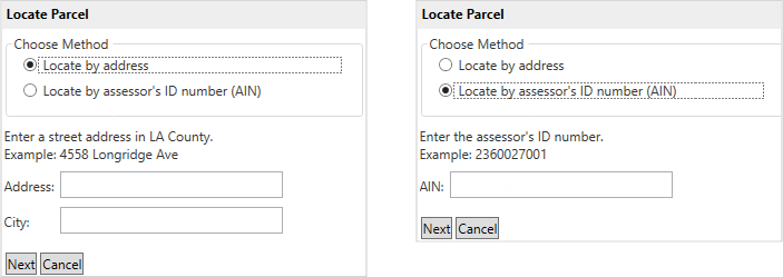
Desired appearance of the form when Locate by Address is selected (left) and when Locate by AIN is selected (right)
First, you add radio buttons for the two search methods to the form. Next, you add two groups. In one group, you add the input fields that you want to show when the user has selected Locate by address (Group2 in the screen capture below). In the other group you add the input field that you want to show when the user has selected Locate by AIN (Group3 in the screen capture).
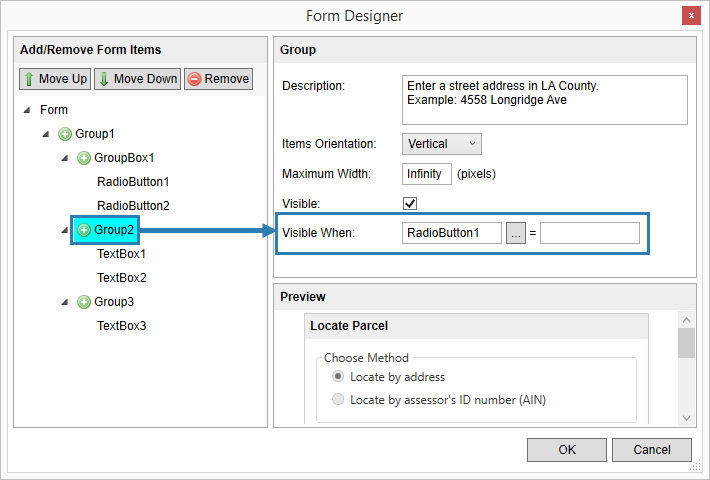
Configuration to show Group2 when RadioButton1 is selected
Add Validation to Form Items
Several Form items like Combo Boxes, List Boxes, and Autocomplete Boxes allow you to add validation of various kinds to ensure that what the user has entered a value, or that the value they entered is the expected format, or within a given range.
The validation options include:
-
Required: Uses simple validation to check for a response from the user. If the user does not enter a response, a message displays to request that they enter the correct response.
-
Regular Expression: Uses regular expressions to validate whether the user has entered a response in the correct format. You can select from a list of preset regular expressions, for example, email addresses, URLs, Phone numbers, zip codes etc. You can also use your own regular expression.
-
Numeric Range: Uses a range of numbers to validate if the users response is acceptable, for example, any situation where you have a set of numbers with a minimum and maximum value, where any number between the two is accepted.
In the procedure below, the example uses a Text Box but the same dialog and options are used by the other types of Form item.
Set Up Validation for a Text Box
To set up validation for a Text Box:
-
In Form Designer, with the Text Box selected, click Add / Remove Validation.
-
In the Validation Items dialog, click Add to see a list of validation options.
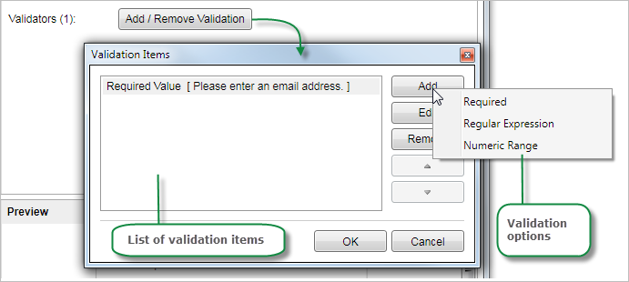
Validation options display when you click Add
-
Continue below using the validation option that applies to you.
-
When you have all the validation items you need, click OK.
Add a Required Validation Item
To add a required validation item:
-
In the Validation Items dialog, click Add | Required.
-
In the Validation Designer dialog, type in the Error Message to display if the user does not type a response.

Example error message for a required form item
-
Click OK.
The new Validation Item is added to the list of Validation Items.
-
Click OK twice more to close Form Designer.
Use a Regular Expression to Validate a Text Box Entry
To use a regular expression to validate a Text Box entry:
-
In the Validation Items dialog, click Add | Regular Expression.
-
In the Validation Designer dialog, type in the Error message to display if the user does not type in a valid email address.
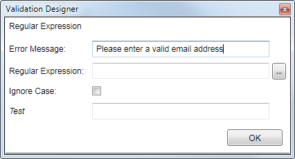
Example error message
-
To select a regular expression, click the ellipsis button beside the Regular Expression box, and then select the regular expression you want to use.
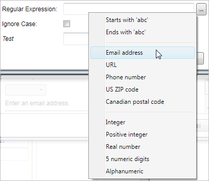
Select a predefined regular expression
You can also type in, or copy and paste your own regular expression into the box.
-
If you want the validation to ignore whether the user types in upper or lower case letters, select the Ignore Case checkbox.
-
To test that the regular expression works, type an example into the Test box.
If you type text that is not the expected format, for example, an email, the Test box turns red:

Test data that does not match the regular expression
If you type in the correct format, the Test box remains white:

Test data that matches the regular expression
-
Click OK and your new Validation Item is added to the list of Validation Items.
-
Click OK twice more to close out of Form Designer.
Use a Numeric Range Value to Validate a Text Box Entry
To use a numeric range to validate a Text Box entry:
-
In the Validation Items dialog, click Add | Numeric Range.
-
In the Validation Designer dialog, type in the Error message to display if the user does not type a number within the given range.
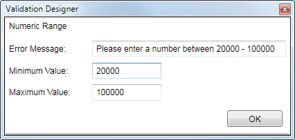
Example of validation using a numeric range
-
In the Minimum Value box, type in the lowest number in the numeric range.
-
In the Maximum Value box, type in the highest number in the numeric range.
-
Click OK.
The new Validation Item is added to the list of Validation Items.
-
Click OK twice more to close Form Designer.
Tokens in Form Item Queries
In Form Designer, you can use tokens in the WHERE clause of form item queries. Tokens represent input values previously selected by the user.
Form item IDs are case sensitive.
Common Tokens in Form Queries
|
Token |
Description |
Single quotes SQL-escaped? |
|---|---|---|
|
|
The input value previously selected from the parent form item, as specified by the Cascading ID field. For example, If the value contains any single quotes, they will automatically be SQL-escaped. |
Yes |
|
|
The input value previously selected from the specified form item, where If the value contains any single quotes, they will not be SQL-escaped. This token is supported by Geocortex Viewer for Silverlight 1.9 and newer, and Geocortex Viewer for HTML5 2.23 and newer. |
No |
|
|
The input value previously selected from the specified form item, where The This token is supported by Geocortex Viewer for Silverlight 1.9 and newer, and Geocortex Viewer for HTML5 2.23 and newer. |
Yes |