This feature is designed to give users manual control over offline functionality. With Disconnected Mode, users can force the app to stop making network requests while their device remains online. This is particularly useful in areas with intermittent or unreliable connectivity, preventing failed processes and ensuring a smoother offline experience. The mode can be activated via a toggle button within the app settings or triggered programmatically using new commands, offering flexibility for different workflows.
If a Disconnected Mode component is added, the icon should appear when Disconnected Mode is on, and disappear when Disconnected Mode is off. However, if the component's visibility is set to 'Hidden', the icon should never appear regardless of the Disconnected Mode state.
The state of Disconnected Mode persists, meaning if the app is closed while Disconnected Mode is activated, it will remain activated at the next startup, and vice versa.
To ensure Disconnected Mode is turned on at the initial app startup, go to Services > App and toggle the Initial Disconnected Mode to the active position. This applies only to the initial app startup. When the user changes the settings in the app, the Disconnected Mode setting is saved and overrides the initial setting at the next startup.
Main Settings
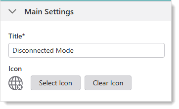
•Title: Type a title to display for the component.
•Icon: To select an icon to represent the component, click Select Icon, click the desired icon and click OK. To remove the icon, click Clear Icon.
Layout
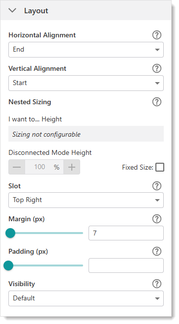
•Horizontal Alignment: Sets the horizontal position of any fixed-width components within. Has no visible effect on any component within whose width automatically grows to the size of the parent.
•Vertical Alignment: Sets the vertical position of any fixed-height components within. Has no visible effect on any component within whose height automatically grows to the size of the parent.
•Height: Specifies the height of the component. If Fixed Size is not selected, the height is an approximate percentage of the height of the parent component. If Fixed Size is selected, the height is in pixels and will not change when other component sizes are changed.
•Fixed Size: Whether the Width or Height of the component is a percentage relative to the size of the parent component or a fixed size in pixels. If Fixed Size is selected, the size will not change when other component sizes are changed.
•Slot: The location of this component within its parent component, assuming the parent component has slots. The possible values depend on the parent component's slots.
•Margin (px): The margin space around the component in pixels.
•Padding (px): The space between the icon and the outer edges of the component.
•Visibility: Controls the visibility of the component, either Visible (default) or Hidden.
Three new operations were added for Disconnect Mode:
•network.enable-web-requests: Command that enables web requests. This turns Disconnected Mode off.
•network.disable-web-requests: Command that disables web requests. This turns Disconnected Mode on.
•network.are-web-requests-disabled: Operation that returns a boolean value (Disconnected Mode on or off).