Check Box Control 
Description
The Check Box control displays text along with a box that can display three states: unchecked, checked and indeterminate. The text in the Check Box control can be manually defined or bound to a data source.
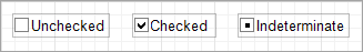
The three states of the Check Box control
Properties Common to Most Controls
For more information about the properties listed below, see Properties Common to Most Controls.
- Actions: Align to Grid, Size to Grid, Center Horizontally, Center Vertically, Bring to Front, Send to Back, Fit Bounds to Container
- Styles: Even Style, Odd Style, Style
- Appearance: Background Color, Border Color, Border Dash Style, Border Width, Borders, Font Name, Font Size, Font Unit, Font Effects, Foreground Color, Padding
- Behavior: Can Publish, Keep Together, Visible
- Data: Tag
- Design: Name
- Layout: Location, Size
- Navigation: Bookmark, Parent Bookmark, Navigation URL
For more information regarding each of the property groups, see the Control Reference.
Actions
|
Text |
|
Type: String Can be configured in the Properties or Expressions panel. Sets the text to appear in the The value of the
|
|
Check State |
|
Type: CheckState Can be configured in the Properties or Expressions panel. Specifies the state of the control. Options include:
The three states of the Check Box control |
|
Glyph Options: Custom Glyphs |
|
Glyphs are the images used for the check boxes. A custom image can be set for each check state. When no custom glyph image is specified, the control displays a glyph image specified by the Images are resized based upon the configurations in the |
|
Glyph Options: Alignment |
|
Specifies the glyph alignment within the control. Alignment options include:
|
|
Glyph Options: Size |
|
Specifies the height and width of the check box in pixels. |
|
Glyph Options: Style |
|
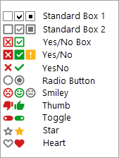
Sets the glyph using a pre-configured styles. Options include the following:
Examples of each of the Glyph Styles available |
Appearance
|
Glyph Options: Custom Glyphs |
|
Glyphs are the images used for the check boxes. A custom image can be set for each check state. When no custom glyph image is specified, the control displays a glyph image specified by the Images are resized based upon the configurations in the |
|
Glyph Options: Alignment |
|
Specifies the glyph alignment within the control. Alignment options include:
|
|
Glyph Options: Size |
|
Specifies the height and width of the check box in pixels. |
|
Glyph Options: Style |
|
Sets the glyph using a pre-configured styles. Options include the following:
Examples of each of the Glyph Styles available |
|
Text Alignment |
|
Can be configured in the Properties or Expressions panel. Specifies the alignment of the |
|
Text Trimming |
|
Type: StringTrimming Can be configured in the Properties or Expressions panel. Sets the trimming mode applied to text when all text cannot fit into the size of the control. Options include:
This property is overridden if |
Behavior
|
Anchor Vertically |
|
Sets the location of the control in relation to the parent container. When the parent container changes size, the control may move or resize to maintain its position. The options for vertically anchoring include:
|
|
Anchor Horizontally |
|
Sets the location of the control in relation to the parent container. When the parent container changes size, the control may move or resize to maintain its position. The options for horizontally anchoring include:
|
|
Word Wrap |
|
Type: Boolean Determines how text is rendered when it does not completely fit into the bounds of the control. When enabled, text will start a new line once it meets the right side of the control. Otherwise, the text is displayed on a single line. Enabled by default. |
Data
|
Check State |
|
Type: CheckState Can be configured in the Properties or Expressions panel. Specifies the state of the control. Options include:
The three states of the Check Box control |
|
Checked |
|
Type: Boolean Specifies the state of the check box. When checked, this property sets the |
|
Text |
|
Type: String Can be configured in the Properties or Expressions panel. Sets the text to appear in the The value of the
|
|
Text Format String |
|
The Text Format String Editor provides the ability to apply formatting to data. You can select one of the pre-built formats or create your own. The Text Format String Editor cannot format values that have been manually entered into a control. For more information, see the help regarding the Format String Editor and Format Specifiers. |
Printing
|
Right to Left |
|
Specifies the layout of the content within a The options include:
Modifying this setting will change the side that the check box appears on. |
Related Tutorials
Refer to the following resources for additional help on implementing this control: