Gauge Control 
Description
Allows you to embed graphical gauges into your report.
Properties Common to Most Controls
For more information about the properties listed below, see Properties Common to Most Controls.
- Actions: Align to Grid, Size to Grid, Center Horizontally, Center Vertically, Bring to Front, Send to Back, Fit Bounds to Container
- Styles: Even Style, Odd Style, Style
- Appearance: Background Color, Border Color, Border Dash Style, Border Width, Borders, Font Name, Font Size, Font Unit, Font Effects, Foreground Color, Padding
- Behavior: Can Publish, Keep Together, Visible
- Data: Tag
- Design: Name
- Layout: Location, Size
- Navigation: Bookmark, Parent Bookmark, Navigation URL
For more information regarding each of the property groups, see the Control Reference.
Actions
|
View Type |
|
Specifies the type of gauge displayed. The following options are available:
|
|
View Style |
|
Specifies how the gauge is oriented, given the selected |
|
View Theme |
|
Specifies the color theme of the gauge. |
|
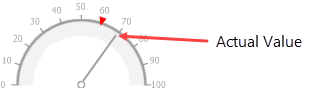
Actual Value |
|
Specifies the value displayed by a gauge.
|
|
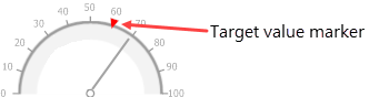
Target Value |
|
Specifies the position of the target value marker
|
|
Minimum |
|
Specifies the gauge's minimum value. |
|
Maximum |
|
Specifies the gauge's maximum value. |
Appearance
|
Image Type |
|
Specifies how the image is rendered. Options for this property include the following:
|
|
View Style |
|
Specifies how the gauge is oriented, given the selected |
|
View Theme |
|
Specifies the color theme of the gauge. |
|
View Type |
|
Specifies the type of gauge displayed. The following options are available:
|
Data
|
Actual Value |
|
Specifies the value displayed by a gauge.
|
|
Tickmark Count |
|
Specifies the number of tick marks displayed on a gauge scale. |
|
Maximum |
|
Specifies the gauge's maximum value. |
|
Minimum |
|
Specifies the gauge's minimum value. |
|
Target Value |
|
Specifies the position of the target value marker
|
Related Tutorials
Refer to the following resources for additional help on implementing this control: