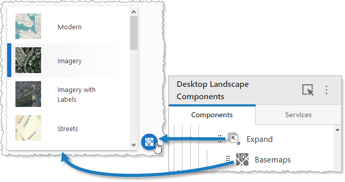
By default, an Expand component hides its subcomponents until it is clicked. Once clicked, it displays its subcomponents vertically. If the Expand component is clicked again, its subcomponents are hidden again. In the following example, we see an Expand component that contains a Basemaps Picker component.

We do not recommend nesting Expand components inside other Expand components.
The Expand settings include the following:
▪Main Settings
▪Visibility Layers
▪Layout
Main Settings
Field |
Description |
|---|---|
Title |
Type a title to display for the component. This title is used both in Web and Designer. |
Icon |
To select an icon to represent the component, click Select Icon, click the desired icon, and click OK. To remove the icon, click Clear Icon. |
Visibility Layers
Field |
Description |
|---|---|
Visible To |
Determines which users and groups can access this component. If no users or groups are specified, all users can access this component by default. The Hidden From setting overrides this setting. |
Hidden From |
Determines which users and groups are explicitly forbidden to access this component. This setting overrides the Visible To setting. |
Layout
Field |
Description |
|---|---|
Horizontal Alignment |
Sets the horizontal position of any fixed-width components within. Has no visible effect on any component within whose width automatically grows to the size of the parent. |
Vertical Alignment |
Sets the vertical position of any fixed-height components within. Has no visible effect on any component within whose height automatically grows to the size of the parent. |
Height |
Specifies the height of the component. If Fixed Size is not selected, the height is an approximate percentage of the height of the parent component. If Fixed Size is selected, the height is in pixels and will not change when other component sizes are changed. |
Slot |
Select the slot to position the component within the Map component. In addition to the various positions on the map such as Top Left and Bottom Center, you can position the component within the map context menu, which appears when the user right-clicks the map. You can also position the component within the Popup slot, which appears at the mouse cursor. This setting only appears when the component is within the Map component. |
Margin (px) |
The margin space around the component in pixels. |
Initially Hidden |
Specifies whether or not the component is initially hidden when the app loads. If selected, the component remains hidden unless activated, for example, by the Show command. |
Button Style |
The style of the button. Choose either Rounded or Square. |
Show Title |
Whether or not to display the title of the component. |
Show Icon |
Whether to display the icon of the component. |