With the Bulk Attribute Update command, you can select multiple features (even across different layers) and edit their common attributes at once.
This tool is ideal for large-scale data changes, and ensures efficiency and data integrity.
To configure the Bulk Attribute Update:
1.Add the Bulk Attribute Update component to your layout .
2.Navigate to the Results component where you want the bulk edit action to be available (for example, the Results List).
3.Go to the Result Actions section and click Add Menu Item.
4.Select Bulk Attribute Update in the Commands tab.
5.Click Select.
6.Save your app.
The component is now configured for you to perform a Bulk Attribute Update.
To perform a Bulk Attribute Update:
1.Select the features you want to edit. In our example, we configure a Query to select buildings that have a height greater than 50.
2.In the Results list, click the three-dot menu to open the Result Actions menu.
If the selected features have editable attributes in common, the Bulk Attribute Update command is available to click. If there are no common editable attributes among the selected features, this option is disabled.
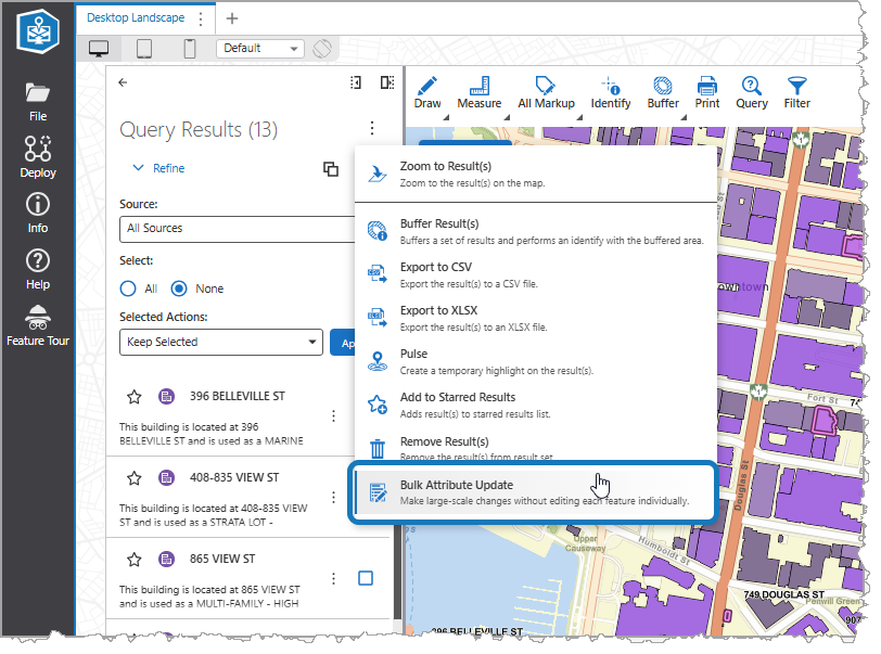
3.Click Bulk Attribute Update to open the Bulk Updating panel. This panel displays a list of all the attribute fields that the selected features have in common.
4.For each attribute you want to change, enter the new value in its field. For your reference, the current values for each attribute are listed.
Empty fields are ignored.
5.Click Preview.
A Confirmation dialog appears, summarizing the proposed changes.
These changes cannot be undone, so carefully review them and ensure they are correct before proceeding.
6.Click Confirm Update to apply the changes to all selected features.
The system is designed with safeguards. If any feature fails to update, the entire operation is canceled, and no features are changed, preventing partial updates.
Main Settings
Field |
Description |
|---|---|
Title |
Type a title to display for the component. This title is used both in Web and Designer. |
Icon |
To select an icon to represent the component, click Select Icon, click the desired icon, and click OK. To remove the icon, click Clear Icon. |
Visibility Filters
Field |
Description |
|---|---|
Visible To |
Determines which users and groups can access this component. If no users or groups are specified, all users can access this component by default. The Hidden From setting overrides this setting. |
Hidden From |
Determines which users and groups are explicitly forbidden to access this component. This setting overrides the Visible To setting. |
Layout
Field |
Description |
|---|---|
Margin (px) |
The margin space around the component, measured in pixels. |
Padding (px) |
The space inside the component, measured in pixels. |
Visibility |
Determines how the component appears in the app. The options are as follows: •Default: Defers to each component's default "autoActivate" property, which determines the default behavior on startup. •Visible: Displays the component on app startup. •Hidden: Hides the component on app startup and requires an action or trigger to make it appear. |