A Dialog component displays content in a modal dialog window that appears on top of the application. While a dialog is active, users cannot interact with the underlying app.
Use a Dialog to present information, collect input, or require user confirmation before continuing. You can configure the Dialog to remain visible until the user performs a specific action.
Common scenarios include:
•Displaying a Terms of Use
•Creating a mandatory Disclaimer
•Inserting a splash screen
In these cases, users must acknowledge the content (for example, by clicking an Agree button) before they can interact with the application.
See this Community article for an example of creating a splash page.
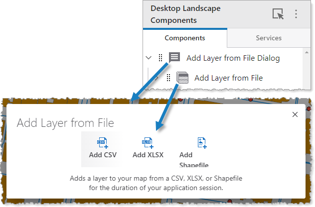
The figure below shows a Dialog component that contains a Text component.
Main Settings
Field |
Description |
|---|---|
Title |
Type a title to display for the component. This title is used both in Web and Designer. |
Icon |
To select an icon to represent the component, click Select Icon, click the desired icon, and click OK. To remove the icon, click Clear Icon. |
Visibility Layers
Field |
Description |
|---|---|
Visible To |
Determines which users and groups can access this component. If no users or groups are specified, all users can access this component by default. The Hidden From setting overrides this setting. |
Hidden From |
Determines which users and groups are explicitly forbidden to access this component. This setting overrides the Visible To setting. |
Layout
Field |
Description |
|---|---|
Padding (px) |
The amount of space inside the component, measured in pixels. |
Nested Spacing (px) |
The amount of space applied between the subcomponents, measured in pixels. |
Visibility |
Specifies whether or not the component is initially hidden when the app loads. If selected, the component remains hidden unless activated, for example, by the Show command. |
When enabled, users can dismiss the dialog using the close button (x), the Esc key, or clicking outside the dialog. When disabled, users can not dismiss the dialog unless it is explicitly hidden via the ui.deactivate command in a component such as a button or child workflow. |