When you open the Analytics application, the Reports section is shown by default. The navigation panel on the left displays a list of all the resources being monitored.
The Reports interface includes the following main elements:
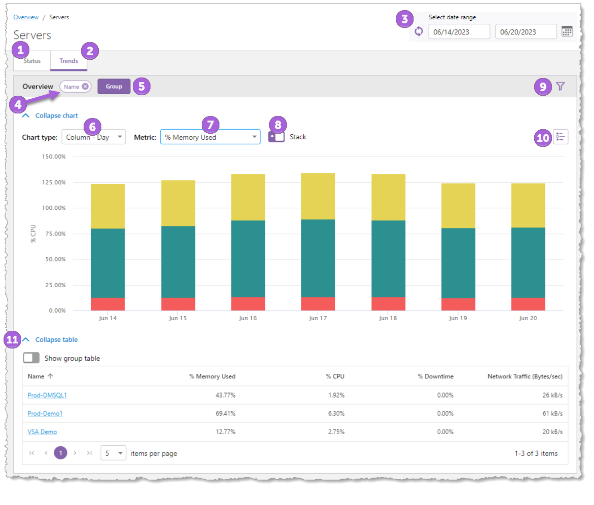
1.Status tab: Shows details of the current state of your monitored resources. You can click links in the navigation panel to view details about each resource’s status.
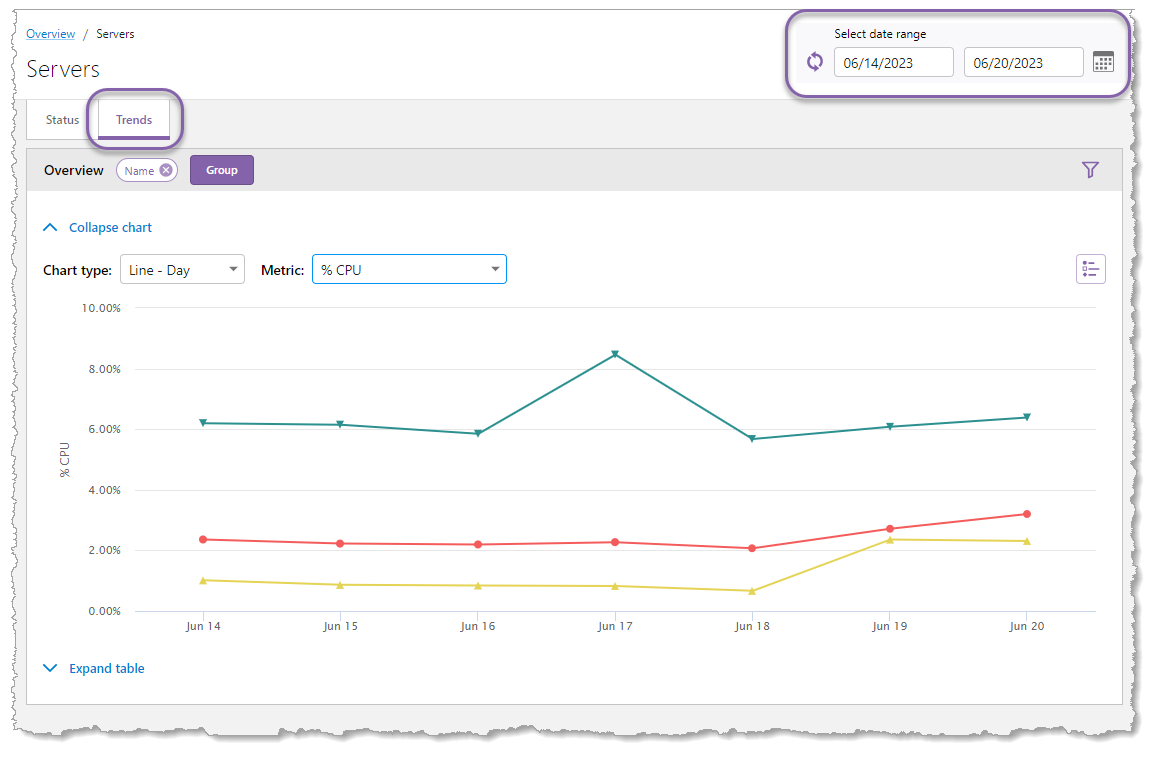
2.Trends tab: Shows how data changes over time. You can view trends for the entire system, a specific resource group, or individual resource based on the selected date range.
3.Select Date Range: Shows the operating date range when you view a report in the Trends tab. The date range defaults to the last seven days (including today's date). You can modify the date range by clicking either the beginning date, end date, or the calendar icon  , which opens the calendar shown below.
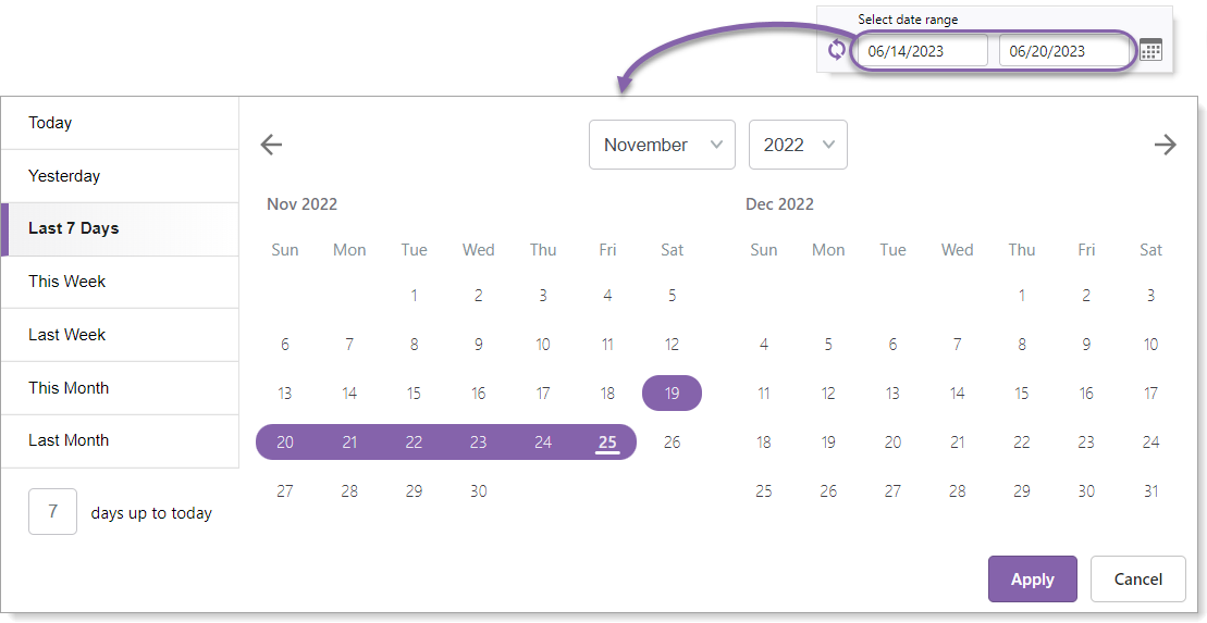
Modify the date range in any of the following ways:
•Select a button on the left side such as Today, This Week, or Last Month.
•Enter a number in the days up to today field.
•Click and drag directly on the calendar.
•Click the start date and then click the end date.
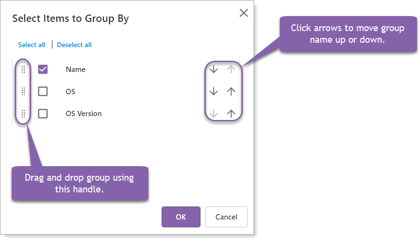
4.Grouped by: Shows the data's column name(s) used for grouping the data. Click the "x" on the group to remove the grouping.
5.Group: Add, remove, and reorder groupings.
6.Chart type: Depending on the data, the available chart type will change. A time series chart type, such as Line - hour or Column - Day, will show data with a time component for the "X" axis. Choose a non-time series such as Column or Pie to see a total for that resource or service.
7.Metric: The performance aspect of the resource that is being displayed in the chart, such as Used Memory or Free Disk Space.
8.Stack: (Only visible when there is one or more groupings applied) When enabled, this control combines the grouped items and stacks them vertically to facilitate the comparison of totals. When the grouped items are not stacked, it allows for the comparison of sub-totals.
9.Filter: Allows you to filter the data that is presented in both the chart and the table. See Filters.
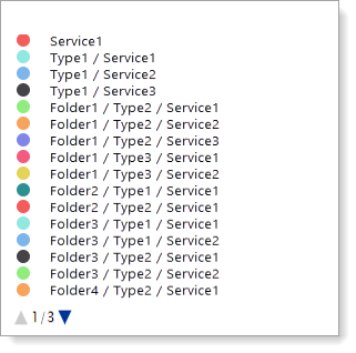
10.Legend: Identifies which colors correspond to specific groups of data. For example, if the Folder, Type, and Service groups are used, the legend shows a color-coded list in hierarchical order as seen below. Hover your mouse over any item in the legend to highlight that item in the chart. You can also click any item in the legend to toggle its visibility in the chart.
11.Expand/Collapse table: When expanding a table, the Show group table option may be available. This option shows a table with the group columns placed in the same order as defined when using the Group button as well as metric data. If the Show group table is toggled off, the table shows the collected data.