The VertiGIS Studio Desktop provides a Designer component that allows an administrator to define the user interfaces as well the logical structure of object-classes and attributes at the base of layers and standalone tables on the map.
The Designer can be called from the context menu for either a feature layer or for a standalone table.
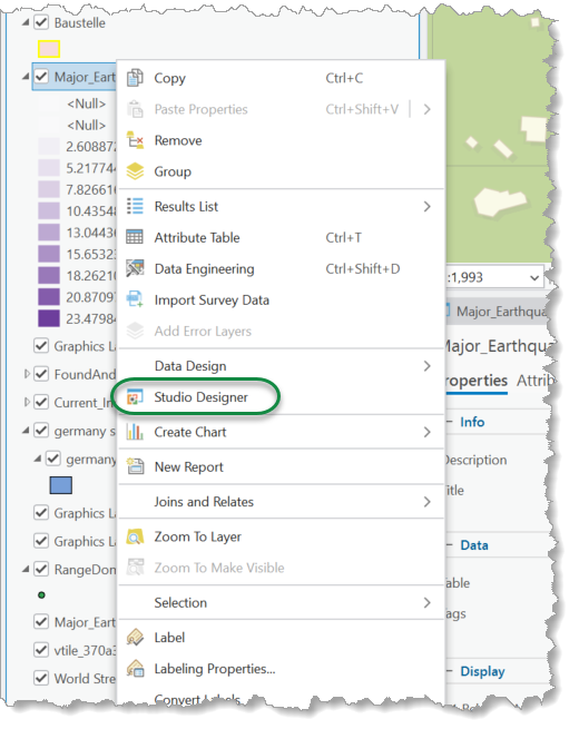
Studio Designer
Open the Studio Designer to enter properties for the selected object class.
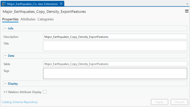
The following tabs are available for settings:
•Properties
•Attributes
•Categories
Properties tab
At the Properties tab, all generic settings for the current feature class or standalone table can be defined.
•Info Category - Set the title and description for the current class.
oDescription - In addition to the title, a description can be stored for a class. Further components in the Studio Desktop, such as the Bulk Update or the Attribute Delta Analyzer, can use the description of a class as an information basis for their UI components (e.g., for tooltips).
oTitle - This is the title for the current class. It is taken by default from the alias from the underlying table definition. The title will be used as information, when records from the current class are rendered at the Attribute Form or within the Result List.
•Data Category - Shows the underlying table and allows tags to be added.
oTable - This is a non editable field.
oTags - Define tags for the current class.
•Display Category - The visibility of related classes can be defined. If 1:1 relationships are available to the current class, a checkbox is provided to allow an admin to toggle visibility of the attributes of the related classes directly at the Attribute Form.
Attributes tab
The Attributes tab shows the configurable attributes for the current class.
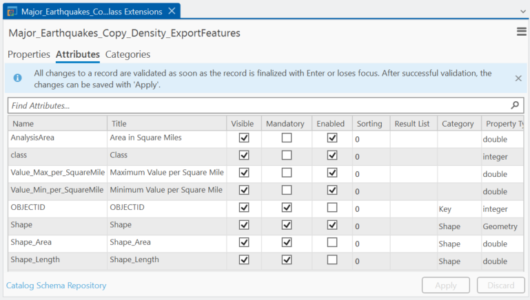
The following settings are available:
•Title - This is the title or display name for an attribute. This text is used as a label for the attribute when it's going to be displayed within UI components from the Studio Toolkit, like the Attribute Form or Result List. Double-click the corresponding cell to open the editor for the current attribute.
The title for an attribute is derived from the alias name for the corresponding field by default.
•Visible - Toggle visibility for an attribute. An attribute that has been set to invisible (by unchecking the Visibility Box) will not appear at the Attribute Form, Result List (when displayed in detail mode), or other components like Bulk Update or Attribute Delta Analyzer.
The visibility for an attribute is derived from the corresponding layer by default. Note, that this settings is defined at the level of data (VertiGIS Desktop) and not at the map level (Esri). Any visibility settings in Studio Designer only affects visibility in Desktop tools. And, any visibility settings at the map level affects the visibility in Esri tools.
•Mandatory - If an attribute has been set as mandatory, an implicit validation rule will be appended to the current class. If validation is done for a corresponding record, this attribute will be invalid if no proper value has been set. All fields, that are defined as being not nullable at the underlying geodatabase, will be mandatory by default.
•Enabled - Enable an attribute to edit it in the Attribute Form. If a field is declared "read only" it cannot be enabled for user input. A non read-only field that is not enabled cannot receive user input from the user interface. But, its value and Enabled status can be set programmatically (e.g., when dynamic scripting extensions require such a behavior).
Proprietary fields like Object- or Global identifier are disabled by default. They cannot be enabled using the designer.
•Sort Order - The attributes of a class can be assigned a sort criterion. The sort criterion is used to bring the attributes of the class into a specific order. By default, the sort criterion is set to 0 (zero), which means no sorting is performed.
•Result List - Any field in the class can get an Result List Order. This is a numerical value, that indicates that the corresponding attribute will be part of an informational text or snippet, that is used to describe records of the current class.
Those snippets usually appear in the user interface at the Assignments Explorer, Result List, or any other component that is displaying record nodes. The numerical value controls the positioning of the attribute value within the snippet text.
•Categories - The Category column allows you to assign an attribute or field to a specific category. The Category Editor field at the designer can be used to select an existing category from the list of categories or to enter a name for a new category.

Categories including their UI settings are maintained in the Categories tab.
•Property Type - The property type column lets you define a more specific type for the attribute. By default, the property type for an attribute is derived from the data type from the underlying field. Specific data types can be converted into a more complex data type. For instance:
Data Type (Database) |
Property Type (UI) |
Remarks |
|---|---|---|
string |
uuid |
This mapping establishes a UUID from text in a database row and vice versa. The Attribute Form will render the GUID-Text and contains a GUID Edit Box for data management. |
string |
anyUri |
This mapping allows to setup an URL or Hyperlink from a text value from the database. This is a helpful type mapping when the current attribute needs to handle a file or directory path or has to maintain hyperlinks to online resources. |
integer |
bool |
This mapping allows to maintain null, 0 or 1 values from the database and provide proper checkboxes at the UI at the Attribute Form. |
integer |
color |
This is a type mapping, that converts an ARGB integer value from database into its corresponding color instance. The UI will bring up a color editor component in order to provide proper color values, that can be converted into corresponding ARGB values. |
The property type cannot be set for attributes that refer to proprietary fields (like object, global identifier, or fields from editor tracking)
•Base Unit - The base unit is defined by a text, that indicates the SI Base Unit for an attribute value. For instance, if an attribute refers to an area, the base unit text could be [m]². In the Attribute Form, the base unit is rendered after the attribute value.
•Editor - This column is used to configure a specific catalog for an attribute. Domains, Coded Values, or Contingent Values can be used to define a proper range for valid data when working with a Geodatabase. The Studio class extensions facilitate the setup of a catalog from a single standalone table.
See Catalog Table Schemas for more information of how to setup a proper catalog configuration from standalone tables.
Double-click in a cell to expose the ellipsis button.
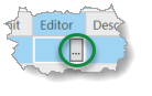
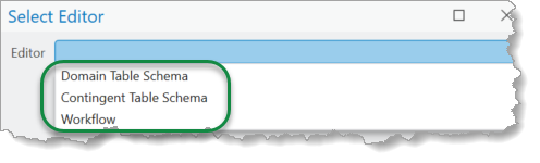
Click the ellipsis button to open the Select Editor dialog. From the dialog, you can choose either Domain Table Schema, Contingent Table Schema, or Workflow.
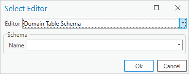
Every Domain Table, that has been registered at the Catalog Schema Repository is identified using a specific name.
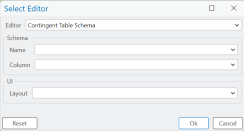
If a contingent table schema is selected from the Catalog Schema Repository, the corresponding target Name, Column, and UI Layout must be identified as well.
•Description - Double-click in a cell to expose the ellipsis button. Click the ellipsis button to enter the desired help text for the current attribute. This help text is used as tooltip text for the Description box on the Attribute Form.
•Foreground and Background Colors - This includes the Label Foreground, Editor Foreground, and Editor Background columns. The class editor also allows to set foreground and background colors for label and editor boxes on the Attribute Form.
ArcGIS Pro supports a light and a dark theme. The color settings in Studio Designer currently support single color settings only. This requires a color scheme that works with light and dark themes.
•Editor Icon - The Icon can be used to display an icon at the attribute expander in the Attribute Form.
•Editor UI - Depending on the Property Type, a specific editor component for use with the Attribute Form can be declared. For instance, if the data type for a property is an Integer and the property type for an attribute is a Boolean, a checkbox can be selected as a proper editor component for that attribute in the Attribute Form.
The following editor UI types are supported:
Property Type |
Editor UI |
|---|---|
Short, Integer, Long, Float, Double |
TextBox, EditBox, UpDown |
String |
TextBox, TextArea |
Date, DateTime, Time, Guid |
|
If no specific UI Editor is defined, the most appropriate UI Editor from the Studio Property Grid Subsystem is used. Especially when Date Types are used, these editor are sufficient out of the box (such as Date Editor, Time Boxes, or GUID Editor). Only define a UI Editor to enforce a specific UI at runtime.
Categories Tab
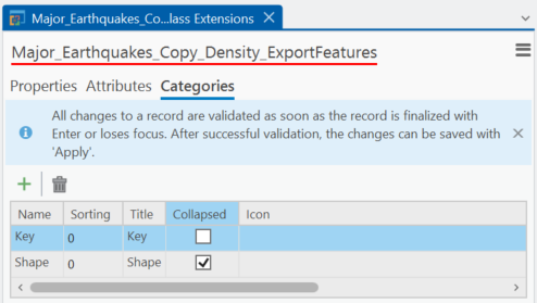
An attribute category is defined by its logical name. The logical name appears as the Name for the category on the Attributes tab. The following settings can be defined:
•Sort Order - Every attribute category can refer to a sort order: When attribute data is displayed within catgeories at the Attribute Form, the categories will be sorted using the given sort order.
•Title - The Title is used as a display name for the category.
•Collapsed - If the Collapsed setting is checked, the initial state for the expander for the category will be collapsed. Check this setting, if the attributes for a specific category shall not be visible by default.
•Icon - The Icon can be used to display an icon at the category expander in the Attribute Form.
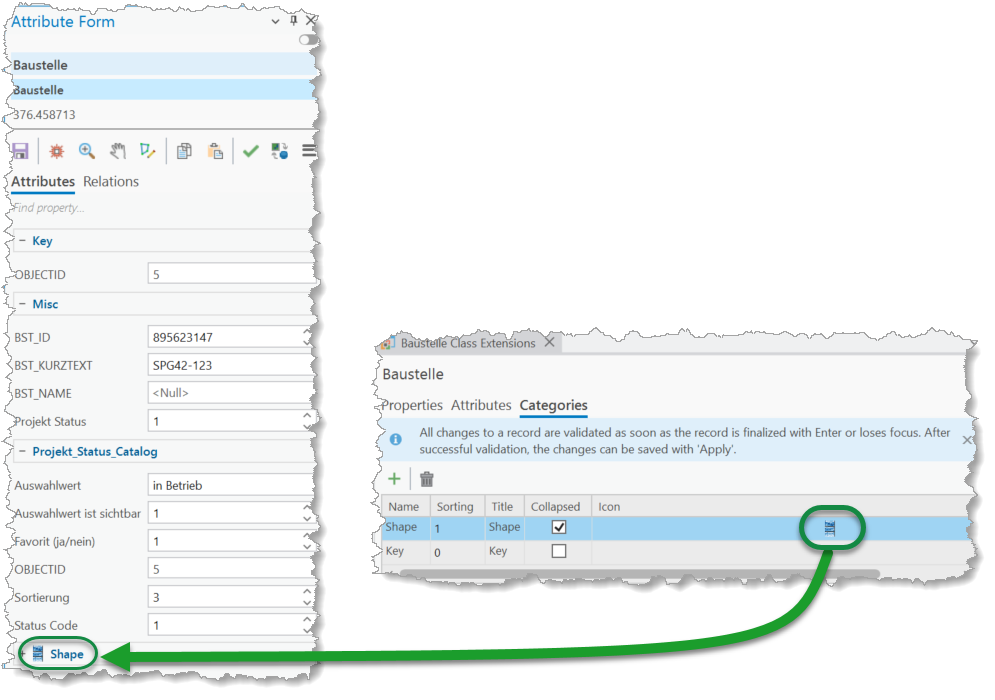
The icon is referenced using a Pack URL. For example, pack://application:,,,/ArcGIS.Desktop.Resources;component/images/arcgis16.png