FeatureDetails Module
The FeatureDetails Module displays information related to a spatial feature. As of version 2.4, the Desktop and Tablet interfaces can show feature details in two modes: Compact View and Expanded View. In the Compact View, feature details are displayed as a list in the sidebar. In the Expanded View, feature details are displayed as a table in the bottom panel. The user can switch between the different modes via the Panel Actions Menu ![]() at the top-right of the panel. By default, the feature details are displayed in the Compact View. The Handheld interface does not support the Expanded View.
at the top-right of the panel. By default, the feature details are displayed in the Compact View. The Handheld interface does not support the Expanded View.
Different types of information are obtained from sources that you configure called "feature details providers". The feature details providers are the sources that provide information about the feature. For example, if you want the feature's attributes to display when the user views the feature details, ensure the configuration for the Attributes Provider is present. All feature details providers are configured by default.
The HTML5 Viewer has the following feature details providers:
-
Description: Displays the feature's description or long description. -
Hyperlinks: Lists the feature hyperlinks for the current feature. -
Attributes: Lists the attributes of the feature, for example,ObjectId,Shape,Name, and so on. -
SingleFeatureCharts: Displays charts about a single feature, as configured in Manager.For more information on how to configure charts, see Charting.
-
Attachments: Lists the feature's attachments. To delete an attachment, click the Delete attachment icon and confirm the deletion when prompted. -
RelatedFeatures: Lists the relationships that are configured for the current layer. -
SearchTablesRelatedFeatures: Lists the relationships that are configured for the current search table. -
DataLinks: Lists the data linked to by data links that are configured for the current layer.
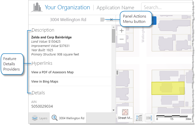
The Compact View displays the different types of information in a stack, as illustrated below.

Example of feature detail providers in the Compact View
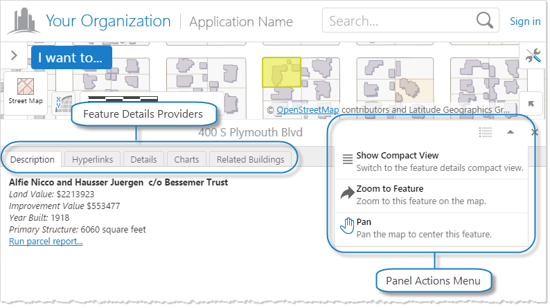
The Expanded View displays the different types of information in separate tabs, as illustrated below.

Example of feature detail providers in the Expanded View
Configuration Properties
Module
-
defaultViewMode: The default mode with which to view feature details: eithercompactorexpanded. The default iscompact. The Handheld interface does not supportexpanded. -
viewModes: The different modes available to view feature details:-
compact: The Compact View typically displays the feature details as a list in the sidebar:-
viewId: The ID of the view to use as the Compact View. The default isFeatureDetailsCompactView. -
defaultProviderTargetRegion: The default region to use for the feature details provider in the Compact View. The default isFeatureDetailsCompactViewRegion.
-
-
expanded: The Expanded View typically displays the feature details as a table in the bottom panel:-
viewId: The ID of the view to use as the Expanded View. The default isFeatureDetailsExpandedView. -
defaultProviderTargetRegion: The default region to use for the feature details provider in the Expanded View. The default isFeatureDetailsBottomRegion.
-
-
-
behaviors: An array of named behaviors that run when an associated event occurs. By default, the behaviors are:-
FeatureDetailsOpenedBehavior: A behavior that runs an array of commands when feature details are displayed. By default, this includes four commands:ZoomToFeature,SetActiveHighlightLayerDefault,ClearHighlights, andHighlightFeature. -
FeatureDetailsClosedBehavior: A behavior that runs an array of commands when feature details are closed. By default, this includes two commands:SetActiveHighlightLayerDefaultandClearHighlights.
You can remove or rearrange the commands of any behavior. You can also remove behaviors altogether.
You can add commands to a behavior if the command does not require a parameter, or if the type of the command's parameter matches the parameter of an existing command or the event associated with the behavior. Refer to "Viewer Commands and Events" in Developer Help to determine if the parameters are compatible. Note that private commands and events are not documented.
Adding a new behavior is only recommended for experienced developers.
See Viewer Commands and Events for more information.
-
-
providers: An array of feature details providers. Each provider is a view model that provides information about the feature to the corresponding view, for example, theRelatedFeaturesViewModelprovides a list of related features to theRelatedFeaturesView.The configuration properties for the feature details providers are as follows:
-
Description: To display any feature description (long or short), set this feature detail provider'senabledproperty totrue. The default isfalse.-
longDescription: To display the feature's long description, set totrue. The default isfalse.
-
-
Hyperlinks: Noconfigurationproperties -
Attributes: Noconfigurationproperties -
SingleFeatureCharts:-
infrastructureLibraryId: The ID of the infrastructure library. By default, this isCharting. -
containerRegionName: The name of the container region in which to host single feature charts. The default isSingleFeatureChartsRegion. -
chartConfiguration: A chart configuration object with the following properties:-
animationsEnabled: To enable chart animations, set totrue. The default istrue. -
gradientsEnabled: To enable chart gradients, set totrue. The default isfalse. -
interactiveLegendEnabled: To enable interactivity with legend items, set totrue. The default isfalse. When enabled, clicking legend items of pie charts will enable or disable slices of the pie, and clicking legend items of linear charts will toggle the display of corresponding series. -
pieStartAngle: The angle at which to start pie charts in degrees. The default is180. -
renderAs: The format in which to render charts. The default issvg. Possible values include:-
svgrenders the chart as an inline SVG document, if available. -
vmlrenders the chart as VML, if available. -
canvasrenders the chart as a Canvas element, if available.
-
-
-
-
Attachments: Noconfigurationproperties -
RelatedFeatures: Noconfigurationproperties -
SearchTablesRelatedFeatures: Noconfigurationproperties -
DataLinks:-
dataLinkDetailsView: The region where the view for linked data is hosted. This view is created when the user clicks a linked data item. In the Desktop and Tablet interfaces, the default isDataFrameResultsContainerRegion; in the Handheld interface, the default isResultsViewContainerRegion. For a list of regions, see Regions.
-
-
Each feature detail provider supports an optional enabled property, which is on the same level as the config property. To enable the feature detail provider, set enabled to true; otherwise, set it to false. The default is true by virtue of the feature detail provider's presence, so in most cases, the enabled property is omitted.
Each feature detail provider supports an optional targetRegion property, which is on the same level as the config property. This property overrides the default region where feature details are displayed, as specified by the defaultProviderTargetRegion property. By default, if more than one provider targets the same region, tabs appear above the region to allow switching between providers.
To use the targetRegion property, you must supply an object with the view mode names as the keys, and the corresponding regions as the values:
"providers": [
    {
        ...
        "viewId": "FeatureDescriptionProviderView",
        "targetRegion": {
            "compact": "MyCompactRegion",
            "expanded": "MyExpandedRegion"
        },
        ...
    },
    ...
]
In the above example, the feature description provider uses the MyCompactRegion for the Compact View and the MyExpandedRegion for the Expanded View.
Each feature detail provider supports the markup property, which is on the same level as the config property. This property specifies HTML file to use as the markup for each view mode.
To use the markup property, you may either supply a string containing the location of the HTML file for all view modes; or an object with the view mode names as the keys, and the corresponding HTML file locations as the values:
"providers": [
    {
        ...
        "viewId": "FeatureDescriptionProviderView",
        "markup": {
            "compact": "MyPath/MyCompactView.html",
            "expanded": "MyPath/MyExpandedView.html"
        },
        ...
    },
    ...
]
In the above example, the feature description provider uses MyPath/MyCompactView.html for the Compact View and the MyPath/MyExpandedView.html for the Expanded View.
Views
-
FeatureDetailsExpandedView:-
onDeactivated: An array of commands to run when theFeatureDetailsExpandedViewview is deactivated. By default, one command is run:ClearDefaultHighlights.
-
-
FeatureDetailsCompactView:-
onDeactivated: An array of commands to run when theFeatureDetailsCompactViewview is deactivated. By default, one command is run:ClearDefaultHighlights.
-
View Models
-
FeatureDetailsExpandedViewModel:-
defaultTabViewForLayer: To set the default tab view for all layers, use the view name as the property and set the value todefault. To set the default tab view for specific layers, add the view name as the property and set the value to an array of objects for each layer; each object contains the following properties:-
mapServiceId: The ID of the map service that contains the layer for which you want to set the default tab view. -
layerId: The ID of the layer for which you want to set the default tab view.
In the following example, the default tab view is
FeatureChartsProviderViewfor all layers except layer1of theStreetsmap service and layer2of theZoningmap service:"defaultTabViewForLayer": { "FeatureChartsProviderView": "default", "FeatureChartsProviderView": [ { "mapServiceId": "Streets", "layerId": "1" }, { "mapServiceId": "Zoning", "layerId": "2" } ] } -
-
regions: An array of regions. A region has the following properties:-
regionName: The name of the region. -
regionType: (optional) The type of region. By default, when multiple feature detail providers target the same region, tabs appear above the region. If you want the views to stack one after another instead, set this property togeocortex.framework.ui.DivStackRegionAdapter. By default, this property is omitted.If you add this property, the CSS class specified by
regionCSSmust be modified accordingly. -
regionCss: The Cascading Style Sheet (CSS) class for the region.
-
-
-
FeatureDetailsCompactViewModel:-
regions: An array of regions. A region has the following properties:-
regionName: The name of the region. -
regionType: (optional) The type of region. By default, when multiple feature detail providers target the same region, tabs appear above the region. If you want the views to stack one after another instead, set this property togeocortex.framework.ui.DivStackRegionAdapter. By default, this property is omitted.If you add this property, the CSS class specified by
regionCSSmust be modified accordingly. -
regionCss: The Cascading Style Sheet (CSS) class for the region.
-
-
Example - Add a Command with a Parameter to a Behavior
The following example demonstrates adding a new command with a parameter to the behavior, FeatureDetailsOpenedBehavior.
To add a command with a parameter to a behavior:
-
Run an XML editor or text editor as an administrator.
-
Open one of the viewer configuration files,
Desktop.json.js,Tablet.json.js, orHandheld.json.js, in the editor.By default, the configuration files are here:
C:\Program Files (x86)\Latitude Geographics\Geocortex Essentials\[instance]\REST Elements\Sites\[site]\Viewers\[viewer]\VirtualDirectory\Resources\Config\Default\
-
In the
FeatureDetailsmodule section, find thebehaviorsproperty. Locate the behavior you want to edit, for example,FeatureDetailsOpenedBehavior.{ "moduleName": "FeatureDetails", ... "configuration": { ... "behaviors": [ { "name": "FeatureDetailsOpenedBehavior", "event": "FeatureDetailsCurrentFeatureChanged", "commands": [ "ZoomToFeature", "SetActiveHighlightLayerDefault", "ClearHighlights", "HighlightFeature" ] }, ... ] }, ... }The behavior executes a few commands, some that include a parameter, for example,
ZoomToFeature. -
Refer to Viewer Commands and Events to determine the type of parameter that is associated with these commands.
ZoomToFeaturehas a parameter of type,geocortex.essentialsHtmlViewer.mapping.infrastructure.Feature. -
Find a command that you want to add to the behavior that has the same parameter type, for example,
ShowMapTip. -
Add the desired command to the list of commands, separated by a comma. For example:
"commands": [ "ZoomToFeature", "SetActiveHighlightLayerDefault", "ClearHighlights", "HighlightFeature", "ShowMapTip"] -
Save the file.