Footer Module
The Footer module implements the footer in HTML5 viewers. The footer can appear in the Desktop and Tablet interfaces only—the Handheld interface cannot have a footer. By default, the Footer module's height property is set to 0 (zero pixels), which hides the footer. To show the footer, set the height to a positive value.
A viewer's footer can contain different types of content:
-
Menus: A footer menu is an array of items, each of which can optionally run a command. An item can be:
-
Simple Text: For example, a copyright statement that is not clickable.
-
Text Hyperlink: For example, a link to a help system or website.
-
Simple Image: For example, a logo that is not clickable.
-
Hyperlinked Image: For example, an email hyperlink or social media hyperlink.
-
- Features implemented by other modules: For example, the Scale Bar map widget or Map Coordinates map widget.
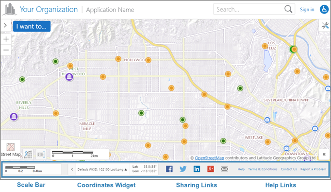
Example of an HTML5 viewer's footer with a variety of items
To configure text items in a footer menu, configure the item's text property, but not its iconUri property. To configure image items, configure the item's iconUri property, but not its text property. You may also want to use different markup—views in the Footer module have two options for the markup that they apply to menu items:
-
MenuView.html: Provides formatting for simple images, hyperlinked images, and simple text. -
MenuHyperlinkView.html: Provides formatting for text hyperlinks. If you useMenuView.htmlinstead ofMenuHyperlinkView.htmlfor text hyperlinks, the hyperlinks will work, but they will not look like hyperlinks.
The footer has its own regions—FooterRegion, LeftFooterRegion, and RightFooterRegion. FooterRegion is the entire footer. LeftFooterRegion and RightFooterRegion lie on top of FooterRegion. The contents of the LeftFooterRegion are left justified. The contents of the RightFooterRegion are right justified. See Regions for a diagram of the HTML5 Viewer's regions.
By default, the Footer module has two views—FooterView and FooterMenuView. FooterMenuView contains a menu of hyperlinks in the RightFooterRegion by default.
Configuration Properties
Module
-
menus: An array of menus to display in the footer.-
id: The menu's ID. -
description: A short description of the menu.If your viewer is going to be available in more than one language, enter the text key that the description is assigned to. See Configure User Interface Text for more information on using text keys.
-
moduleId: The ID of the module that the menu belongs to. ThemoduleIdisFooter. -
items: An array of menu items. Menu items have the following properties:-
iconUri: The image to display for the menu item. In order for the icon to show, the view'smarkupproperty must be set toMapping/infrastructure/menus/MenuView.html. -
text: The text to appear for the menu item. You can use a text key or the literal text. In order for the text to show, the view'smarkupproperty must be set toMapping/infrastructure/menus/MenuHyperlinkView.html. -
description: A brief description of the menu item to appear below thetext. You can use a text key or the literal text. -
command: The command to execute when the menu item is selected. A footer menu can run any HTML5 Viewer command. For a list of commands, refer to Viewer Commands and Events.If you set the
commandproperty, do not set thebatchproperty. -
commandParameter: The parameter value to pass to the command when it runs, if it has a parameter. Parameters may either be simple strings or complex objects containing any number of parameters. For information on the parameters for a particular command, refer to the Viewer Commands and Events.If you set the
commandParameterproperty, do not set thebatchproperty. -
hideOnDisable: If this property is set totrueand the menu item's command cannot run, the menu item does not show in the menu.If
hideOnDisableisfalseand the menu item's command cannot run, the menu item shows in the menu, but it is grayed out. -
batch: An array of objects, each with three properties: an executable command, an optional command parameter, and an optional Boolean to abort the execution of further commands if a command fails to execute. This allows multiple commands to be executed in a specified order, although some commands may trigger asynchronous actions.The following example attempts to activate the tabbed toolbar and, if successful, proceeds to greet the user with an alert:
"batch": [
    {
        "command": "ActivateView",
        "commandParameter": "TabbedToolbarView",
        "abortBatchOnFailure": true
    },
    {
        "command": "Alert",
        "commandParameter": "Hello!"
    }
]
If omitted,
abortBatchOnFailureisfalseby default.If you set the
batchproperty, do not set thecommandorcommandParameterproperties.
-
-
Views
-
FooterView: Noconfigurationproperties -
FooterMenuView:-
menuId: The ID of the menu to display inFooterMenuView. The menu is configured in the Footer module'smenusproperty.
-
View Models
-
FooterViewModel:-
backgroundColor: A valid HTML color to use for the footer's background. For example, white or #FFFFFF.Footer text is black and hyperlinks are dark blue, so use a light color for the background.
-
height: The footer's height, in pixels. When the height is 0 (zero), the viewer does not have a footer. By default, the height is 0.
-
-
FooterMenuViewModel: Noconfigurationproperties
Example 1 - Show Text Hyperlinks in the Footer
This example shows how to configure a menu of text hyperlinks.
First, define the menu. The following snippet shows the configuration for a footer menu that contains two text items.
  ...
  {
    "id": "FooterMenu",
    "description": "@language-menu-footer-menu-desc",
    "moduleId": "Footer",
    "items": [
      {
        "text": "@language-menu-powered-by-geocortex",
        "description": "@language-menu-powered-by-geocortex-desc",
        "command": "OpenWebPage",
        "commandParameter": "http://www.geocortex.com//"
      },
      {
        "text": "Report a Problem",
        "command": "RunWorkflowById",
        "commandParameter": "ShowProblemReportForm"
      }
    ]
  },
  ...
Next, define the view. To ensure that the items appear as hyperlinks rather than simple text, set the view's markup property to Mapping/infrastructure/menus/MenuHyperlinkView.html. Set the region property to the region where you want the menu to appear, in this case, RightFooterRegion. Set the menuId property to the menu's ID, FooterMenu.
  ...
  {
    "id": "FooterMenuView",
    "viewModelId": "FooterMenuViewModel",
    "libraryId": "Mapping.Infrastructure",
    "type": "geocortex.essentialsHtmlViewer.mapping.infrastructure.menus.MenuView",
    "markup": "Mapping/infrastructure/menus/MenuHyperlinkView.html",
    "region": "RightFooterRegion",
    "visible": true,
    "configuration": {
      "menuId": "FooterMenu"
    }
  }
  ...
Finally, set the FooterViewModel's height property and, optionally, the backgroundColor property.
  ...
  {
    "id": "FooterViewModel",
    "type": "geocortex.essentialsHtmlViewer.mapping.modules.footer.FooterViewModel",
    "configuration": {
      "backgroundColor": "white",
      "height": 40
    }
  }
  ...
Example 2 - Show a Menu of Image Items in the Footer
This example shows how to configure a menu of image items.
First, define the menu. The following snippet shows the configuration for a footer menu with three items. The first item does not run a command, so it appears as a simple (unclickable) image in the footer. The other two items run commands, so they are hyperlinks.
  ...
  {
    "id": "SocialFooterMenu",
    "description": "@language-menu-social-links-menu-desc",
    "moduleId": "Footer",
    "items": [
      {
        "iconUri": "Resources/Images/Icons/logo-24.png",
      },
      {
        "iconUri": "Resources/Images/Icons/twitter-24.png",
        "command": "ShareOn",
        "commandParameter": "twitter"
      },
      {
        "iconUri": "Resources/Images/Icons/Toolbar/contact-24.png",
        "command": "ShareOn",
        "commandParameter": "email"
      }
    ]
  }
  ...
Next, define the view. Set the view's markup property to Mapping/infrastructure/menus/MenuView.html. Set the region property to the region where you want the menu to appear, in this case, LeftFooterRegion. Set the menuId property to the menu's ID, SocialFooterMenu.
  ...
  {
    "id": "SocialFooterMenuView",
    "viewModelId": "SocialFooterMenuViewModel",
    "libraryId": "Mapping.Infrastructure",
    "type": "geocortex.essentialsHtmlViewer.mapping.infrastructure.menus.MenuView",
    "markup": "Mapping/infrastructure/menus/MenuView.html",
    "region": "LeftFooterRegion",
    "visible": true,
    "configuration": {
      "menuId": "SocialFooterMenu"
    }
  }
  ...
Next, add a new MenuViewModel whose id corresponds to the viewModelId which, in the above example, is named SocialFooterMenuViewModel.
  ...
  {
    "id": "SocialFooterMenuViewModel",
    "type": "geocortex.essentialsHtmlViewer.mapping.infrastructure.menus.MenuViewModel",
    "configuration": {}
  }
  ...
Finally, set the FooterViewModel's height property and, optionally, the backgoundColor property.
  ...
  {
    "id": "FooterViewModel",
    "type": "geocortex.essentialsHtmlViewer.mapping.modules.footer.FooterViewModel",
    "configuration": {
      "backgroundColor": "#EEEEEE",
      "height": 50
    }
  }
  ...
Example 3 - Show the Scale Bar and Map Coordinates in the Footer
You can show any module in a viewer's footer by setting the view's region property to one of the footer regions.
For example, to show the scale bar in the footer, you could set the region property in the Scalebar module's ScalebarView to LeftFooterRegion. If you also set CoordinatesView's region to LeftFooterRegion in the Coordinates module, both the Scale Bar map widget and the Map Coordinates map widget will show in the left part of the footer. Showing the Scale Bar and the Map Coordinates map widgets in the footer reduces the number of map widgets on the map.