Results Module
The Results Module provides views that display feature data. The views honor the configuration defined in a site for layers and fields (visibility, aliases, and so on).
The Results Module can display results in two modes: a List view and a Table view. The List view (also referred to as the Results List), displays results in a list in the side panel. The Table view (also referred to as the Results Table), displays results in a table in the bottom panel. The user can switch between the views via the Panel Actions menu ![]() at the top-right of the panel. By default, results are displayed in the List view. The List view can be activated via the
at the top-right of the panel. By default, results are displayed in the List view. The List view can be activated via the ShowResultsList command, while the Table view can be activated via the ShowResultsTable command.
In Manager, you can configure which results view the user sees by default. For information see Look and Feel.
The Handheld interface does not support the Table view.
Results List View
When a user completes an identify action, the view summarizes the results for each identified layer in the Results List in the side panel.
Summarized list of identified results
When the user clicks one of the summarized items in the list, the specific items are listed and the panel heading indicates the layer name and the number of items. Each item comprising the summary is listed.
For example, clicking (2) Hospitals in the summary list shown in the above image opens a list identifying the 2 hospitals. The hospitals are highlighted in yellow on the map, and when the user places the cursor on one of the entries, the corresponding hospital icon is graphically emphasized in blue on the map.

Item highlighted in the list and the icon emphasized on the map
When the user clicks one of the hospital names, its details are displayed, and the corresponding icon for the hospital is emphasized and centered on the map.
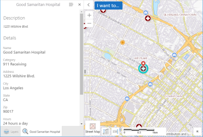
Item details shown and the icon is emphasized and centered on the map
When the user clicks an identified layer in the summary list that has more than 50 items, the specific items are listed in groups of 50 (the default), and a paging area opens at the bottom of the list panel. The total number of items is also shown. The user can page forward and backward, and go to the last page or return to the first page of the items list. As the user pages through the list, the paging area shows which group of 50 is being displayed, for example 1 - 50, 51 - 100, 101 - 150, and so on.
Note that the default of 50 items per page can be changed by updating pageSize in the FeatureSetResultsView (see Views in the Configuration Properties below).
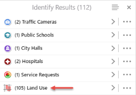
Land Use in the summary list indicating 105 items found
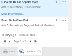
Specific Land Use items and the paging area below the list
Results Table View
When the user selects Switch to Table in the Panel Actions menu, the view displays the results in a table with the feature sets organized on separate tabs, as illustrated below. Clicking a tab shows the data for that set of features. For example, with Land Use features included in the results, the Land Use tab shows the features in rows, with the attributes of each feature organized in labeled columns. All of the land use items are highlighted in yellow on the map. When the user hovers their cursor over a row, that feature is highlighted in blue on the map. When the user clicks one of the rows, the map zooms to the corresponding item. This behavior is defined in ResultsTableFeatureClickedBehavior in the configuration file. After clicking a row, the user can continue to hover the pointer over other rows to highlight the corresponding features on the map. When the user clicks ![]() , Results Table filtering is enabled and the user can find results by applying filters. The user can directly edit the Results Table.
, Results Table filtering is enabled and the user can find results by applying filters. The user can directly edit the Results Table.
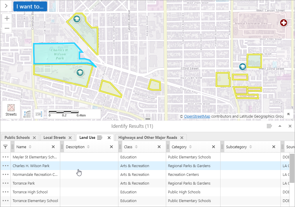
Example of the Results Table
Results Table Fields and Controls
The major elements of the Results Table are described below.
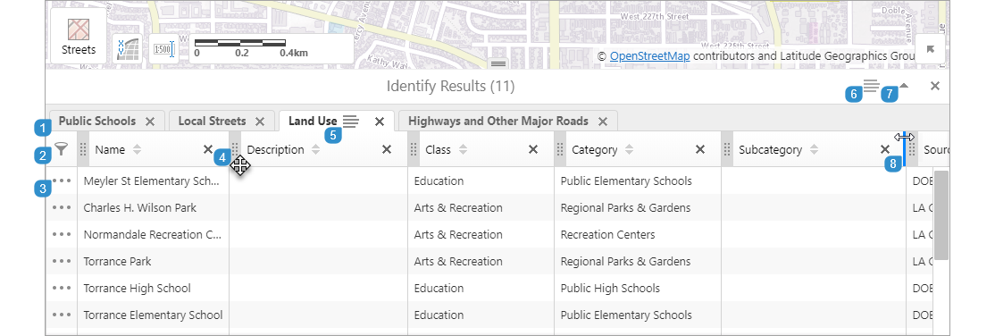

|
Click a tab to view its features in the table. |

|
Click |

|
Click the Feature Actions menu to select actions that apply to the specific feature. |

|
Drag  left or right to reorder the column. left or right to reorder the column. |

|
Click the Feature Set Actions menu on a selected tab to choose an action that is applicable to the feature set. |

|
Click the Panel Actions menu to select actions that apply to all of the feature sets in the Results Table. |

|
Use the Maximize and Restore toggle to change the panel size. |

|
Drag a column separator in the header row of the table left or right to resize a column. |
Filters can be applied to the Results Table to find results of interest.
Filtering, sorting and column removal and reordering are respected when you export results to CSV, XLSX or Shapefile.
To filter results:
-
Near the top-left of the Results Table panel, click
 .
.A row of filters appears beneath the column headings.
-
In the column you want to filter, type a search term. For example, beneath the Name heading, type tor.

Only results whose Name contains tor are displayed. Search terms are case-insensitive.
-
You can apply more than one filter at a time. For example, beneath the Category heading, type schools.

Only results whose Name contains tor and whose Category contains schools are displayed.
To clear a specific filter, click
 beside the search term. To clear all filters, click
  to the far-left of all filters.
 -
To disable filtering, click
 .
.The filters are disabled and the row of filters is hidden.
Instead of editing each feature individually, you can edit feature attributes directly in the Results Table.
To edit the Results Table:
-
In the Results Table, click the Panel Actions menu
 of the tab you want to edit.
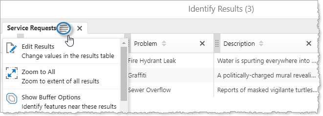
The Panel Actions menu appears.
-
In the menu, click Edit Results.
You can now edit fields in the Results Table.
-
Click the field you want to edit.
The current field is highlighted in blue.
-
Enter a new value for the field.

The modified field is highlighted in yellow and
 appears to the far-left of the row to indicate unsaved changes.
 -
To save your edit, move to another field by clicking it or using a keyboard shortcut.
While editing the Results Table, the following keyboard shortcuts are available:
-
Tab: Move to the field to the right of the current field.
-
Shift+Tab: Move to the field to the left of the current field.
-
Enter: Move to the field below the current field.
-
Shift+Enter: Move to the field above the current field.
-
Esc: Reset the value of the current field.
If the Viewer saves the edit successfully,
 briefly appears to the far-left of the row.
If the Viewer cannot save the edit, the following occurs:
- The field is highlighted in red.
-
 appears to the far-left of the row.
 - A yellow error message appears above the Results Table.
-
-
To finish editing, click Exit Editing near the top-right of the Results Table.
Actions Menus
The content of the actions menus, represented by the menu icons ![]() and
and  , is determined by the actions associated with the view that is open. For example, the menus can contain some or all of the following.
-
Zooming to features
-
Buffering
-
Charting
-
Cut Feature
-
Exporting the results' attributes to a
.csvfile, an.xlsxfile, or a shapefile (.shpfile) -
Opening, saving, or combining results
-
Running reports
-
Union Features
The actions menus applicable to the Results List and the Results Table are configured in the Menu Module. The following table maps the menu name in the configuration JSON file to the menu name on Context Menus page in the Management Pack.
| Menu name in the configuration JSON file | Menu name in Management Pack Context Menus |
|---|---|
| FeaturesActions1 | Feature Actions |
| FeatureSetCollectionActions | Results List Collection Actions |
| FeatureSetCollectionResultsFeatureSetActions | Results List Collection Element Actions |
| ResultsTableActions | Results Table Collection Actions |
| FeatureSetResultsActions1 | Results List and Results Table Set Actions |
| FeatureSetResultsFeatureActions1 | Results List and Results Table Set Element Actions |
| 1 Changes to the FeatureActions menu, the FeatureSetResultsActions menu, and the FeatureSetResultsFeatureActions menu in the configuration file apply to the equivalent actions menus for both the Results List and the Results Table. | |
The Results Module does not need to be aware of which module is the source of the feature set collection that it is going to host, that is, which module generated the feature set collection and how it was requested. The request can originate from an identify, search, query, measurement, or map tip operation. You can configure the way the result of an operation is handled (that is, which commands are executed) by using the resultMappings element.
Export Results with Data Links
If the results that a user wishes to export have data link data, an additional field (called GCX_OID by default) is added to the exported results data.
If the user exports results to CSV, the data link tables are included as an additional CSV file in the Export.zip. The GCX_OID correlates the data link's CSV and the exported results CSV, as it is a matching field in both files.
Similarly, if the user exports results to XLSX, the data link tables are included as additional sheets in the XLSX file included in the Export.zip. The GCX_OID correlates the data link's sheet and the exported results' sheet, as they have matching fields on each sheet.
Export Results as Shapefiles
If the user exports results to a shapefile, an Export.zip is created with five shapefile pieces (.shp, .shx, .dbf, .prj, and .cpg).
When the results include data link data, additional shapefile pieces are created. Because data link data often does not include geographical data, only a subset of shapefile pieces are generated (.dbf, and .cpg).
Configuration Properties
Module
-
resultMappings:-
Identify: An array of commands to execute when the feature set collection was generated from an identify operation. The default is the set of commands:ShowResultsListandSetCollectionOfInterest. -
MapTip: An array of commands to execute when the feature set collection was generated from a map tip operation. The default is theShowMapTipResultscommand. -
Measurement: An array of commands to execute when the feature set collection was generated from a measurement operation. By default, the array is empty. If you add theShowResultsTablecommand to the array, measurements are presented in the Results Table, in addition to on the map. For information, see Measurement Module. -
Coordinates: An array of commands to execute when the feature set collection was generated from a plot coordinates operation. By default, the array is empty. If you add theShowResultsTablecommand to the array, coordinates are presented in the Results Table, in addition to on the map. For information, see PlotCoordinates Module. -
Workflow: An array of commands to execute when the feature set collection was generated from a Select Features activity in a workflow. The default is the set of commands:ShowResultsListandSetCollectionOfInterest. -
Search: An array of commands to execute when the feature set collection was generated from a search operation. The default is the set of commands:ShowResultsListandSetCollectionOfInterest. -
QueryBuilder: An array of commands to execute when the feature set collection was generated from a QueryBuilder operation. The default is the set of commands:ShowResultsListandSetCollectionOfInterest. -
ClusterFeatures: An array of commands to execute when the feature set collection was generated from a cluster operation. The default is the set of two commands:ShowMapTipResultsandSetCollectionOfInterest. -
Selection: An array of commands to execute when the feature set collection was generated from a Saved Results operation. The default is the set of commands:ShowResultsListandSetCollectionOfInterest.
-
-
behaviors: An array of named behaviors that run when an associated event occurs. By default, the behaviors are:-
ResultsListFeatureClickedBehavior: A behavior that runs an array of commands when a feature in the Results List is clicked. By default, this includes theShowFeatureDetailscommand. -
ResultsListFeaturePressedBehavior: A behavior that runs an array of commands when a feature in the Results List is pressed for a long time. By default, this includes theShowFeatureDetailscommand. -
ResultsTableFeatureClickedBehavior: A behavior that runs an array of commands when a feature in the Results Table is clicked. By default, this includes the following command:ZoomToFeature. -
ResultsTableFeaturePressedBehavior: A behavior that runs an array of commands when a feature in the Results Table is pressed for a long time. By default, this includes the commandZoomToFeature. -
FeatureSetClickedEventBehavior: A behavior that runs an array of commands when a feature set in the Results View is clicked. By default, this includes the commandShowFeatureSetResultsView. -
ResultsListFeatureHoverBehavior: A behavior that runs an array of commands when the cursor hovers over a feature in the Results List. By default, this includes the commandFocusFeature. -
ResultsListFeatureHoverEndBehavior: A behavior that runs an array of commands when the cursor no longer hovers over a feature in the Results List. By default, this includes the commandClearFeatureFocus. -
ResultsTableFeatureHoverBehavior: A behavior that runs an array of commands when the cursor hovers over a feature in the Results Table. By default, this includes the commandFocusFeature. -
ResultsTableFeatureHoverEndBehavior: A behavior that runs an array of commands when the cursor no longer hovers over a feature in the Results Table. By default, this includes the commandClearFeatureFocus. -
ResultsViewClosedBehavior: A behavior that runs an array of commands when the Results View is closed when the user clicks the X (Close Panel). -
ResultsViewCollapsedBehavior: A behavior that runs an array of commands then the Results View is collapsed – when the user clicks the < (Collapse Panel) icon beside the panel. -
ResultsPageChangedBehavior: This behavior applies to the Results List only. It runs an array of commands each time the contents of the pages in the Results View change, for example, as a result of a deletion, an addition, or the clearing of the pages. This behavior is enabled with the default highlight mode of Highlight Features On Page specified in the Management Pack. By default, this includes the commandClearAndHighlightFeatures.If the highlight mode is set to Highlight All Features in the Management Pack, the behavior changes to
AllResultsPageChangedBehavior, which by default includes the commandClearAndHighlightFeatures.If the highlight mode is set to Do Not Highlight Any Features, the behavior is removed.
You can remove or rearrange the commands of any behavior. You can also remove behaviors altogether.
You can add commands to a behavior if the command does not require a parameter, or if the type of the command's parameter matches the parameter of an existing command or the event associated with the behavior. Refer to "Viewer Commands and Events" in Developer Help to determine if the parameters are compatible. Note that private commands and events are not documented.
Adding a new behavior is only recommended for experienced developers.
See Viewer Commands and Events for more information.
-
-
customSearchSuggestions: Specifies the message to display to the user when an operation does not return any results. If you do not configure custom search suggestions, the viewer displays a built-in message.-
Identify: Specifies the message to display when no results are returned for an identify operation. The built-in message for identify operations is No results to display. -
MapTip: Specifies the message to display when no results are returned in a map tip. The built-in message for map tips is No results. -
Search: Specifies the message to display when no results are returned for a search operation. The built-in message for search operations is No results to display. -
QueryBuilder: Specifies the message to display when no results are returned for a QueryBuilder operation. The built-in message for QueryBuilder operations is No results to display. -
Workflow: Specifies the message to display when no results are returned for a search, identify, map tip, or query operation that is run in a workflow. The built-in message for workflows is No results to display.
-
-
showInvisibleAttributesOnExport: Specifies whether exported results tables should respect the visibility of fields. The default value isfalse. -
includeDatalinksOnExport: Specifies whether data link data is exported in addition to results data. The default value istrue. -
enableDataLinkObjectIdFieldOnExport: Specifies whether feature set collections with data links should include an Object ID field when results are exported. The default value istrue. -
gcxObjectIdFieldNameOnExport: Specifies the format of the name of the Object ID field that is included when feature set collections have results with data links. The default field name isGCX_OID.
Views
-
ResultsListView:-
automaticDrillInDelay: If the user performs an operation that returns results belonging to the same feature set in less time than this value, then individual results are listed in the Results list. If the operation that returns results takes longer than the drill-in delay setting, then the results are displayed in the summary panel, and the user needs to click the entry to open the list of individual results. The default drill-in delay setting is 300 milliseconds. If the setting is changed to 0,automaticDrillInDelayis disabled.
-
FeatureSetResultsView:-
contentField: Which field should be displayed as the content for a feature in the search Results List. Possible values include:descriptionandlongDescription. The default islongDescription. -
isPaged: When set tofalse, all the items listed appear in a single scrollable page. When set totrue, the list items are displayed in pages. The number of items per page depends on the page size, which is also configurable. -
pageSize: The number of list items that should appear in a single page. -
showBackButton: Shows the back button to go back to the ResultsListView. -
highlightMode: Highlight mode is specified in the Management Pack, and the mode selections are: Highlight Features On Page (this is the default), Highlight All Features, and Do Not Highlight Any Features. Note that changing this field in the configuration file does not affect the highlight behavior. See Look and Feel.
-
-
ResultsTableView: Noconfigurationproperties
View Models
-
ResultsListViewModel: Noconfigurationproperties -
FeatureSetResultsViewModel: Noconfigurationproperties -
ResultsTableViewModel: Noconfigurationproperties
Example - Add a Command with a Parameter to a Behavior
The following example demonstrates adding a new command with a parameter to the behavior, ResultsListFeatureClickedBehavior.
To add a command with a parameter to a behavior:
-
Run an XML editor or text editor as an administrator.
-
Open one of the viewer configuration files,
Desktop.json.js,Tablet.json.js, orHandheld.json.js, in the editor.By default, the configuration files are here:
C:\Program Files (x86)\Latitude Geographics\Geocortex Essentials\[instance]\REST Elements\Sites\[site]\Viewers\[viewer]\VirtualDirectory\Resources\Config\Default\
-
In the
Resultsmodule section, find thebehaviorsproperty. Locate the behavior you want to edit, for example,ResultsListFeatureClickedBehavior.{ "moduleName": "Results", ... "configuration": { ... "behaviors": [ { "name": "ResultsListFeatureClickedBehavior", "event": "ResultsListFeatureClickedEvent", "commands": [ "ShowFeatureDetails" ] }, ... ] }, ... }The behavior executes a single command:
ShowFeatureDetails. -
Refer to Viewer Commands and Events to determine the type of parameter that is associated with this command or the behavior's event. Although
ShowFeatureDetailsaccepts a parameter of either type,geocortex.essentialsHtmlViewer.mapping.infrastructure.Featureorgeocortex.essentialsHtmlViewer.mapping.infrastructure.FeatureSetCollectionID (string),ResultsListFeatureClickedEventhas a parameter of type,geocortex.essentialsHtmlViewer.mapping.infrastructure.Feature -
Find a command that you want to add to the behavior that has the same parameter type, for example,
PanToFeature. -
Add the desired command to the list of commands, separated by a comma. For example:
"commands": [ "ShowFeatureDetails", "PanToFeature" ] -
Save the file.
