TabbedToolbar Module
The toolbar can be configured using Manager. See Toolbar for instructions.
The TabbedToolbar Module implements the tabbed toolbar typically found in the Desktop and Tablet interfaces. When activated, the tabbed toolbar appears below the banner.
As of version 2.4, the Handheld interface uses the compact toolbar by default. The compact toolbar is implemented by the CompactToolbar Module. It is also possible to use the tabbed toolbar in the Handheld interface.
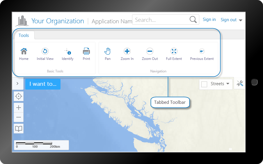
Tabbed toolbar, shown in the Tablet interface
Tabbed Toolbar
The tabbed toolbar is made up of tabs, groups, buttons, tools, multitools (also known as flyouts), and a Tool Labels toggle button. Buttons immediately run commands that do not require input from the user. Tools run commands that operate on a geometry that the user draws; when the user clicks a tool, the tool must wait for the user to draw the geometry before running the command. Multitools act as menus of various related tools or buttons.
Tools and buttons are arranged in groups, and groups are arranged on tabs. The following example includes a tab named My Tab, containing two groups: My Group 1 and My Group 2. In the Handheld interface, tabs are ignored and groups are stacked on top of each other.
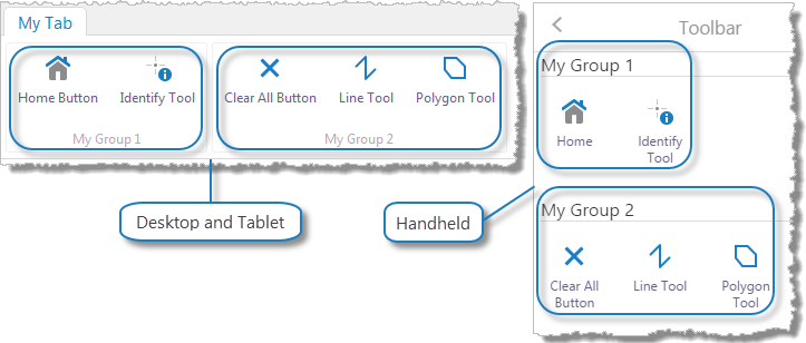
A tabbed toolbar consisting of a single tab with two groups
In the configuration, tabs are configured as groups of groups. Whenever you configure a toolbarGroup that has at least one toolbarGroup item within it, the outer toolbarGroup is rendered in the viewer as a tab. The inner toolbarGroup items are rendered as groups within the tab. In the above example, the tab named My Tab is configured as a toolbarGroup that contains two other toolbarGroup items.
In the Desktop and Tablet interfaces, the tabbed toolbar has three views, all of which use the TabbedToolbarViewModel:
-
Tabbed Toolbar: The
TabbedToolbarViewis used for the tabbed toolbar that appears immediately below the banner in the Desktop and Tablet interfaces, or in theMiscViewContainerRegionfor the Handheld interface. -
Toolbar Button: The
TabbedToolbarButtonViewis used for the toolbar button that the user clicks to open the tabbed toolbar. The toolbar button displays in the
 ToolbarRegionin the Desktop and Tablet interfaces, or in theHeaderRegionin the Handheld interface. -
Toolbar Flyout: The
ToolbarFlyoutViewis used to display the content of multitools. A multitool is a tool that contains multiple related tools.
Configuration Properties
Module
-
isEnabled: To enable the tabbed toolbar, set totrue. The default isfalse. -
transientElements: An array of elements that define context-sensitive toolbars, each of which are associated with a state, a widget, a region, and a set of toolbar items.As of HTML5 Viewer 2.5, each element must be associated with an application state to create context-sensitive toolbars.
-
stateName: The name of the application state that triggers the context-sensitive toolbar. For a complete list of states, see State Reference. -
widgetId: The ID of the widget. -
region: The name of the region to use.CompactToolbarTransientRegion.For the context-sensitive menu to be available in the tabbed toolbar, the
regionmust be added to theitemsarray of a group in thetoolbarGroupsarray. -
items: An array of toolbar items, each of which is either a button or toggle button.See Properties of Buttons or Properties of Toggle Buttons for more information.
-
-
toolbarGroups: An array oftoolbarGroupitems, each of which is rendered as a tab in the tabbed toolbar.Properties of Tabs
-
id: A unique ID for thistoolbarGroup. -
type: The type istoolbarGroup. -
name: The name that you want to appear on the tab.For example, @language-toolbar-group-tools or Tools.
If your viewer is to be available in more than one language, enter the text key that the tab name is assigned to. See Configure User Interface Text for more information on using text keys.
-
items: An array oftoolbarGroupitems, each of which is rendered as a group in the toolbar.Properties of Groups
-
id: A unique ID for thistoolbarGroup. -
type: The type istoolbarGroup. -
name: The name that you want to appear on the group. You can use a text key or the literal text.For example, @language-toolbar-group-home or Basic Tools.
-
items: An array of toolbar items, each of which is either a button, toggle button, tool, region, or flyout (also known as a multitool).See Properties of Buttons, Properties of Toggle Buttons, Properties of Tools, Properties of Regions, or Properties of Multitools (Flyouts) for more information.
-
-
-
id: A unique ID for thisbutton. -
type: The type isbutton. -
iconUri: The URI for the icon that you want to appear on the button. The image must be an appropriate size to fit on the button. Valid file formats are PNG, BMP, JPG, and JPEG. -
command: The command that the button runs when the user clicks the button.For information on commands, see Viewer Commands and Events.
-
commandParameter: The value for the command to use as its parameter, if it has a parameter. Parameters may either be simple strings or complex objects containing any number of parameters.For information on a particular command's parameter, see Viewer Commands and Events.
-
hideOnDisable: If this property is set totrueand the button's command cannot run under the current configuration or run-time conditions, the button does not show in the toolbar.If
hideOnDisableisfalseand the button's command cannot run, the button shows in the toolbar, but it is grayed out. -
name: The name that you want to appear on the button. You can use a text key or the literal text.For example, @language-toolbar-home-sub or Home.
-
tooltip: The text for the tool tip that opens when the user positions the pointer over the button. You can use a text key or the literal text.For example, @language-toolbar-navigation-home-tooltip or Return to the introductory page.
-
id: A unique ID for thistoggleButton. -
type: The type istoggleButton. -
toggleStateName: (optional) The name of the toggle state that this toggle button affects. -
toggleOn: Configures the toggle-on button, which turns the toggle button on:-
name: The name that you want to appear on the toggle-on button. You can use a text key or the literal text.For example, @language-toolbar-home-sub or Home.
-
tooltip: The text for the tool tip that opens when the user positions the pointer over the toggle-on button. You can use a text key or the literal text.For example, @language-toolbar-navigation-home-tooltip or Return to the introductory page.
-
iconUri: The URI for the icon that you want to appear on the toggle-on button. The image must be an appropriate size to fit on the toggle-on button. Valid file formats are PNG, BMP, JPG, and JPEG. -
hideOnDisable: If this property is set totrueand the toggle-on button's command cannot run under the current configuration or run-time conditions, the toggle-on button does not show in the toolbar.If
hideOnDisableisfalseand the toggle-on button's command cannot run, the toggle-on button shows in the toolbar, but it is grayed out. -
command: The command that the toggle-on button runs when the user clicks the toggle button to turn it on.For information on commands, see Viewer Commands and Events.
-
commandParameter: The value for the command to use as its parameter, if it has a parameter. Parameters may either be simple strings or complex objects containing any number of parameters.For information on a particular command's parameter, see Viewer Commands and Events.
-
-
toggleOff: Configures the toggle-off button, which turns the toggle button off:-
name: The name that you want to appear on the toggle-off button. You can use a text key or the literal text.For example, @language-toolbar-markup-clear or Clear markup.
-
tooltip: The text for the tool tip that opens when the user positions the pointer over the toggle-off button. You can use a text key or the literal text.For example, @language-toolbar-markup-clear-tooltip or Clear all drawings from the map.
-
iconUri: The URI for the icon that you want to appear on the toggle-off button. The image must be an appropriate size to fit on the toggle-off button. Valid file formats are PNG, BMP, JPG, and JPEG. -
hideOnDisable: If this property is set totrueand the toggle-off button's command cannot run under the current configuration or run-time conditions, the toggle-off button does not show in the toolbar.If
hideOnDisableisfalseand the toggle-off button's command cannot run, the toggle-off button shows in the toolbar, but it is grayed out. -
command: The command that the toggle-off button runs when the user clicks the toggle button to turn it off.For information on commands, see Viewer Commands and Events.
-
commandParameter: The value for the command to use as its parameter, if it has a parameter. Parameters may either be simple strings or complex objects containing any number of parameters.For information on a particular command's parameter, see Viewer Commands and Events.
-
-
id: A unique ID for thistool. -
type: The type istool. -
iconUri: The URI for the icon that you want to appear on the tool. The image must be an appropriate size to fit on the tool. Valid file formats are PNG, BMP, JPG, and JPEG. -
command: The command that the tool runs after the user has drawn the geometry for the command to operate on.For information on commands, see .
-
drawMode: The type of geometry the user draws, upon which the tool operates. -
name: The name that you want to appear on the tool. You can use a text key or the literal text.For example, @language-toolbar-tasks-identify or Identify.
-
tooltip: The text for the tool tip that opens when the user positions the pointer over the tool. You can use a text key or the literal text.For example, @language-toolbar-identify-point-tooltip or Find out about a location on the map.
-
hideOnDisable: If this property is set totrueand the tool's command cannot run, the tool does not show in the toolbar.If
hideOnDisableisfalseand the tool's command cannot run, the tool shows in the toolbar, but it is grayed out. -
isSticky: When set totrue, the tool remains selected after the user has used it. To deselect the tool, the user must click the tool a second time, or click a different tool. This allows the user to use a tool repeatedly without having to reselect it each time.If you do not want a tool to remain selected after it is used, set
isStickytofalse. -
statusText: The status message to display when the tool is activated, often containing instructions for the user. You can use a text key or the literal text.For example, @language-toolbar-identify-point-desc or Click or tap a location on the map to learn what’s there.
-
id: A unique ID for thisregion. -
type: The type isregion. -
regionName: A unique name for thisregion. This property is referred to by transient elements to create context-sensitive toolbars associated with an application state.
Properties of Multitools (Flyouts)
-
id: A unique ID for this multitool. -
type: The type isflyout. -
name: The name that you want to appear on the multitool.You can use a text key or the literal text. For example, @language-toolbar-markup-drawing-tools or Draw.
-
items: An array of items, each of which is either a button, toggle button, or tool. -
layout: To display large icons for each tool, set this property toLarge. Otherwise, set the property toSmall. The default isLarge.This property is not used by the compact toolbar.
Views
-
TabbedToolbarView: Noconfigurationproperties -
TabbedToolbarButtonView: Noconfigurationproperties -
ToolbarFlyoutView: Noconfigurationproperties -
IWantToMenuButtonView: (Handheld interface only) Noconfigurationproperties -
SearchView: (Handheld interface only) Noconfigurationproperties -
NavBarSmallView: (Handheld interface only) Noconfigurationproperties -
NavButtonView: (Handheld interface only) Noconfigurationproperties -
As of version 2.4, the
ToolbarViewandToolbarManagedViewsViewin previous versions of the Handheld interface no longer exist.
View Models
-
TabbedToolbarViewModel:-
toolbarGroupRefs: An array of the IDs of the configured groups that you want to appear in the toolbar.This property provides a way to hide a group that is configured in the toolbar, without removing the configuration for the group. This is useful if you want to remove a group, but you think that you might want to add it back later.
Hide the group by removing its ID from the
toolbarGroupRefslist. Add the group back by adding its ID back to thetoolbarGroupRefslist. -
toolbarOpenByDefault: To open the toolbar when the viewer starts, set totrue. The default isfalse.
-
-
TabbedToolbarTransientViewModel: Noconfigurationproperties -
NavButtonViewModel: (Handheld interface only) Noconfigurationproperties
See Also...