Workflow Module
The Workflow Module renders workflows in HTML5 viewers. Use the Workflow Module's properties to customize the appearance of workflow content that is displayed in the viewer.
There are several steps to create workflows and run them from HTML5 viewers. For information, see Main Steps to Create and Use a Workflow.
Workflow Containers
Workflow containers define the
Workflow display activities—DisplayForm, DisplayHyperlink, DisplayCaptureGeometry, and DisplayResultPicker—each have a Workflow Container Name property where you specify the container to use. The
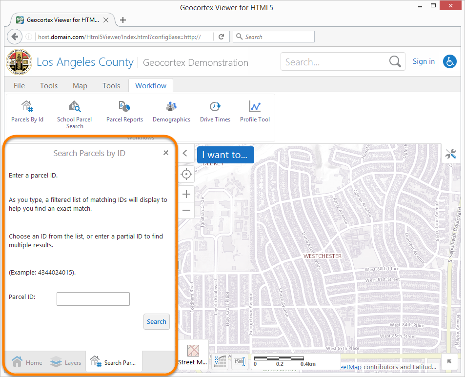
DisplayForm activity's content displayed in an HTML5 viewer's DataRegion
The
-
Default: Displays the content in the DataRegion and provides a Close button
 so users can close the tab.
 -
DefaultNoCloseButton: Displays the content in the DataRegion with no Close button.
-
ModalWindow: Displays the content in the ModalWindowRegion and provides a Close button
so users can close the window. -
ModalWindowNoCloseButton: Displays the content in the ModalWindowRegion with no Close button.
To use a predefined container, enter the container's name in the Workflow Container Name property when you configure the activity in Essentials Workflow Designer. For example, to use the predefined Default container, set Workflow Container Name to "Default".
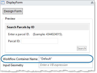
DisplayForm activity that uses the predefined Default container
If the predefined containers do not offer what you need, you can create custom containers by adding new items to thecontainers array
We do not recommend modifying the out-of-the-box containers. Create a new container instead.
The Geocortex software does not place a limit on the number of different containers that you can define in a viewer or use in a workflow. For workflows that proceed through a number of steps similar to a software wizard, you may want to use the same container for all the display activities. This creates a smooth transition from one step to the next. In this case, rather than hard coding each activity to the same container name, we recommend that you store the container name in a variable.
If you do not specify the workflow container for an activity, then the activity's content is displayed in the default region using the default title and icon. You can configure these defaults using the defaultContainerRegionName, defaultContainerTitle, and defaultContainerIconUri properties.
To create a custom workflow container for a workflow that will run in an HTML5 viewer:
Step 1: Configure a Workflow Container in the Viewer
-
Open one of the viewer's configuration files in a text editor.
-
Find the Workflow Module.
-
Add a new item to the module's
containersarray and configure its -
Optionally configure the
defaultContainerRegionName,defaultContainerTitle, anddefaultContainerIconUri. -
Repeat these steps for each configuration file.
Step 2: Reference the Workflow Container in the Workflow
-
In each workflow activity where you want to use your custom container, set the Workflow Container Name property to the
namethat you defined in the viewer configuration.
You can modify aspects of a workflow container while the workflow is running, such as the title, message, and the container's visibility. For information, see ConfigureWorkflowContainer Activity.
Configuration Properties
Module
-
showTitleInFormBody: When this property is set totrue, the title appears in the body of the form along with the header. -
defaultContainerRegionName: The name of the default region where the activity displays content to the user. The default isDataRegion.If a region is specified in the activity's workflow container, the workflow container's region overrides this property.
-
defaultContainerTitle: The default title of the container hosting the workflow. The default is@language-workflow-title. This is a language key whose default en-US value is "Workflow". See Configure User Interface Text for more information on using text keys.If a title is specified in the activity's workflow container, the workflow container's title overrides this property.
-
defaultContainerIconUri: The default image to be displayed with the title of the container hosting the workflow.If an icon is specified in the activity's workflow container, the workflow container's icon overrides this property.
-
showCaptureStatusMessages: When set to true, the capture geometry messages are shown in the Status Module. The default istrue.
Example of a capture message displayed on the map
-
displayResultPickerTemplateComplexity: The amount of information to display in query results from a workflow that uses the workflow Display Result Picker activity. The default for the Desktop interface iscomplex. For the Tablet and Handheld interfaces, the default issimple. -
icons: A list of icon URLs followed by associated replacement icon URLs. For example, given an icon URL, you might want to replace it with a certain icon URL for the Desktop interface, but a different icon URL for the Handheld interface. You may add as many icon URL and replacement icon URL pairs as you want. -
containers: An array of workflow containers with the following properties:-
name: The name of the container. -
title: The title of the workflow. You can use a text key or the literal text. -
regionName: The name of the region to host the container. -
iconUri: The URI of the image to be displayed with the title. -
allowClose: To display a close button for the container, set totrue; otherwise, set tofalse.
-
Views
-
WorkflowListView: -
hideOnClickWorkflow: When this property set totrue, the workflow list is hidden when a workflow from the list is selected by the user.
View Models
-
WorkflowViewModel: Noconfigurationproperties