Accessibility Window
The Accessibility page in Manager has settings to configure the viewer's Accessibility window. The Accessibility window informs users of the accessibility features in the HTML5 Viewer. To open the Accessibility window in the Desktop or Tablet interface, the user clicks the Accessibility icon  in the viewer's banner. In the Handheld interface, the default I Want To menu has a "View the Accessibility Window" option that the user can use to open the Accessibility window.
You can configure the viewer to show or hide the Accessibility icon and the option in the I Want To menu. You can also customize the title and content of the Accessibility window. The content of the Accessibility window is defined using HTML markup. The content can include formatted text, images, and hyperlinks.
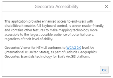
Default Accessibility window
The Accessibility window is implemented by the Accessibility Module. See Accessibility Module for information.
Open the Accessibility Page
To open an HTML5 Viewer's Accessibility page in Manager:
-
In
 beside the viewer.
 -
In the side panel, click Accessibility.
The Accessibility page opens.
Accessibility Window Settings
The Accessibility page has the following settings:
-
Include Enhanced Screen Reader Notifications: When this checkbox is selected, map information is read out to users by a screen reader. If you do not want map information to be read out to users, clear the checkbox. By default, map information is read out to users.
-
Include Accessibility Button: When this checkbox is selected, the Accessibility icon
is available in the Desktop and Tablet interfaces and the I Want To menu shows the View the Accessibility window option in the Handheld interface. If you do not want the viewer to have an Accessibility option, clear the checkbox. By default, the Accessibility option is included. -
Title: The title that appears at the top of the Accessibility window. The default title is Geocortex Accessibility.
If your viewer is going to be available in more than one language, enter the text key that the Accessibility window's title is assigned to. The default key @language-accessibility-map-title. is For more information on using text keys, see Configure User Interface Text.
-
Content: The HTML markup that defines the content of the Accessibility window. The Content box has a Rich Text Editor with a toolbar at the top.
You can use a valid text key for the content as long as there are no spaces or HTML markup surrounding the text key. For more information on using text keys, see Configure User Interface Text.
If the Rich Text Editor does not have a particular tool that you want, or you prefer to work directly in the HTML markup, use the Show Source icon
 at the end of the toolbar. This displays the HTML markup in the Content box, so you can edit the HTML markup directly. To return to the Rich Text Editor, press the icon again.
 -
Keyboard Focus Indicator Color: Set the color to use to outline the active element when the user is navigating the page using the keyboard. You can either type the color's hex code or click the color picker
 to select a color. The default value is
 #550055.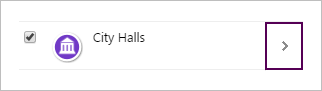
City Halls layer with the focus on the Actions menu icon

-
Skip Links Menu: The skip navigation function is supported in the Desktop interface. The items in the menu list define the links that open when initially tabbing in the Viewer. The first item in the list is the link that receives focus when the skip navigation links menu opens. Subsequent tabbing traverses each of the items in the menu. Users can quickly return to the skip navigation links menu by clicking the address field in the Viewer and then tabbing to open the menu. Users can also return to the initial item in the skip navigation links menu by continuing to tab through the Viewer, or they can access the last link in the menu by tabbing back (SHIFT+TAB) through the Viewer.
To add a menu item, click Add Menu Item, update the fields, and click OK. You can see how to complete the fields by clicking the Edit icon
 for an existing menu item.
To edit a menu item, click the Edit icon
for the item, update the fields in the dialog, and click OK.To reorder the menu items, drag and drop the menu handle
 to the new position in the list.
To remove a menu item, click the Remove icon
 for the item.
Note that only 5 skip link items are supported in order to minimize the amount of tabbing required to access specific areas in the Viewer.
See Also...