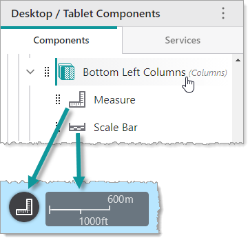
A Columns component displays the components it contains horizontally. In the following example, we see a Columns component titled Bottom Left Columns that contains a Measure component and a Scale Bar component.
Columns components can be nested and contain other container components. You can modify the alignment and size of subcomponents, and the slot and margin of the Columns component.
Main Settings
•Title: Type a title to display for the component.
•Icon: To select an icon to represent the component, click Select Icon, click the desired icon and click OK. To remove the icon, click Clear Icon.
Layout
•Horizontal Alignment: Sets the horizontal position of any fixed-width components within. Has no visible effect on any component within whose width automatically grows to the size of the parent.
•Vertical Alignment: Sets the vertical position of any fixed-height components within. Has no visible effect on any component within whose height automatically grows to the size of the parent.
•Width: Specifies the width of the component. If Fixed Size is not selected, the width is an approximate percentage of the width of the parent component. If Fixed Size is selected, the width is in pixels and will not change when other component sizes are changed.
• /
/  : Click to toggle whether the Width or Height of the component is unlocked or locked. When a size is locked, it will not change when other component sizes are changed. This setting only appears when there are three or more components whose sizes are not fixed.
•Fixed Size: Whether the Width or Height of the component is a percentage relative to the size of the parent component or a fixed size in pixels. If Fixed Size is selected, the size will not change when other component sizes are changed.
•Slot: The location of this component within its parent component, assuming the parent component has slots. The possible values depend on the parent component's slots.
•Margin (px): The margin space around the component in pixels.
•Initially Hidden: Specifies whether or not the component is initially hidden when the app loads. If selected, the component remains hidden unless activated, for example, by the Show command.