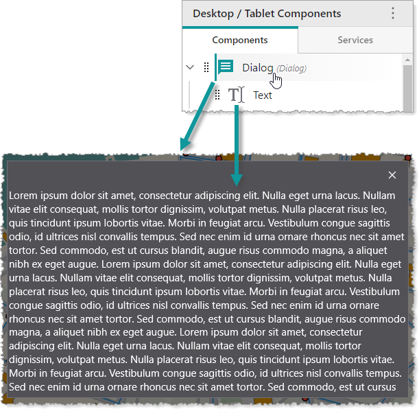
A Dialog is a component that displays its content within a modal dialog window on top of your app. A Dialog may contain any number of subcomponents. In the following example, we see a Dialog component that contains a Text component.
Main Settings
•Title: Type a title to display for the component.
•Icon: To select an icon to represent the component, click Select Icon, click the desired icon and click OK. To remove the icon, click Clear Icon.
Layout
•Margin (px): The margin space around the component in pixels.
•Initially Hidden: Specifies whether or not the component is initially hidden when the app loads. If selected, the component remains hidden unless activated, for example, by the Show command.
•Map: The Map component this component affects. This setting cannot be modified if this component is either a subcomponent of a Map component or there is only a single Map component in the app.