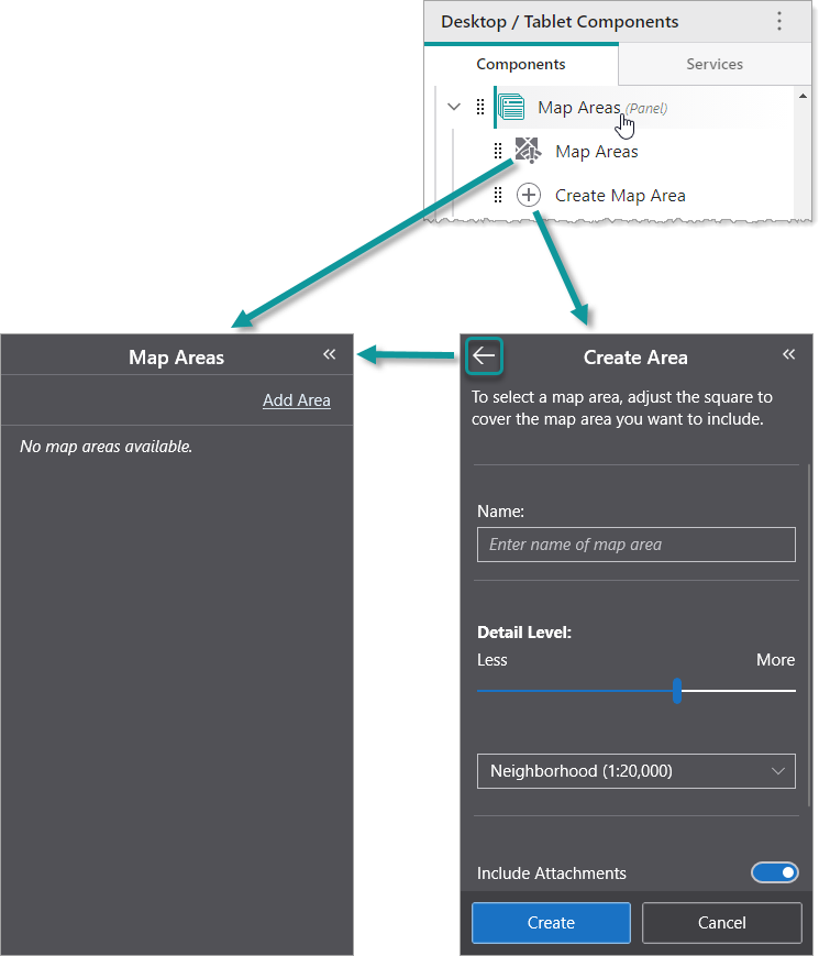
A Panel is a component whose Back button  navigates through any of its subcomponents that were activated towards the first subcomponent. In the following example, we see a Panel component titled Map Areas that contains an Offline Areas component titled Map Areas and a Create Offline Areas component titled Create Map Area.
If the user clicks Add Area in the Offline Areas component titled Map Areas, the panel displays the Create Offline Areas component titled Create Map Area. If the user then clicks Back, the panel displays the Offline Areas component titled Map Areas.
You can modify the slot and margin of the Panel component.
We do not recommend nesting Panel components inside other Panel components.
Main Settings
•Title: Type a title to display for the component. If the Panel component is placed within a Taskbar component, the title appears in the Taskbar.
•Icon: To select an icon to represent the component, click Select Icon, click the desired icon and click OK. To remove the icon, click Clear Icon. If the Panel component is placed within a Taskbar component, the icon appears in the Taskbar.
Layout
•Slot: The location of this component within its parent component, assuming the parent component has slots. The possible values depend on the parent component's slots.
•Margin (px): The margin space around the component in pixels.
•Initially Hidden: Specifies whether or not the component is initially hidden when the app loads. If selected, the component remains hidden unless activated, for example, by the Show command.