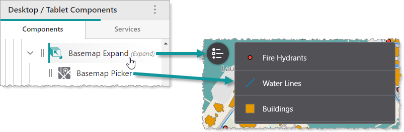
By default, an Expand component hides its subcomponents until it is clicked. Once clicked, it displays its subcomponents vertically. If the Expand component is clicked again, its subcomponents are hidden again. In the following example, we see an Expand component that contains a Legend component.
You can modify the alignment and height of subcomponents, as well as the slot, margin and style of the Expand component. You can also specify whether the Expand component is initially hidden, and whether to display the title or icon.
We do not recommend nesting Expand components inside other Expand components.
Main Settings
•Title: Type a title to display for the component.
•Icon: To select an icon to represent the component, click Select Icon, click the desired icon and click OK. To remove the icon, click Clear Icon.
Layout
•Horizontal Alignment: Sets the horizontal position of any fixed-width components within. Has no visible effect on any component within whose width automatically grows to the size of the parent.
•Vertical Alignment: Sets the vertical position of any fixed-height components within. Has no visible effect on any component within whose height automatically grows to the size of the parent.
•Height: Specifies the height of the component. If Fixed Size is not selected, the height is an approximate percentage of the height of the parent component. If Fixed Size is selected, the height is in pixels and will not change when other component sizes are changed.
•Fixed Size: Whether the Width or Height of the component is a percentage relative to the size of the parent component or a fixed size in pixels. If Fixed Size is selected, the size will not change when other component sizes are changed.
•Slot: The location of this component within its parent component, assuming the parent component has slots. The possible values depend on the parent component's slots.
•Margin (px): The margin space around the component in pixels.
•Initially Hidden: Specifies whether or not the component is initially hidden when the app loads. If selected, the component remains hidden unless activated, for example, by the Show command.
•Button Style: The style of the button. Choose between rounded or square.
•Show Title: Whether to display the title, in case you only want to display the icon.
•Show Icon: Whether to display the icon, in case you only want to display the title.