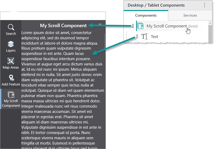
A Scroll component displays its content with a scroll bar if the content is too long. Although the Scroll component can only contain a single component, you can use another container component, such as a Rows component, to add multiple components. In the following example, we see a Scroll component titled My Scroll Component that contains a Text component.
You can modify the slot and margin of the Scroll component.
We do not recommend nesting Scroll components inside other Scroll components.
Main Settings
•Title: Type a title to display for the component.
•Icon: To select an icon to represent the component, click Select Icon, click the desired icon and click OK. To remove the icon, click Clear Icon.
Layout
•Slot: The location of this component within its parent component, assuming the parent component has slots. The possible values depend on the parent component's slots.
•Margin (px): The margin space around the component in pixels.
•Initially Hidden: Specifies whether or not the component is initially hidden when the app loads. If selected, the component remains hidden unless activated, for example, by the Show command.