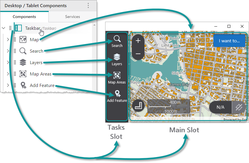
The Taskbar component consists of two parts, known as slots:
•Tasks: Subcomponents that use this slot are displayed in the taskbar as menu items that can be opened by clicking them. The titles and icons of subcomponents are displayed in the taskbar.
•Main: Subcomponents that use this slot are displayed in the main area beyond the taskbar. Usually, a Map component is set to use this slot.
In the following example, we see a Taskbar that contains a Map component that uses the Main slot, and various Panel components that use the Tasks slot.
You can modify the margin and orientation of the Taskbar component.
We do not recommend nesting Taskbar components inside other Taskbar components.
Main Settings
•Title: Type a title to display for the component.
•Icon: To select an icon to represent the component, click Select Icon, click the desired icon and click OK. To remove the icon, click Clear Icon.
Layout
•Margin (px): The margin space around the component in pixels.
•Initially Hidden: Specifies whether or not the component is initially hidden when the app loads. If selected, the component remains hidden unless activated, for example, by the Show command.
•Orientation: Displays the Taskbar component in one of the following ways:
•Auto: Automatically determines the orientation of the Taskbar depending on the form factor of the device. Typically, smartphones display a vertical Taskbar, while other devices such as tablets display a horizontal Taskbar. The default is Auto.
•Vertical: Orients the Taskbar vertically.
•Horizontal: Orients the Taskbar horizontally.
This setting only has an effect on Android and iOS devices. Windows devices always orient the taskbar vertically.