A Rows component displays the components it contains vertically. In the following example, we see a Rows component titled Layers that contains a Layers component, a Columns component titled Add Layer Buttons, and a Layer Presets component.
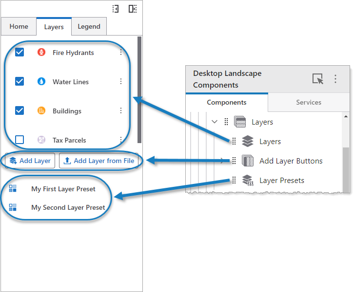
Rows components can be nested and contain other container components.
Main Settings
Field |
Description |
|---|---|
Title |
Type a title to display for the component. This title is used both in Web and Designer. |
Icon |
To select an icon to represent the component, click Select Icon, click the desired icon, and click OK. To remove the icon, click Clear Icon. |
Visibility Layers
Field |
Description |
|---|---|
Visible To |
Determines which users and groups can access this component. If no users or groups are specified, all users can access this component by default. The Hidden From setting overrides this setting. |
Hidden From |
Determines which users and groups are explicitly forbidden to access this component. This setting overrides the Visible To setting. |
Layout
Field |
Description |
|---|---|
Horizontal Alignment |
Sets the horizontal position of any fixed-width components within. Has no visible effect on any component within whose width automatically grows to the size of the parent. |
Vertical Alignment |
Sets the vertical position of any fixed-height components within. Has no visible effect on any component within whose height automatically grows to the size of the parent. |
Height |
Specifies the height of the component. If Fixed Size is not selected, the height is an approximate percentage of the height of the parent component. If Fixed Size is selected, the height is in pixels and will not change when other component sizes are changed. |
|
Click to toggle whether the Width or Height of the component is unlocked or locked . When a size is locked, it will not change when other component sizes are changed. This setting only appears when there are three or more components whose sizes are not fixed. |
Fixed Size |
Whether the Width or Height of the component is a percentage relative to the size of the parent component or a fixed size in pixels. If Fixed Size is selected, the size will not change when other component sizes are changed. |
Margin (px) |
The margin space around the component, measured in pixels. |
Initially Hidden |
Specifies whether or not the component is initially hidden when the app loads. If selected, the component remains hidden unless activated, for example, by the Show command. |
Resizable |
Whether the user can resize the parts of the component. |