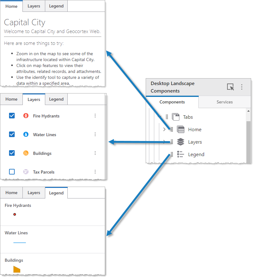
A Tabs component displays each of its components within tabs like a web browser. In the following example, we see a Tabs component that contains a Text component titled Home, Rows component titled Layers, Legend component, Workflow component titled Forms, and Print component.
We do not recommend nesting Tabs components inside other Tabs components.
Main Settings
Field |
Description |
|---|---|
Title |
Type a title to display for the component. This title is used both in Web and Designer. |
Icon |
To select an icon to represent the component, click Select Icon, click the desired icon, and click OK. To remove the icon, click Clear Icon. |
Visibility Layers
Field |
Description |
|---|---|
Visible To |
Determines which users and groups can access this component. If no users or groups are specified, all users can access this component by default. The Hidden From setting overrides this setting. |
Hidden From |
Determines which users and groups are explicitly forbidden to access this component. This setting overrides the Visible To setting. |
Layout
Field |
Description |
|---|---|
Tabs Orientation |
Sets whether the orientation of the tabs is either horizontal or vertical. This setting in combination with the Tabs Position setting determines where the tabs appear. |
Tabs Position |
Sets whether the position of the tabs is either at the start or the end. This setting in combination with the Tabs Orientation setting determines where the tabs appear. |
Horizontal Alignment |
Sets the horizontal position of any fixed-width components within. Has no visible effect on any component within whose width automatically grows to the size of the parent. |
Vertical Alignment |
Sets the vertical position of any fixed-height components within. Has no visible effect on any component within whose height automatically grows to the size of the parent. |
Margin (px) |
The margin space around the component, measured in pixels. |
Initially Hidden |
Specifies whether or not the component is initially hidden when the app loads. If selected, the component remains hidden unless activated, for example, by the Show command. |