The Taskbar component serves as a dynamic layout feature, which organizes child components into separate items in a taskbar.
Similar to the traditional Tabs component, the Taskbar offers a versatile approach to customizing the user interface by activating and deactivating taskbar entries.
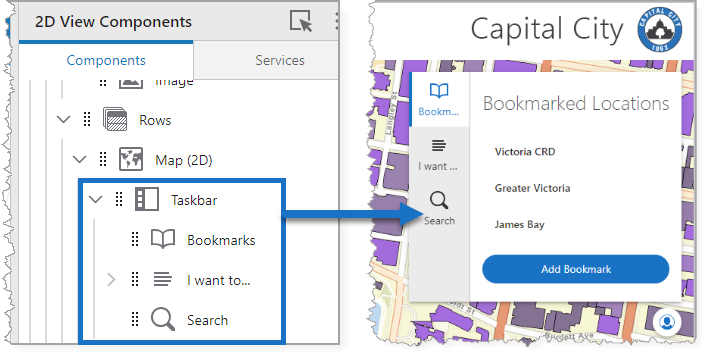
The figure below shows a Taskbar configured to include Bookmarks, I Want to menu, and Search.
Main Settings
Field |
Description |
|---|---|
Title |
Type a title to display for the component. This title is used both in Web and Designer. |
Icon |
To select an icon to represent the component, click Select Icon, click the desired icon, and click OK. To remove the icon, click Clear Icon. |
Visibility Layers
Field |
Description |
|---|---|
Visible To |
Determines which users and groups can access this component. If no users or groups are specified, all users can access this component by default. The Hidden From setting overrides this setting. |
Hidden From |
Determines which users and groups are explicitly forbidden to access this component. This setting overrides the Visible To setting. |
Layout
Field |
Description |
|---|---|
Slide-out Behavior |
Determines whether the content panel will push sibling components or overlay them. |
Tabs Alignment |
Sets the position of the tabs within the component. |
Tabs Orientation |
Sets whether the orientation of the tabs is either horizontal or vertical. This setting in combination with the Tabs Position setting determines where the tabs appear. |
Tabs Position |
Sets whether the position of the tabs is either at the start or the end. This setting in combination with the Tabs Orientation setting determines where the tabs appear. |
Show Title |
When enabled, the tab displays the Title. |
Show Icon |
When enabled, the tab displays the specified Icon. |
Icon Position |
Choose whether the icon appears in the top, bottom, start, or end of the tab title. |
Margin (px) |
The space around the component, in pixels. |
Padding (px) |
The space inside the component, in pixels. |
Visibility |
Determines how the taskbar appears in the app. The options are as follows: •Default: Defers to each component's default "autoActivate" property, which determines the default behavior on startup. •Visible: Displays the Taskbar component on app startup. •Hidden: Hides the component on app startup and requires an action or trigger to make it appear. |