The Number Range Slider form element allows the user to select a range of numbers using a slider control or by typing numbers in the Start and End fields.
To use a Number Range Slider, drag the Start handle to the left or right ( ). The Start field box shows the currently selected number. Then drag the End handle to the left or right (
 ). The End field box shows the currently selected number. Alternatively, the user can use the arrows
  to change the number (
 ) or type a number directly into the Start or End field boxes.
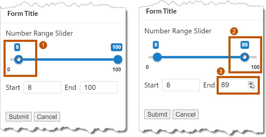
Example of the Number Range Slider form element, shown in a viewer
The Number Range Slider can also be manipulated using keyboard shortcuts. To use keyboard shortcuts, select the Number Range Slider form element with a left-click. Alternatively, you can use the Tab key to toggle between controls until the desired element's control has been selected. You can reverse the tabbing toggle direction by clicking Shift+TAB. Once the desired control has been selected, use the arrow keys to increase or decrease the value. This works for the manual input fields as well as the slider's endpoints.
The Start and End field's numeric value is increased with the Up arrow key and decreased with the Down arrow key.
The slider's endpoints are manipulated with the arrow keys; Down or Left to decrease the value and Up or Right to increase the value.
See also...
Number Range Slider Properties
The Properties table describes the properties of the Number Range Slider form element.
The type of a property defines what types of values the property can have. Many properties are type string, which means that the property's value is text. Boolean properties can be true or false. Some properties have more than one possible type.
Property names in Workflow Designer's Properties panel are written using the capitalization and spacing of a title. Property names in expressions are valid JavaScript identifiers and start with a lower case letter.
In the table below:
▪If a property can be accessed in both the Properties panel and expressions, then the table gives both versions of the name.
▪If a property's name in the table starts with a lower case letter, then you can only access the property in expressions.
▪If a property's name starts with a capital letter and the table does not give a name to use in expressions, then you can only access the property in the Properties panel.
Expressions are case sensitive. When you access a form element property in an expression, you must use the correct capitalization.
Properties of the Number Range Slider Form Element
Accessible Description |
Type: String Name in Properties Panel: Accessible Description Name to Use in Expressions: accessibleDescription An accessible version of the description of the element. The accesible description is not visible on the page; it is hidden. You can use the Accessible Description property to provide a description that can be used by assistive technologies, such as screen readers. |
Currency |
Type: String Name in Properties Panel: Currency Name to Use in Expressions: format.currency The currency to display in Currency or Accounting formats. This property is only shown when the Number Format property is set to "Currency" or "Accounting". The value must be a valid ISO 4217 Currency Code. To access the currency property in an expression: ${Display Form ID}.state.{Element ID}.format.currency For example: $form1.state.numberRangeSlider1.format.currency |
Custom Format |
Type: String Name in Properties Panel: Custom Format Name to Use in Expressions: format.customDisplayFormat The custom format to display numbers in. This property is only shown when the Number Format property is set to "Custom". Relevant and additional information on custom number formatting can be found at Microsoft's Custom Numeric Format Strings. To access the customDisplayFormat property in an expression: ${Display Form ID}.state.{Element ID}.format.customDisplayFormat For example: $form1.state.numberRangeSlider1.format.customDisplayFormat |
Decimal Places |
Type: Number The number of decimal digits to show, for example: ▪0 shows integers (...-2, -1, 0, 1, 2...), for example, 154 or -12; ▪1 shows one decimal place (...-0.2, -0.1, 0, 0.1, 0.2...), for example, 1.9 or -52.0; |
Default Values |
Type: String The numbers that appear in the Start and End fields. This controls the initial end points of the range slider. If you leave the Default Value blank, the Start and End fields will default to the Minimum and Maximum values. Each Default Value is entered one per line (
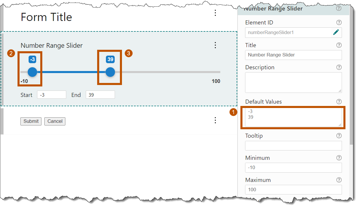 Default values example for the Number Range Slider
The default Start value cannot be less than the Minimum value. The default End value cannot be greater than the Maximum value. |
Description |
Type: String Name in Properties Panel: Description Name to Use in Expressions: description A description of the element. The description appears below the element's title. You can use the Description property to describe what the element represents or to provide instructions to the user about how to use the element. You can format the description using Markdown. |
Element ID |
Type: String The element's ID, which is used in other form elements and activities to access the element's properties, including the user's input. The ID must be unique across all elements in the form. You cannot set the value of the Element ID property in an expression—you can only use the value that you configured for it. To use the Element ID property in an expression: ${Display Form ID}.state.{Element ID}.{property name} For example: $form1.state.numberRangeSlider1.visible |
Enabled |
Type: Boolean Name in Properties Panel: Enabled Name to Use in Expressions: enabled Indicates whether the Number Range Slider element is enabled in the running workflow. When a Number Range Slider element is enabled, the user can select a number range. When a Number Range Slider element is disabled, the user can see the Number Range Slider element, but cannot interact with it. Disabled elements appear dimmed or shaded in the running workflow. By default, Number Range Slider elements are enabled. To disable a Number Range Slider element, clear the Enabled checkbox. You may want to change the property's value at run time depending on the user's input in a previous form element. To access the enabled property in an expression: ${Display Form ID}.state.{Element ID}.enabled For example: $form1.state.numberRangeSlider1.enabled |
error |
Type: String | MarkdownRef Indicates whether an error occurred in the element. We recommend using the Set Form Element Error and Clear Form Element Error activities to work with errors in form elements. |
Maximum |
Type: Number The slider's maximum value. If you leave Maximum blank, the maximum value will be 100. The highest value you can set Maximum to is JavaScript's maximum value. |
Minimum |
Type: Number The slider's minimum value. If you leave Minimum blank, the minimum value will be 0 (zero). The lowest value you can set Minimum to is JavaScript's minimum value. |
Number Format |
Type: String Name in Properties Panel: Number Format Name in expressions: format.displayFormat Available number formats: ▪Number: A localized representation of a number with a decimal separator, group separator, and optional negative sign. ▪Fixed Point: A localized representation of a number with a decimal separator and optional negative sign. ▪Currency: A localized representation of a monetary amount in a specific currency. ▪Accounting: A localized representation of a monetary amount in a specific currency, where negative values may be displayed in brackets (locale dependent). ▪Percent: A localized representation of a percentage. ▪Custom: Use one or more numeric specifiers to define how to format numeric data. Relevant and additional information on custom number formatting can be found at Microsoft's Custom Numeric Format Strings. |
Show Inputs |
Type: Boolean Name in Properties Panel: Show Inputs Name to Use in Expressions: manualEntry Indicates whether inputs should be displayed for manual user entry. Inputs are visible by default. If you want to hide the element, clear the Show Inputs checkbox. 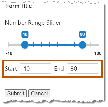 Inputs used for manual entry You may want to change the visibility at run time depending on the user's input in a previous form element. To access the manualEntry property in an expression: ${Display Form ID}.state.{Element ID}.manualEntry For example: $form1.state.numberRangeSlider1.manualEntry |
Show Min/Max Labels |
Type: Boolean Name in Properties Panel: Show Min/Max Labels Name to Use in Expressions: showMinMaxLabels Indicates whether to display the Minimum/Maximum labels under the slider bar. 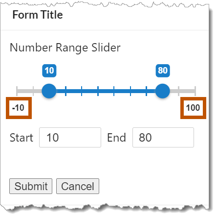 Min and Max labels shown under the slider You may want to change the visibility at run time depending on the user's input in a previous form element. To access the showMinMaxLabels property in an expression: ${Display Form ID}.state.{Element ID}.showMinMaxLabels For example: $form1.state.numberRangeSlider1.showMinMaxLabels |
Show Tick Marks |
Type: Boolean Name in Properties Panel: Show Tick Marks Name to Use in Expressions: showTickMarks Indicates whether to display tick marks for the slider. 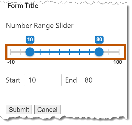 Tick Marks shown on the Number Range Slider Based on the screen resolution and the Step Size value, individual tick marks may not be distinguishable as they would visually blend together. In this case, they would appear as a thicker range slider line. To access the showTickMarks property in an expression: ${Display Form ID}.state.{Element ID}.showTickMarks For example: $form1.state.numberRangeSlider1.showTickMarks |
Type: Number The amount by which the number in the Start or End box increases or decreases each time the user drags the slider or clicks the up arrow or down arrow |
styleName |
Type: String Indicates the name of the style that will be applied to the element. To access the styleName property in an expression: ${Display Form ID}.state.{Element ID}.styleName For example: $form1.state.numberRangeSlider1.styleName |
Title |
Type: String Name in Properties Panel: Title Name to Use in Expressions: title The element's title, which appears at the top of the element. You may want to change the title to describe what the element represents in your workflow. You can format the title using Markdown. |
Title Location |
Type: String Name in Properties Panel: Title Location Name to Use in Expressions: titleLocation Specifies whether the element's title appears above (default) or beside the element. The value must be either "above" or "beside". |
Tooltip |
Type: String Name in Properties Panel: Tooltip Name to Use in Expressions: tooltip A message that displays when the user hovers the mouse pointer over the Number Range Slider. You may want to use the tooltip to provide help to the user. |
type |
Type: String The variety of form element. Number Range Slider elements are type "NumberRangeSlider". Use the type property to find out the variety of a form element in a form with many elements. Loop through ${Display Form ID}.state, comparing each element to the known form types and performing some action on the elements that meet your type criteria. To access the type property in an expression: ${Display Form ID}.state.{Element ID}.type For example: $form1.state.numberRangeSlider1.type |
value |
Type: Number[] An array of numbers that represents the currently selected start and end values. To access the values in an expression: ${Display Form ID}.state.{Element ID}.value[{array index}] For example: $form1.state.numberRangeSlider1.value[0] --(start value) $form1.state.numberRangeSlider1.value[1] --(end value) |
Visible |
Type: Boolean Name in Properties Panel: Visible Name to Use in Expressions: visible Indicates whether the element is visible to the user. By default, Number Range Slider elements are visible. If you want to hide the element, clear the Visible checkbox. You may want to change the visibility at run time depending on the user's input in a previous form element. To access the visible property in an expression: ${Display Form ID}.state.{Element ID}.visible For example: $form1.state.numberRangeSlider1.visible |
Number Range Slider Events
The following table describes the events associated with the Number Range Slider form element.
Events for the Number Range Slider Form Element
load |
The load event fires when the element finishes loading. You can use the load event to set one or more of the element's properties at run time. For example, you could set the element's initial value. |
change |
The change event fires when the user moves the slider's endpoints, clicks an arrow You can use the change event to create dependencies between form elements. For example, you could configure a change subworkflow that enables or disables other form elements depending on the user's selection. The change event fires every time the user's selection changes by one Step Size. This means that the change subworkflow can run multiple times. Because of this, you should make sure that the change subworkflow is not computationally intensive or long running. |
drag |
The drag event is repeatedly fired while an input is dragged. The drag event fires every time the user's selection changes by one Step Size. This means that the drag subworkflow can run multiple times. Because of this, you should make sure that the drag subworkflow is not computationally intensive or long running. |
