Image Form Element
The Image form element displays an image in the form.
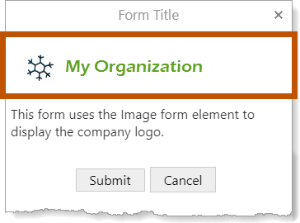
Example of the Image form element, shown in a viewer
Image Properties
The Properties table describes the properties of the
The type of a property defines what types of values the property can have. Many properties are type string, which means that the property's value is text. Boolean properties can be true or false. Some properties have more than one possible type.
Property names in Workflow Designer's Properties panel are written using the capitalization and spacing of a title. Property names in expressions are valid JavaScript identifiers and start with a lower case letter.
In the table below:
- If a property can be accessed in both the Properties panel and expressions, then the table gives both versions of the name.
- If a property's name in the table starts with a lower case letter, then you can only access the property in expressions.
- If a property's name starts with a capital letter and the table does not give a name to use in expressions, then you can only access the property in the Properties panel.
Expressions are case sensitive. When you access a form element property in an expression, you must use the correct capitalization.
Properties of the Image Form Element
|
Accessible Description |
|
Type: String Name in Properties Panel: Accessible Description Name to Use in Expressions: accessibleDescription An accessible version of the description of the element. The accesible description is not visible on the page; it is hidden. You can use the Accessible Description property to provide a description that can be used by assistive technologies, such as screen readers. |
|
Description |
|
Type: String Name in Properties Panel: Description Name to Use in Expressions: description A description of the element. The description appears below the element's title. You can use the Description property to describe what the element represents or to provide instructions to the user about how to use the element. You can format the description using Markdown. |
|
Element ID |
|
Type: String The element's ID, which is used in other form elements and activities to access the element's properties. The ID must be unique across all elements in the form. You cannot set the value of the Element ID property in an expression—you can only use the value that you configured for it. To use the Element ID property in an expression: ${Display Form ID}.state.{Element ID}.{property name} For example: $form1.state.
|
|
error |
|
Type: String | MarkdownRef Indicates whether an error occurred in the element. We recommend using the Set Form Element Error and Clear Form Element Error activities to work with errors in form elements. |
|
Height |
|
Type: Number The height of the image in pixels. You only need to set the height if you want the image to display at a certain height in the form. If you do not configure the height and width, the image displays at its actual size. Note that if the image is larger than the form, part of the image will not be visible. |
|
Image URL |
|
Type: String The fully qualified URL of the image to display in the form. A placeholder |
|
styleName |
|
Type: String
Indicates the name of the style that will be applied to the element. To access the ${Display Form ID}.state.{Element ID}.styleName
For example: $form1.state.
|
|
Title |
|
Type: String Name in Properties Panel: Title Name to Use in Expressions: title The element's title, which appears at the top of the element.
You can format the title using Markdown. |
|
Title Location |
|
Type: String Name in Properties Panel: Title Location Name to Use in Expressions: titleLocation Specifies whether the element's title appears above (default) or beside the element. The value must be either |
|
Tooltip |
|
Type: String Name in Properties Panel: Tooltip Name to Use in Expressions: tooltip A message that displays when the user hovers the mouse pointer over the
|
|
type |
|
Type: String The variety of form element. Use the To access the ${Display Form ID}.state.{Element ID}.type For example: $form1.state.
|
|
Visible |
|
Type: Boolean Name in Properties Panel: Visible Name to Use in Expressions: visible Indicates whether the element is visible to the user. By default,
To access the ${Display Form ID}.state.{Element ID}.visible For example: $form1.state.
|
|
Width |
|
Type: Number The width of the image in pixels. You only need to set the width if you want the image to display at a certain width in the form. If you do not configure the height and width, the image displays at its actual size. Note that if the image is larger than the form, part of the image will not be visible. |
 is used to represent the image in
 Image Events
The following table describes the events associated with the
Events for the Image Form Element
|
load |
|
The
You can use the |