Form Elements
Form elements are the building blocks of forms. When you design a form, the Toolbox contains form elements instead of activities. To build the form, you drag form elements from the Toolbox to the design surface and place them in the order that you want them to appear to the end user. Configuring an element's properties customizes the behavior and appearance of the element. VertiGIS Studio Workflow supports Markdown to format the text in forms.
In a workflow, you can use the Get Form Element Property activity to find out the current value of a particular property. You can change the value of a particular property using the Set Form Element Property activity.
In addition to the built-in form element provided in the Toolbox, you can develop custom form elements to use in web applications. For information, refer to the VertiGIS Studio Workflow Typescript SDK.
Add Form Elements
To add form elements to a form:
-
Double-click the Display Form activity in the flowchart to open the form in the Form Designer.
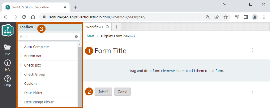
Initially, the form contains header and footer elements. The Toolbox contains the form elements that you can add to the form.

New form, showing the header element (
 ), footer element (
 ), and the Toolbox (
 ) of form elements
 -
In the Toolbox, find a form element that you want to add to the form. Drag the element to the design surface and drop it between the header and footer elements.
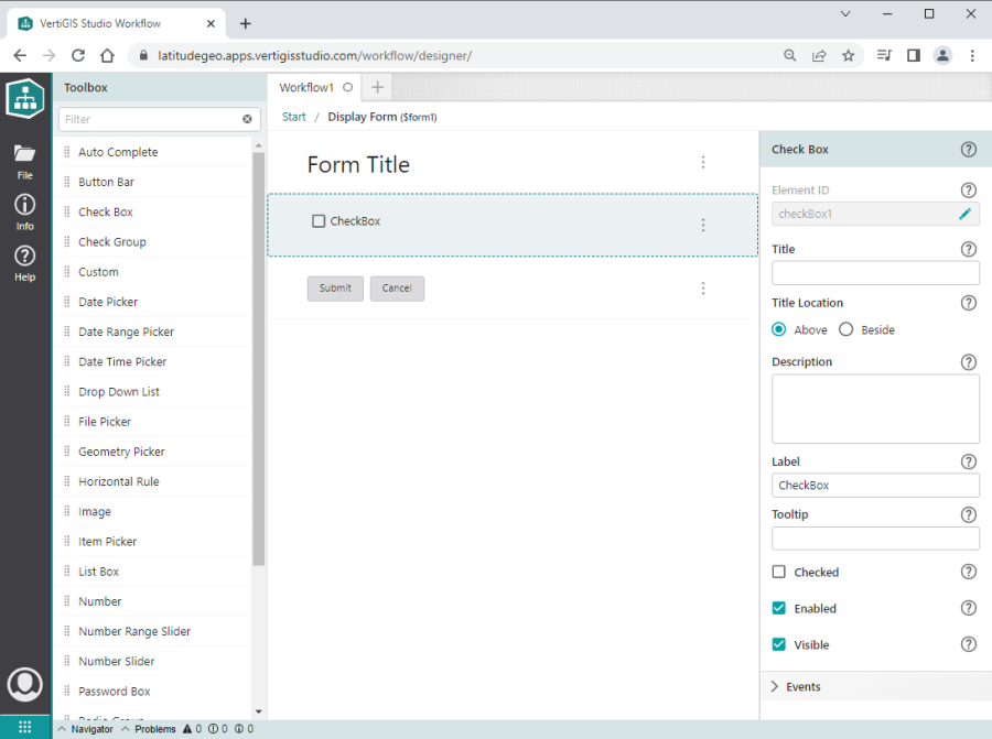
The element is automatically selected to show its properties.

Form with a Check Box element selected to show its properties
-
Configure the form element's properties.
For information about the individual properties, refer to the form element's page in the Form Element Reference.
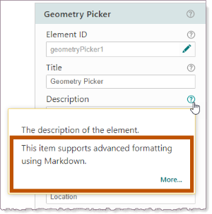
Some text properties support Markdown to format the text. To check whether a property supports Markdown, hover the pointer over the property's help icon
 . Click More to open the table of Markdown syntax.
 -
Optionally configure events for the form element.
-
Continue to add and configure form elements until you have added all the elements you want.
The order of the form elements in the Form Designer is the order they appear to the user. You can add a form element to any position between the header and footer.
-
If necessary, re-order the form elements by dragging them to the desired position on the design surface.
You cannot move the header or footer.
-
Use the breadcrumbs at the top of the design surface to exit the Form Designer.
Types of Form Elements
VertiGIS Studio Workflow has the following customizable form elements:
-
Auto Complete: A text input that presents suggestions based on what the user types.
-
Button Bar: A list of buttons.
-
Check Box: A single checkbox input.
-
Check Group: A list of checkbox inputs.
-
Custom: Custom developed form elements.
-
Date Picker: An input that allows the user to select a date using a calendar.
-
Date Range Picker: An input that allows the user to select a range of dates.
-
Date Time Picker: An input that allows the user to select a date and time using a calendar and time selector.
-
Drop Down List: An input that allows the user to select a single item from a list.
-
File Picker: An input that allows the user to select one or more files from the file system.
-
Geometry Picker: An input that allows the user to draw one or more geometries on a map.
-
Header: The form's header, which contains the form's title.
-
Horizontal Rule: A horizontal line used to separate content.
-
Image: An element that displays an image.
-
Item Picker: An element that displays a list of items and optionally allows the user to select items.
-
List Box: An input that allows the user to select one or more items from a list.
-
Number: An input that allows the user to select a number.
-
Number Range Slider: An input that allows the user to select a range of numbers using a double-ended slider control.
-
Number Slider: An input that allows the user to select a number using a slider control.
-
Password Box: A single-line text input that conceals the text so that it cannot be read.
-
Radio Group: An input that allows the user to select one option from a set of options.
-
Scanner: An element that allows the user to scan a barcode or QR code using their device's camera.
-
Section: An element that groups the elements in a form into sections.
-
Signature: An element that allows the user to sign their name.
-
Sketch: An element that allows the user to draw on an image.
-
Text: An element that displays text.
-
Text Area: A multi-line text input.
-
Text Box: A single-line text input.
-
Time Picker: An input that allows the user to select a time.
Format Text in a Form
You can improve the appearance and effectiveness of your forms by formatting the text that you display to the user. Workflow Designer supports Markdown, a simple method of adding formatting like headers, lists, bold text, and more. You can also add hyperlinks to the text.
Text is formatted at the level of individual form element properties. Properties that display text in the main body of the form, like a form element's title and description, can be formatted. To check whether a particular setting supports formatting, hover the pointer over the setting's help icon ![]() in the Properties panel. The help indicates whether the property supports formatting. To open the Markdown Syntax table, click the More hyperlink.
in the Properties panel. The help indicates whether the property supports formatting. To open the Markdown Syntax table, click the More hyperlink.

Example of a property that supports Markdown
To use Markdown, you precede or surround the text with the Markdown characters for the formatting you want. For example, if you surround a sentence with asterisks (*), (*This sentence is italics*), then the sentence will appear italics in the form (This sentence is italics).
The Form Designer shows the formatted text, so you can see what the formatting will look like in the running workflow.
If you want to use a Markdown character as itself in a setting that supports Markdown, put a backslash (\) before the character. For example, if you want a hash at the beginning of a line (#10 Downing Street), enter \# at the beginning of the line (\#10 Downing Street). This prevents the hash from being interpreted as the Markdown character for a heading.
Some formats require more than one line. For example, a list with three items requires three lines. However, some settings in Workflow Designer do not allow you to enter more than one line. For example, you cannot enter multiple lines into a Title property. If pressing Enter does not go to a new line when you are configuring a setting, then the setting only allows one line.
If the information that you want to display requires more than one line, add a Text element to your form. The Text element's Description property allows you to enter as many lines as you want.
The following table summarizes the syntax to add Markdown formatting to form element properties.
|
Format
|
Example |
Description
|
|
|
This configuration... |
Displays as... |
||
|
Italics |
This is *italics.* or This is _italics._ |
This is italics. |
To display italics text, put an asterisk (*) or an underscore (_) at each end of the text. |
|
Bold |
This is **bold.** or This is __bold.__ |
This is bold. |
To display bold text, put two asterisks (**) or two underscores (__) at each end of the text. |
|
Headings |
# Main Heading ## Second-level Heading ### Third-level Heading |
Main Heading Second-level Heading Third-level Heading |
To display a top-level heading, put a hash (#) at the beginning of the paragraph. Put two hashes (##) for second-level headings, three hashes (###) for third-level headings, and so on. |
|
Inline Monospace |
The site at `https://vertigisstudio.com` provides samples. |
The site at |
To display a single line or part of a line of text in a monospace font and preserve the number of spaces in the original text, put backticks (`) at the beginning and end of the text. You cannot nest Markdown within Inline Monospace text. Characters like asterisks (*), underscores (_), and hashes (#) will appear as themselves in the running workflow. They are not interpreted as Markdown characters within Inline Monospace text. |
|
Hyperlink |
[VertiGIS Studio Website](https://vertigisstudio.com) or <https://vertigisstudio.com> |
or |
The pattern to put a hyperlink in the text is: [link text](URL) Replace Alternatively, if you want to use the URL as the link text, you can use this pattern: <URL> |
|
Horizontal Rule |
This is a horizontal line. |
This is a horizontal line. |
To enter a horizontal line, type three or more underscores (___) on a new line. |
|
New Line |
This is the first line.\
|
This is the first line. |
To go to a new line, type a backslash (\) and press Enter. The New Line Markdown has no effect in settings that only allow a single line. |
|
Bulleted List |
- First list item or * First list item |
|
To display a bulleted list, put a dash (-) or an asterisk (*) at the beginning of each list item. The Bulleted List Markdown will not render a multi-line list in a setting that only allows a single line. |
|
Numbered List |
1. This is the first step. or 1) This is the first step. |
1. This is the first step. |
To display a numbered list, put a number followed by a period or a closing bracket at the beginning of each step, for example, 1. or 1). The list starts at whatever number you use in the first step. It doesn't matter what numbers you use in subsequent steps—the numbers will increment by 1. To end the list, press Enter twice at the end of the last step. The Numbered List Markdown will not render a multi-line list in a setting that only allows a single line. |