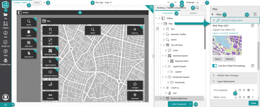
Mobile Designer User Interface
Mobile Designer is where you configure, deploy, build, and begin the distribution of Mobile apps.

|
Taskbar: A list of icons that allow you to select high-level tasks. Clicking the icon displays a panel containing tools you need to accomplish each task, for example, creating a new app, deploying an app to testing or production or opening the Help. |

|
Layout Tab: Displays the title of the layout and includes a menu of layout actions. |

|
Add Layout: Add a new layout to this app. |

|
Application Name: The name given to this app when it was saved. A circle beside the name indicates unsaved changes. |

|
Undo / Redo Buttons: Undoes or redoes changes to the app such as configuration or layout changes. |

|
Pinpoint Search: Pinpoint Search allows you to search for components, services, settings, layers, fields and operations. |

|
Language Menu: Allows for localization of your app. |

|
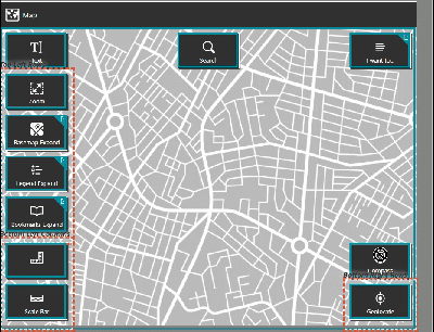
App Preview: Provides a visual representation of your app layout and helps you navigate the Components settings. See App Preview for more information. |

|
Enable selection of components: When selected, this allows previously added components to be relocated via drag and drop. This provides for moving components between different slots, switching positions by moving a component on top of other components, moving components in and out of rows and columns, and moving rows or columns by dragging their borders.
Container components, other than rows and columns, do not support dragging into at this time.
|

|
Components Panel: Displays the components of the layout in a tree-like hierarchy. You can also toggle between components and services. Click a component or service to open its configuration panel. |

|
Panel Subtitle:The subtitle provides context about the settings of the panel. For example, when you view the settings of a layer, the subtitle changes to the name of the layer. |

|
Configuration Options Menu: Displays the menu that allows you to import components from other apps or templates, or to export them, or revert a component configuration to the default settings. |

|
One-click Settings and Expand Arrow: Icons that you can click to instantly change the settings of this item. For example, Disable Identify |

|
Add/Remove Component Button: By default, opens the Toolbox panel, which contains components you can add to your layout. If you drag an existing component into it, the button becomes the Remove Component button and the dragged component is removed. |

|
Switch to Another VertiGIS Studio Product: Clicking this button will allow you to quickly switch to another VertiGIS Studio product. If the product is already open in a different browser tab, selecting the product will take you to that tab instead of opening a new tab. Only available in the SaaS version. |
 Disable Search
  , Disable Edit Button
  and Disable Delete Button
  for a particular layer. You can click the arrow
  to expand another panel of settings to apply to that particular item.
 App Preview
The App Preview is intended as a conceptual guide to the layout of your app; it allows you to see where the components will appear. You can select a component to view its configuration without having to navigate to it in the Components panel.
The layout of the App Preview is determined by the following:
-
The selected template when you created the app.
-
The selected app layout (i.e., Desktop/Tablet or Phone).
The App Preview is captured in the Taskbar window, and includes the map and the app components.
You can click anywhere on the map to open the Components panel to the Map Settings, so you can see which web map is in use.
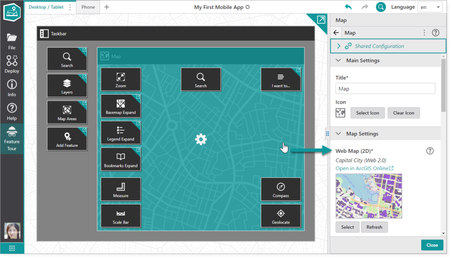
You can select a component in the App Preview to open its configuration settings.
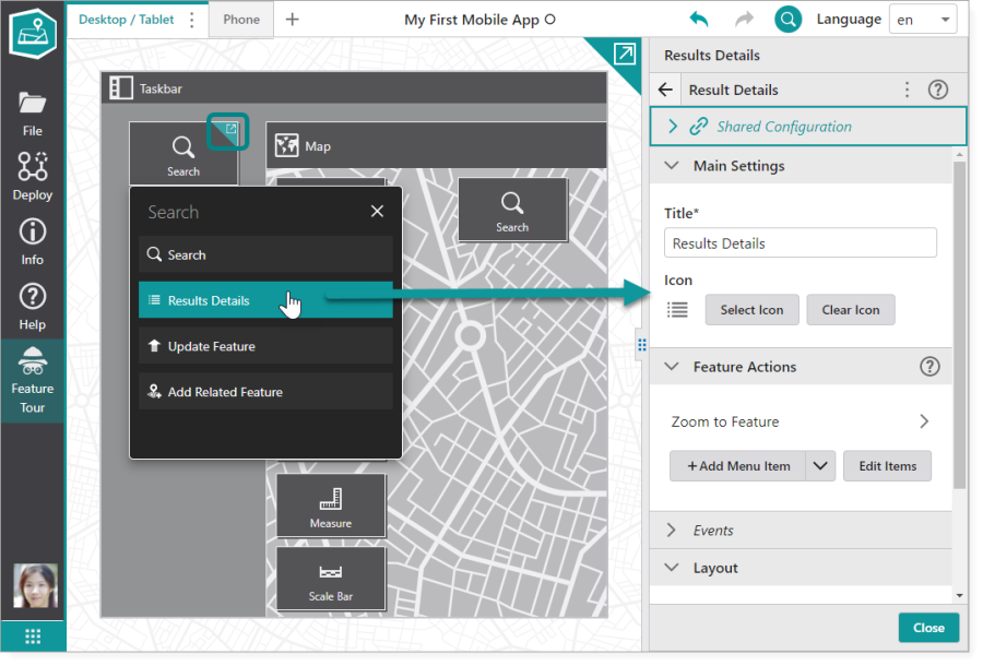
Components with sub-components are indicated by an expandable arrow icon in the top right corner. Click the icon to access the list of sub-components. Then, select the sub-component to open its configuration settings.
See also...