Component Settings
You can change the settings for any component in a VertiGIS Studio Mobile (Mobile) app. The settings for components are accessible from the Components panel, which appears when you create or open an app.
In Mobile Designer, you can use Pinpoint Search  (CTRL+SHIFT+F) to easily find any component. The following section lists each component by its type, since component titles can be changed arbitrarily. To determine the type of a component, hover the mouse cursor over the component's icon in the Components panel.
About Shared Configuration
Some components are linked with one or more other components, as indicated by  Shared Configuration near the top of the panel of the component. Changing settings (other than layout settings) of such components may affect the configuration of components with which they are linked. To see which components a component is linked with, click Shared Configuration. If the linked component belongs to a different layout, the layout is also displayed.
You can unlink a component's configuration from other components so that you can edit the configuration of those other components separately.
To unlink a component's configuration from other components:
-
In the Components panel, click the component with shared configuration that you want to unlink.
-
Click
Shared Configuration.Any other components linked to this component are displayed. If the linked component belongs to a different layout, the layout is also displayed.
-
Click
 Unlink.
The configuration of this component is now unlinked from other components. You can now edit the configuration of those other components separately.
Basemap Picker Settings 
You can change the following basemap picker settings:
Main Settings
-
Title: Type a title to display for the component.
-
Icon: To select an icon to represent the component, click Select Icon, click the desired icon and click OK. To remove the icon, click Clear Icon.
Additional Basemaps
You can configure two kinds of basemaps for the user to select:
-
Esri Basemap: These are the well-known standard Esri basemaps.
-
Custom Basemap: Create your own basemap with whichever layers you want.
-
Offline Basemap: Create a basemap from Tile Package files (TPK/TPKX/VTPK) that can be used offline.
Basemap layers are typically drawn at the bottom of other layers, although a custom basemap may contain reference layers, which are drawn on top of all other layers.
All basemaps, reference layers and base layers should ideally use exactly the same spatial reference as the web map specified in the Map Settings.
To add an Esri basemap:
-
In the Components panel, select Basemap Picker.
-
In the Basemap Picker panel, click +Add Esri Basemap.
The Esri Basemap window appears.
-
In the Esri Basemap window, from the Basemap menu, select a standard Esri basemap.
-
Click Submit.
The Esri Basemap panel appears.
-
In the Esri Basemap panel, you can set the following:
-
Title: The title of the basemap as it will appear in the basemap picker.
-
Basemap: The standard Esri basemap to use as the basemap.
-
To add a custom basemap:
-
In the Components panel, select Basemap Picker.
-
In the Basemap Picker panel, click
 beside +Add Esri Basemap and click Add Custom Basemap.
 -
In the Custom Basemap window, set the following:
-
Title: The title of the basemap as it will appear in the basemap picker.
-
Thumbnail Image URL: The URL for an image you want to use as the thumbnail in the basemap picker.
-
-
Click Submit.
The Custom Basemap panel appears.
-
In the Custom Basemap panel, set the following:
-
Title: The title of the basemap as it will appear in the basemap picker.
-
Thumbnail Image URL: The URL for an image you want to use as the thumbnail in the basemap picker.
-
Reference Layers: These layers are drawn on top of all other layers. They are typically text label layers such as street names.
To add a reference layer:
-
In the Custom Basemap panel, click +Add Layer.
-
Select the reference layers you want to add as part of the custom basemap. You can search for a reference layer to use by name or portal item ID. You can search reference layers you own, reference layers shared with you or public reference layers.
-
Click Select.
To edit a reference layer:
-
In the Custom Basemap panel, in the Reference Layers section, click the name of the reference layer.
-
Change any of the following reference layer settings:
-
Layer: Click Select to select a different reference layer.
-
Transparency: The transparency of the offline base layer represented by a percentage between 0 (opaque) and 100 (transparent).
-
Maximum Scale: The maximum visible scale of the reference layer.
-
Minimum Scale: The minimum visible scale of the reference layer.
-
-
Click the back button
 .
.
To reorder a reference layer:
-
In the Custom Basemap panel, in the Reference Layers section, click Edit Items.
-
Drag the reference layer up or down to the position you want.
-
Click Done.
To delete a reference layer:
-
In the Custom Basemap panel, in the Reference Layers section, click Edit Items.
-
Click the Delete icon
 .
. -
Click Done.
-
-
Base Layers: These layers are drawn at the bottom of the other layers.
To add a base layer:
-
In the Custom Basemap panel, click +Add Layer.
-
Select the base layers you want to add as part of the custom basemap. You can search for a base layer to use by name or portal item ID. You can search base layers you own, base layers shared with you or public base layers.
-
Click Select.
To edit a base layer:
-
In the Custom Basemap panel, in the Base Layers section, click the name of the base layer.
-
Change any of the following base layer settings:
-
Layer: Click Select to select a different base layer.
-
Transparency: The transparency of the offline base layer represented by a percentage between 0 (opaque) and 100 (transparent).
-
Maximum Scale: The maximum visible scale of the base layer.
-
Minimum Scale: The minimum visible scale of the base layer.
-
-
Click the back button
.
To reorder a base layer:
-
In the Custom Basemap panel, in the Base Layers section, click Edit Items.
-
Drag the base layer up or down to the position you want.
-
Click Done.
To delete a base layer:
-
In the Custom Basemap panel, in the Base Layers section, click Edit Items.
-
Click the Delete icon
. -
Click Done.
-
-
To create an offline basemap:
-
In the Components panel, select Basemap Picker.
-
In the Basemap Picker panel, click
beside +Add Esri Basemap and click Add Offline Basemap. -
In the Offline Basemap window, set the Title of the basemap as it will appear in the basemap picker.
-
Click Submit.
The Offline Basemap panel appears.
-
In the Offline Basemap panel, set the following:
-
Title: The title of the basemap as it will appear in the basemap picker.
-
Base Layers: These layers are drawn at the bottom of the other layers.
To add a base layer:
-
In the Offline Basemap panel, click +Add Offline Layer.
-
Type the Title you want for the offline base layer.
-
Click Submit.
To edit a base layer:
-
In the Offline Basemap panel, in the Base Layers section, click the name of the offline base layer.
-
Change any of the following base layer settings:
-
Title: The title of the offline base layer.
-
Source: To use an Esri portal item as the source for the offline base layer, click Select, select a layer and click Select.
If the Source setting is set, the File Name setting is automatically set and cannot be changed until the Source is removed. If you set the Source, the Tile Package file (TPK/TPKX/VTPK) does not need to be manually sideloaded onto the device.
If you cannot find the offline base layer, try selecting a different option in the Filter by menu.
To remove the source, click Remove.
-
File Name: The file name of the Tile Package file (TPK/TPKX/VTPK) for the offline base layer.
If the Source setting is set, the File Name setting is automatically set and cannot be changed until the Source is removed. If you set the Source, the Tile Package file (TPK/TPKX/VTPK) does not need to be manually sideloaded onto the device.
-
Transparency: The transparency of the offline base layer represented by a percentage between 0 (opaque) and 100 (transparent).
-
Maximum Scale: The maximum visible scale of the offline base layer.
-
Minimum Scale: The minimum visible scale of the offline base layer.
-
-
Click the back button
.
To reorder a base layer:
-
In the Offline Basemap panel, in the Base Layers section, click Edit Items.
-
Drag the base layer up or down to the position you want.
-
Click Done.
To delete a base layer:
-
In the Offline Basemap panel, in the Base Layers section, click Edit Items.
-
Click the Delete icon
. -
Click Done.
-
-
To edit a basemap:
-
In the Components panel, select Basemap Picker.
-
In the Basemap Picker panel, click the name of the basemap.
-
Change the basemap settings you want.
To reorder a basemap:
-
In the Components panel, select Basemap Picker.
-
In the Basemap Picker panel, click Edit Items.
-
Drag the basemap up or down to the position you want.
-
Click Done.
To delete a basemap:
-
In the Components panel, select Basemap Picker.
-
In the Basemap Picker panel, click Edit Items.
-
Click the Delete icon
. -
Click Done.
Layout
-
Margin (px): The margin space around the component in pixels.
-
Initially Hidden: Specifies whether or not the component is initially hidden when the app loads. If selected, the component remains hidden unless activated, for example, by the
Showcommand. -
Map: The Map component this component affects. This setting cannot be modified if this component is either a subcomponent of a Map component or there is only a single Map component in the app.
Bookmarks Settings 
You can change the following bookmarks settings:
Main Settings
-
Title: Type a title to display for the component.
-
Icon: To select an icon to represent the component, click Select Icon, click the desired icon and click OK. To remove the icon, click Clear Icon.
Layout
-
Margin (px): The margin space around the component in pixels.
-
Initially Hidden: Specifies whether or not the component is initially hidden when the app loads. If selected, the component remains hidden unless activated, for example, by the
Showcommand. -
Button Style: The style of the button. Choose between rounded or square.
Button Settings 
You can change the following button settings:
Main Settings
-
Title: Type a title for the button.
-
Icon: To select an icon to represent this button, click Select Icon, click the desired icon and click OK. You do not need to have an icon, you can just have words to represent the button. To remove the icon, click Clear Icon.
-
Command: The command to run when a user taps the button. A command is an action the app should perform.
To select the command you want, click the box that contains the current command followed by
 . The list of available commands depends on the context of the component.
Some commands have additional settings you can configure.
To turn your command into a custom command, click
 . A code box appears in which you can manually edit the JSON code for the command. Turning your command into a custom command is a one-way operation.
To run multiple commands, click
and, in the code box, type a sequence of commands in JSON format. While editing the custom command in the code box, press CTRL+Space to access code suggestions.
Behavior
-
Hide when Disabled: Whether to hide the button when the command cannot be executed.
-
Can be Toggled: Whether the button can be toggled between two states. If the button can be toggled, you can specify the behavior of the button for both states as well as whether the button is toggled by default.
Layout
-
Slot: The location of this component within its parent component, assuming the parent component has slots. The possible values depend on the parent component's slots.
-
Margin (px): The margin space around the component in pixels.
-
Initially Hidden: Specifies whether or not the component is initially hidden when the app loads. If selected, the component remains hidden unless activated, for example, by the
Showcommand. -
Button Style: The style of the button. Choose between rounded or square.
-
Show Title: Whether to display the title, in case you only want to display the icon.
Columns Settings 
The Columns component is a layout component that can contain other components, each of which are displayed horizontally. For more information, see Columns.
Main Settings
-
Title: Type a title to display for the component.
-
Icon: To select an icon to represent the component, click Select Icon, click the desired icon and click OK. To remove the icon, click Clear Icon.
Layout
-
Horizontal Alignment: Sets the horizontal position of any fixed-width components within. Has no visible effect on any component within whose width automatically grows to the size of the parent.
-
Vertical Alignment: Sets the vertical position of any fixed-height components within. Has no visible effect on any component within whose height automatically grows to the size of the parent.
-
Width: Specifies the width of the component. If Fixed Size is not selected, the width is an approximate percentage of the width of the parent component. If Fixed Size is selected, the width is in pixels and will not change when other component sizes are changed.
-
 /
/
 : Click to toggle whether the Width or Height of the component is unlocked or locked . When a size is locked, it will not change when other component sizes are changed. This setting only appears when there are three or more components whose sizes are not fixed.
 -
Fixed Size: Whether the Width or Height of the component is a percentage relative to the size of the parent component or a fixed size in pixels. If Fixed Size is selected, the size will not change when other component sizes are changed.
-
Slot: The location of this component within its parent component, assuming the parent component has slots. The possible values depend on the parent component's slots.
-
Margin (px): The margin space around the component in pixels.
-
Initially Hidden: Specifies whether or not the component is initially hidden when the app loads. If selected, the component remains hidden unless activated, for example, by the
Showcommand.
Compass Settings 
The Compass component allows users to know which direction is north on the map.
The compass only appears when the map is not north-oriented.
-
Title: Type a title to display for the component.
-
Icon: To select an icon to represent the component, click Select Icon, click the desired icon and click OK. To remove the icon, click Clear Icon.
-
Margin (px): The margin space around the component in pixels.
-
Slot: The location of this component within its parent component, assuming the parent component has slots. The possible values depend on the parent component's slots.
-
Initially Hidden: Specifies whether or not the component is initially hidden when the app loads. If selected, the component remains hidden unless activated, for example, by the
Showcommand.
Dialog Settings 
Main Settings
-
Title: Type a title to display for the component.
-
Icon: To select an icon to represent the component, click Select Icon, click the desired icon and click OK. To remove the icon, click Clear Icon.
Layout
-
Margin (px): The margin space around the component in pixels.
-
Initially Hidden: Specifies whether or not the component is initially hidden when the app loads. If selected, the component remains hidden unless activated, for example, by the
Showcommand. -
Map: The Map component this component affects. This setting cannot be modified if this component is either a subcomponent of a Map component or there is only a single Map component in the app.
Disconnected Mode Settings 
This feature is designed to give users manual control over offline functionality. With Disconnected Mode, users can force the app to stop making network requests while their device remains online. This is particularly useful in areas with intermittent or unreliable connectivity, preventing failed processes and ensuring a smoother offline experience. The mode can be activated via a toggle button within the app settings or triggered programmatically using new commands, offering flexibility for different workflows.
If a Disconnected Mode component is added, the icon should appear when Disconnected Mode is on, and disappear when Disconnected Mode is off. However, if the component's visibility is set to 'Hidden', the icon should never appear regardless of the Disconnected Mode state.
The state of Disconnected Mode persists, meaning if the app is closed while Disconnected Mode is activated, it will remain activated at the next startup, and vice versa.
To ensure Disconnected Mode is turned on at the initial app startup, go to Services > App and toggle the Initial Disconnected Mode to the active position. This applies only to the initial app startup. When the user changes the settings in the app, the Disconnected Mode setting is saved and overrides the initial setting at the next startup.
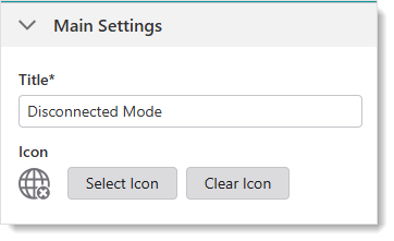
Main Settings
-
Title: Type a title to display for the component.
-
Icon: To select an icon to represent the component, click Select Icon, click the desired icon and click OK. To remove the icon, click Clear Icon.
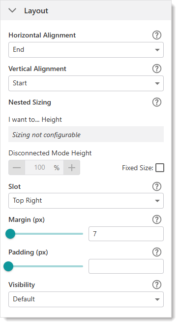
Layout
-
Horizontal Alignment: Sets the horizontal position of any fixed-width components within. Has no visible effect on any component within whose width automatically grows to the size of the parent.
-
Vertical Alignment: Sets the vertical position of any fixed-height components within. Has no visible effect on any component within whose height automatically grows to the size of the parent.
-
Height: Specifies the height of the component. If Fixed Size is not selected, the height is an approximate percentage of the height of the parent component. If Fixed Size is selected, the height is in pixels and will not change when other component sizes are changed.
-
Fixed Size: Whether the Width or Height of the component is a percentage relative to the size of the parent component or a fixed size in pixels. If Fixed Size is selected, the size will not change when other component sizes are changed.
-
Slot: The location of this component within its parent component, assuming the parent component has slots. The possible values depend on the parent component's slots.
-
Margin (px): The margin space around the component in pixels.
-
Padding (px): The space between the icon and the outer edges of the component.
-
Visibility: Controls the visibility of the component, either Visible (default) or Hidden.
Three new operations were added for Disconnect Mode:
-
network.enable-web-requests - Command that enables web requests. This turns Disconnected Mode off.
-
network.disable-web-requests - Command that disables web requests. This turns Disconnected Mode on.
-
network.are-web-requests-disabled - Operation that returns a boolean value (Disconnected Mode on or off).
Expand Settings 
The Expand component is a layout component that can contain other components, each of which are displayed vertically once the Expand component is clicked. For more information, see Expand.
Main Settings
-
Title: Type a title to display for the component.
-
Icon: To select an icon to represent the component, click Select Icon, click the desired icon and click OK. To remove the icon, click Clear Icon.
Layout
-
Horizontal Alignment: Sets the horizontal position of any fixed-width components within. Has no visible effect on any component within whose width automatically grows to the size of the parent.
-
Vertical Alignment: Sets the vertical position of any fixed-height components within. Has no visible effect on any component within whose height automatically grows to the size of the parent.
-
Height: Specifies the height of the component. If Fixed Size is not selected, the height is an approximate percentage of the height of the parent component. If Fixed Size is selected, the height is in pixels and will not change when other component sizes are changed.
-
Fixed Size: Whether the Width or Height of the component is a percentage relative to the size of the parent component or a fixed size in pixels. If Fixed Size is selected, the size will not change when other component sizes are changed.
-
Slot: The location of this component within its parent component, assuming the parent component has slots. The possible values depend on the parent component's slots.
-
Margin (px): The margin space around the component in pixels.
-
Initially Hidden: Specifies whether or not the component is initially hidden when the app loads. If selected, the component remains hidden unless activated, for example, by the
Showcommand. -
Button Style: The style of the button. Choose between rounded or square.
-
Show Title: Whether to display the title, in case you only want to display the icon.
-
Show Icon: Whether to display the icon, in case you only want to display the title.
Geolocate Settings 
The Geolocate component allows user to locate their position on the map.
Main Settings
-
Title: Type a title to display for the component.
-
Icon: To select an icon to represent the component, click Select Icon, click the desired icon and click OK. To remove the icon, click Clear Icon.
Layout
-
Margin (px): The margin space around the component in pixels.
-
Initially Hidden: Specifies whether or not the component is initially hidden when the app loads. If selected, the component remains hidden unless activated, for example, by the
Showcommand.
Geometry Toolbar Settings 
The geometry toolbar contains tools that work with geometry.
Main Settings
-
Title: Type a title to display for the component.
-
Icon: To select an icon to represent the component, click Select Icon, click the desired icon and click OK. To remove the icon, click Clear Icon.
Layout
-
Slot: The location of this component within its parent component, assuming the parent component has slots. The possible values depend on the parent component's slots.
-
Margin (px): The margin space around the component in pixels.
-
Initially Hidden: Specifies whether or not the component is initially hidden when the app loads. If selected, the component remains hidden unless activated, for example, by the
Showcommand. -
Button Style: The style of the button. Choose between rounded or square.
I Want To Menu Settings 
You can change any menu item on the I Want To menu or the title of the I Want To menu itself. You can also add custom items to the menu or delete those you do not want.
Main Settings
-
Title: Type in a new title for the I Want To menu itself.
-
Icon: To select an icon to represent the component, click Select Icon, click the desired icon and click OK. To remove the icon, click Clear Icon.
Menu Items
-
Click a menu item or the arrow
 to open an existing menu item. You can set the following:
 -
Title: Change the name of the menu item to what you want it to be in the I Want To menu.
-
Icon: Replace the existing icon with a different one. The new icon will appear beside the text of that item in the I Want To menu. If you do not want an icon, click Clear Icon.
-
Command: The command to run when a user taps the menu item. A command is an action the app should perform.
-
Hide when Disabled: Select this option if you want the menu item to disappear rather than appear disabled, if it cannot be used for any reason.
-
To add a menu item:
-
In the Components panel, select I want to....
-
In the Menu panel, click +Add Menu Item.
To add a divider between menu items, click
beside +Add Menu Item, and then click Add Divider.
To position the divider, click Edit Items, drag the divider into place, and then click Done.A window appears that lets you select a command or workflow.
-
Click one of the following tabs as appropriate:
-
Commands: Select the command you want to run, and click Select.
-
Workflows: Select the workflow you want to run, and click Select. Alternatively, to create a new Workflow, click Create a new Workflow. After adding the workflow, you can set its Title and Icon.
-
-
Click the new menu item to edit it.
-
In the Menu Item panel, set the following:
-
Title: Type in a title for this menu item as it will appear in the I Want To menu. For example, Switch to Results Table.
-
Description: Type an explanation of what this menu item will do when you click it. For example, Switches to viewing search results in a table.
-
Icon: To select an icon to represent this menu item, click Select Icon, click the desired icon and click OK. You do not need to have an icon, you can just have words to represent the menu item. To remove the icon, click Clear Icon.
-
Command: The command to run when a user taps the menu item. A command is an action the app should perform.
To select the command you want, click the box that contains the current command followed by
. The list of available commands depends on the context of the component.Some commands have additional settings you can configure.
To turn your command into a custom command, click
. A code box appears in which you can manually edit the JSON code for the command. Turning your command into a custom command is a one-way operation.To run multiple commands, click
and, in the code box, type a sequence of commands in JSON format. While editing the custom command in the code box, press CTRL+Space to access code suggestions.For example, the following custom command uses the map.zoom-to-viewpoint command and adds the ability to zoom to a specific point on the map.
Copy[
{
"name": "map.zoom-to-viewpoint",
"arguments": {
"viewpoint": {
"targetGeometry": {
"xmin": "-13727411.901",
"ymin": "6183163.201",
"xmax": "-13726074.253",
"ymax": "6181204.502",
"spatialReference": {
"wkid": 102100,
"latestWkid": 3857
}
}
}
}
}
] -
Hide when Disabled: Whether to hide the menu item when the command cannot be executed.
-
Can be Toggled: Whether the menu item can be toggled between two states. If the menu item can be toggled, you can specify the behavior of the menu item for both states as well as whether the menu item is toggled by default.
-
-
-
Layout
-
Slot: The location of this component within its parent component, assuming the parent component has slots. The possible values depend on the parent component's slots.
-
Margin (px): The margin space around the component in pixels.
-
Initially Hidden: Specifies whether or not the component is initially hidden when the app loads. If selected, the component remains hidden unless activated, for example, by the
Showcommand.
Layer List Settings 
The Layer List displays the layers and basemaps of the map, and allows users to change their visibility on the map.
Main Settings
-
Title: Type a title to display for the component.
-
Icon: To select an icon to represent the component, click Select Icon, click the desired icon and click OK. To remove the icon, click Clear Icon.
Layer Extensions
-
Select the layer list settings for each layer:
-
Disable/Enable Included
 : Click the icon to toggle whether this layer is included in the layer list.
 This setting does not affect the layer's visibility on the map.
-
Open the layer
 : Click the arrow to open this layer's settings:
-
Included
 : Toggles whether this layer is included in the layer list.
This setting does not affect the layer's visibility on the map.
-
-
Layout
-
Margin (px): The margin space around the component in pixels.
-
Initially Hidden: Specifies whether or not the component is initially hidden when the app loads. If selected, the component remains hidden unless activated, for example, by the
Showcommand. -
Map: The Map component this component affects. This setting cannot be modified if this component is either a subcomponent of a Map component or there is only a single Map component in the app.
Layer Presets Settings 
Use the Layer Presets component to create tailored views of your map data that highlight information relevant to your user.
Configuring layer presets allows you to maintain a single app with many layers, rather than creating multiple web apps for different purposes.
You can configure a layer preset to do the following:
-
Apply a different basemap to provide the most effective background for the data you want to emphasize.
-
Show or hide layers in the layer list to focus your users' attention on the relevant information.
-
Set a group extension to be expanded, collapsed, or retain its current state when the preset is applied.
These are the best practices to follow if you want to edit a layer preset.
You can also import a layer preset from Portal, making it easier to migrate complex configurations without manually rebuilding them.
Create a Layer Preset
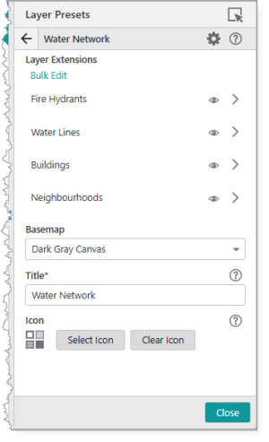
The procedure below shows you how to create a layer preset. As our example, we create a layer preset called "Water Network". When the user selects this preset, all fire hydrants and water lines appear on the map and remain visible regardless of how far out the user zooms.
When you create a layer preset, you may want to also create a default preset that resets the view back to its original state.
To create a layer preset:
- Add a Layer Presets component to your app, or select an existing one.
-
Click Add Layer Preset and give your new preset a descriptive Title (for example, ours is called Water Network).
-
Click the new layer preset to open its settings.
-
Use the Visibility icon (
 ) to configure the visibility for each layer extension. The available options are:
-
No Changes: Leaves the layer's current visibility state unchanged.
This option is the most flexible. It allows you to apply a preset to manage a group of layers without affecting other layers a user may have manually enabled. This is especially useful if you want your layer presets to apply definition expressions to certain layers but leave all other layers untouched.
-
Visible: Forces the layer to be visible when the preset is applied.
-
Not Visible: Forces the layer to be hidden when the preset is applied.
In our example, we want to make the Fire Hydrants and Water Lines layers visible and hide the Buildings and Neighbourhoods layers.
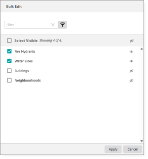
To apply a visibility setting to multiple layers at the same time, click Bulk Edit.
-
-
Select a Basemap that emphasizes your data. For our example, we use Dark Gray Canvas.
-
Click Back ()to return to the settings for the layer preset.
-
Configure the Layout settings, described in the table below.
Setting
Description
Adjust component size
Redirects you to the settings for the parent component so you can resize it. Margin (px)
The space around the component, measured in pixels.
Padding (px)
The space inside the component, measured in pixels.
Visibility
Determines how the component appears in the app. The options are as follows:
-
Default: Defers to each component's default "autoActivate" property, which determines the default behavior on startup.
-
Visible: Displays the component on app startup.
A parent component with hidden visibility will hide its children components until the parent becomes visible.
-
Hidden: Hides the component on app startup and requires an action or trigger to make it appear.
Map
The map that this component depends on.
If a map is an ancestor of this component, or if there is only one map in the app, the dependency is automatically inferred and cannot be manually set.
-
-
Save your app.
When your user selects the configured layer preset, Studio Mobile automatically applies the settings to the current layer.
Set the Expansion State of a Group Extension
Use the Layer Presets component to define the initial expanded or collapsed state of group extensions.
When a user applies a preset, you can automatically expand relevant layer groups while collapsing others, guiding them directly to the information they need.
In the following example, the map contains two group extensions: Water Infrastructure and Electric Grid. We will create a preset named Water Network Focus for users who only works with water assets.
To set the group layer expansion:
-
Add a Layer Presets component to your app, or select an existing one.
-
Click Add Layer Preset and give your new preset a descriptive Title (for example, Water Network Focus).
-
Select the Group Extension whose expansion state you want to configure.
-
Choose one of the following options under Expanded in Layer List:
-
No Changes: The preset does not affect the group's current expanded or collapsed state.
-
Expanded: The group extension is automatically expanded with the layer preset is applied.
-
Collapsed: The group extension is collapsed when the layer preset is applied.
For our example, we will set the Water Infrastructure group extension to Expanded and the Electric Grid group extension to Collapsed.
-
-
Save your app.
When users open the app and select the Water Network Focus preset, the Water Infrastructure group automatically expands while the Electric Grid group collapses, providing an immediate view of the relevant data.
Best Practices to Edit a Layer Preset
Changes made to a web map after creating a layer preset can affect how that preset behaves.
To keep configurations aligned and avoid unexpected results, follow the best practices described in the table below.
|
Best Practice |
Description |
| Save the web map before editing presets. | Ensures that all updates are captured and available to the app. |
| Refresh App Designer after making map changes. |
Reloads the latest map configuration into App Designer so presets stay in sync. |
|
Save App Designer after refresh. |
Ensures the refreshed configuration is committed and available the next time you open App Designer. |
|
Open each preset after making any layer changes. |
Verifies that layers, sublayers, and settings are still correctly applied. |
|
Wait for the app to fully load before editing presets. |
Prevents partial loading issues that can cause missing or misaligned layers. |
|
Avoid null or undefined sublayer titles. |
Reduces errors in preset mapping. Make sure you use clear, consistent names. |
|
Reset the configuration for renamed or re-added layers. |
If you add, remove, or rename layers and sublayers so that they no longer match the preset configuration, you must reopen the preset and manually update the settings. |
Import a Layer Preset from Portal
Layer presets must be created in VertiGIS Studio Desktop and published to Portal before you can import them into Studio Web.
To import a layer preset:
-
Open the Layer Presets settings and click the dropdown beside Add Layer Preset.
-
Click Add Layer Presets from Portal.
The Select Items window opens.
-
Locate the layer preset in your ArcGIS Online or ArcGIS Enterprise Portal.
You can select multiple items and import them in bulk.
-
Click Select to add the items.
The imported items appear in your list of available Layer Presets.
If a layer referenced in the imported layer preset does not exist in the web map of your current app, its configuration is ignored when you activate the layer preset.
If a layer in your web map is not referenced in the imported layer preset, its configuration is set to the default values shown below.
Legend Settings 
The Legend component has the following settings:
Main Settings
-
Title: Type a title to display for the component.
-
Icon: To select an icon to represent the component, click Select Icon, click the desired icon and click OK. To remove the icon, click Clear Icon.
Layout
-
Margin (px): The margin space around the component in pixels.
-
Initially Hidden: Specifies whether or not the component is initially hidden when the app loads. If selected, the component remains hidden unless activated, for example, by the
Showcommand. -
Map: The Map component this component affects. This setting cannot be modified if this component is either a subcomponent of a Map component or there is only a single Map component in the app.
Map Settings 
The underlying map for any Mobile app is a web map that is referenced from ArcGIS Online or an ArcGIS Server Portal.
Main Settings
-
Title: Type a title to display for the component.
-
Icon: To select an icon to represent the component, click Select Icon, click the desired icon and click OK. To remove the icon, click Clear Icon.
Map Settings
A group of settings where you define the web map to use in your app. You can also configure settings for each layer of the map and for the fields in each layer.
The following settings are included:
-
Web Map: Click Select, and when the Select Items dialog opens, do any of the following:
- Type the name of your web map into the Search box, and then click Search.
If you want to use a map in a different Portal, paste the full URL to the portal into the Search box, and then click Search. - Select the type of maps to display:
My Content: Lists only the maps you have created in ArcGIS Online or Portal for ArcGIS and that are listed in your under My Content.
Shared With Me: Lists maps others have been shared with you.
Public: Lists maps that are publicly available.
-
Click the List View icon
 to change the display of web maps to a list format. The default view shows web maps in a Grid View
  with thumbnails of the available web maps.
Once the map is selected, the Map panel displays the name of the chosen map and its layers.
To refresh a web map to reflect any changes made in Esri software, click Refresh.
To remove the web map, click Remove.
- Type the name of your web map into the Search box, and then click Search.
-
Use Esri Field Formatting: Turn off or on, the web map field settings for number formatting. When on, the Esri number formatting that is set in the Esri web map, are taken into account. When off, the number formatting that you set up in Mobile Designer is used.
Mobile Map Package
In addition to web maps, you can add a Mobile Map Package (MMPK) to your app. An MMPK is a zip file containing read-only information about one or more maps. Each map is represented by a Mobile Map file (.mmap) within. For more information, see Mobile Map Packages (MMPK).
-
.mmpk Name: Type the name of the Mobile Map Package file (.mmpk) including the file extension. This file must be sideloaded onto the device.
-
.mmap File: Unzip the .mmpk file, navigate to the p## folder, and select the .mmap file that represents the desired map.
Group Extensions
This section only appears if a group of map services have been defined in the web map using the Group function.
Groups provide an organized hierarchy in your Layers List.
When a map service has many layers, it can be overwhelming for your user to navigate through them individually. By grouping related layers together, you create a hierarchy that makes the Layers List more structured and easier to manage.
The Group Extensions settings are similar to those defined in Layer Extensions.
If you have a group of layers defined in a map service, they appear in the map service's Layer Extension as Sublayer Extensions rather than Group Extensions.
For more information on group layers, see Esri's documentation on group layers.
Layer Extensions
You can set the following settings for each layer of this map:
-
Disable/Enable Identify
 : Click the icon to toggle the identify function on or off for this particular layer. The setting controls whether or not a user can click a feature on the map to identify it.
 -
Disable/Enable Search
 : Click the icon to toggle search on or off for this layer. The setting controls whether or not this layer is included in searches.
 -
Open a Sublayer
: Click a sublayer to open a panel of field extensions on this layer. You can also change settings for the fields, add a result action and configure tasks, zoom settings, and the number formatting for the layer. Result Actions
A list of result actions you can run from the feature Details panel for a particular layer.
When you set a result action at this level, it affects only the features of this particular layer. To set a result action that applies to all layers, see Result Details Settings.
-
Title: Change the name of the menu item as it will appear in the Feature Details panel.
-
Description: Type an explanation of what this result action will do when you click it. For example, zoom to the currently selected feature.
-
Icon: Add an icon to appear on the button in the result Details panel.
-
Command: The command to run when a user taps result action button. A command is an action the app should perform.
-
In the Components panel, select Map, and select the desired layer.
-
In the layer panel, click +Add Menu Item.
A window appears that lets you select a command or workflow.
-
Click one of the following tabs as appropriate:
-
Commands: Select the command you want to run, and click Select.
-
Workflows: Select the workflow you want to run, and click Select. Alternatively, to create a new Workflow, click Create a new Workflow. After adding the workflow, you can set its Title and Icon.
-
-
Click the new menu item to edit it.
-
In the Menu Item panel, set the following:
-
Title: Type a title for this menu item as it will appear in Result Details. For example, Zoom to and Pulse Feature.
-
Description: Type an explanation of what this menu item will do when you click it. For example, Zooms to feature and temporarily highlights it.
-
Icon: To select an icon to represent this menu item, click Select Icon, click the desired icon and click OK. You do not need to have an icon, you can just have words to represent the menu item. To remove the icon, click Clear Icon.
-
Command: The command to run when a user taps the menu item. A command is an action the app should perform.
To select the command you want, click the box that contains the current command followed by
. The list of available commands depends on the context of the component.Some commands have additional settings you can configure.
To turn your command into a custom command, click
. A code box appears in which you can manually edit the JSON code for the command. Turning your command into a custom command is a one-way operation.To run multiple commands, click
and, in the code box, type a sequence of commands in JSON format. While editing the custom command in the code box, press CTRL+Space to access code suggestions.For example, the following custom command zooms to the current feature and temporarily highlights it.
Copy[
"map.zoom-to-features",
"highlights.pulse"
]The above example demonstrates how to pass the current context - the current feature - as an argument into the
map.zoom-to-featuresoperation. The returned value ofmap.zoom-to-features, which is the same set of features, is then automatically passed into the next command,highlights.pulse. -
Hide when Disabled: Whether to hide the button when the command cannot be executed.
-
Can be Toggled: Whether the button can be toggled between two states. If the button can be toggled, you can specify the behavior of the button for both states as well as whether the button is toggled by default.
-
To add a menu item:
Field Extensions
-
Disable Search
: Click the icon to disable search for this field extension. When search is disabled on a field, it will not be included in search results. -
Open a Field: Click a field to open it and apply settings to that field only. The settings that are available vary depending on the type of field. You could see any of the following:
-
Searchable
: Turn search on or off for this field only.
-
Task Settings
Change the following tasks for this layer. Depending on the layer, some settings may not appear.
-
Identify
: Turn identify on or off for this layer. -
Search
: Turn search on or off for this layer. -
Show Edit Button
: Show the Edit button in Feature Details for this layer. -
Show Delete Button
: Show the Delete button in Feature Details for this layer.
Zoom Settings
Change the way zoom works for this layer.
-
Zoom Scale: Set the optimum scale to which the map should zoom for results in this layer. When zooming to results from multiple layers, the highest Zoom Scale is used. If both Zoom Scale and Zoom Factor are set, the higher of the two scale values is used.
-
Zoom Factor: Set the Zoom Factor that is applied to the geometry of non-point results to calculate the scale at which to zoom. When zooming to non-point results from multiple layers, the highest Zoom Factor is used. The default is 1.5.
If both Zoom Scale and Zoom Factor are set, the higher of the two scale values is used.
Overrides
-
Show Related Records When Unconfigured: Controls whether related records are hidden or shown by default when none are found configured in the popup.
-
Inherit Formatting
: Turn inherited formatting options on or off for this layer.Turn off Inherit Formatting to activate options to set custom formatting for this layer.
Where you inherit the formatting for these options depends on the Use Esri Field Formatting option. If that option is on, then the formatting is inherited from the web map. If that option is off, then the formatting is taken from settings you apply in Mobile Designer. -
Date Format: Select the format of the date to use for this layer. The default is Date Time Short.
-
Number Format: Select the number format to use for numbers displayed by this layer. The default is Fixed Point. Select one of the following formats.
-
Number: A localized representation of a number with a decimal separator, group separator and optional negative sign. For example, in the
en-uslocale: 12,345.67 or -42. -
Fixed Point: A localized representation of a number with a decimal separator and optional negative sign. For example, in the
en-uslocale: 12345.67 or -42. -
Currency: A localized representation of a monetary amount in a specific currency. For example, in the
en-uslocale: $123.45 for USD or £123.45 for GBP. -
Accounting: A localized representation of a monetary amount in a specific currency except negative values are displayed in brackets. For example, in the
en-uslocale, -$543.21 would be represented as: ($543.21) for USD. -
Percent: A localized representation of a percentage. For example, in the
en-uslocale, 0.99 would be represented as: 99%. -
Round Trip: An invariant representation of a number that guarantees the number can be parsed back into the same number, regardless of locale. For example, 12345.67.
-
Custom: Use one or more numeric specifiers to define how to format numeric data. For more information, see Microsoft's Custom Numeric Format Strings.
-
-
Currency: Select the currency you want to use for this layer. The default is USD.
-
Decimal Places: Type in the number of digits to appear after the decimal point in fractions. If you do not set a number, the default applied to currency units depends on the currency.
For a number format, the default applied is 4.
-
-
Edit Feature Workflow: This selection overrides the default workflow that is run when a feature is edited. If this is not specified, the default Editing workflow is used.
-
Add Feature Workflow: This selection overrides the default workflow that is run when a feature is added. If this is not specified, the default Add workflow is used.
Override Workflows
Events
This section is hidden by default. Click  to expand the Events section.
-
Map Clicked: The command to run when the map is clicked or tapped. A command is an action the app should perform.
Some commands have additional settings you can configure.
To add a command:
-
In the Components panel, select Map.
-
If necessary, in the Map panel, click
to expand the Events section. -
Under Map Clicked, click +Add Command.
A window appears that lets you select a command or workflow.
-
Click one of the following tabs as appropriate:
-
Commands: Select the command you want to run, and click Select.
-
Workflows: Select the workflow you want to run, and click Select. Alternatively, to create a new Workflow, click Create a new Workflow. After adding the workflow, you can set its Title and Icon.
-
To turn your command into a custom command, click
. A code box appears in which you can manually edit the JSON code for the command. Turning your command into a custom command is a one-way operation.To run multiple commands, click
and, in the code box, type a sequence of commands in JSON format. While editing the custom command in the code box, press CTRL+Space to access code suggestions.To change the command:
-
In the Components panel, select Map.
-
If necessary, in the Map panel, click
to expand the Events section. -
Under Map Clicked, click the box that contains the current command followed by
. -
Select a command and click Submit.
To delete the command:
-
In the Components panel, select Map.
-
If necessary, in the Map panel, click
to expand the Events section. -
Under Map Clicked, beside the current command, click
.
-
-
Map Initialized: Select a command run when the map is initialized. A command is an action the app should perform.
Some commands have additional settings you can configure.
The map is initialized when:
-
An app loads.
-
A map area is activated or deactivated.
-
A user logs out and then in.
To add a command:
-
Beneath Map Initialized, click +Add Command.
The Map Initialized command runs after any Launch Link Workflow is run.
A window appears that lets you select a command or workflow.
-
Click one of the following tabs as appropriate:
-
Commands: Select the command you want to run, and click Select.
-
Workflows: Select the workflow you want to run, and click Select. Alternatively, to create a new Workflow, click Create a new Workflow. After adding the workflow, you can set its Title and Icon.
-
To turn your command into a custom command, click
. A code box appears in which you can manually edit the JSON code for the command. Turning your command into a custom command is a one-way operation.To run multiple commands, click
and, in the code box, type a sequence of commands in JSON format. While editing the custom command in the code box, press CTRL+Space to access code suggestions. -
Context Menu
The Context menu provides quick access to commands, which enable the user to accomplish tasks specific to the map location. The user accesses the menu by right-clicking (with a mouse) or long-pressing (for touch devices) on the map and chooses from a list of commands, which will execute using the selected location.
You can configure which items appear in the menu by either selecting from a list of existing, customizable commands or creating a new command.
The following is an example of a configured context menu.
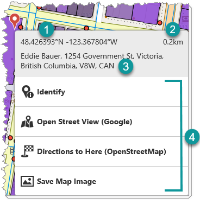

|
Coordinates: The latitude and longitude of the selected map location. The coordinates are included in the menu by default and is not a customizable menu feature. The user can select the coordinates and copy them to the clipboard to use in other apps. |

|
Distance: The distance from your current location to the selected map location. The distance is included in the menu by default and is not a customizable menu feature. |

|
Address: The street address of the selected map location. The address is included in the menu by default and is not a customizable menu feature. The user can select the address and copy it to the clipboard to use in other apps. |

|
Menu items: The list of configured items the user can choose from to perform a task. |
This section explains how to do the following:
-
Select Map in the Components panel.
-
Click +Add Menu Item in the Context Menu section.
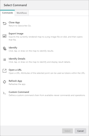
The Select Command dialog opens. The list of available commands depends on the context of the component.
-
Select one of the following tabs, as appropriate:
-
Commands: Select the command you want to assign to the menu item and click Select.
-
Workflows: Select the workflow you want to assign to the menu item and click Select. Alternatively, to create a new workflow, click Create a new Workflow.
The Main Settings section opens in the Map panel.
-
-
Enter the settings for the menu item. The table below describes the fields in the Main Settings section.
Field Description Title The title for the menu item as it will appear in the context menu when the user right-clicks or long-presses the map. For example, "Run My Workflow". Description An explanation for what the menu item does. For example, "Runs my custom workflow". If you don't want to include a description of the menu item, leave it blank. Icon The image to represent the menu item. Command The action the app will perform when a user selects the menu item. Some commands have additional settings you can customize. See how to customize a menu item command below. Hide when Disabled The option to hide the menu item when it cannot be executed. -
Click Close.
To customize a menu item command:
-
To turn your command into a custom command, click
. A code box appears, in which you can manually edit the JSON code for the command. Turning your command into a custom command is a one-way operation. While editing the custom command in the code box, press CTRL + Spacebar to access code suggestions. You can specify a sequence of multiple commands.
-
To convert commands in a workflow, first click
to customize the commands, then click  . Converting commands into a workflow cannot be reversed. This option is not available of on-premise Workflow installations that are not installed in the default installation folder.
For example:
To create a menu item that runs a workflow, enter Run Workflow in the Command box and select the command when it appears. From the list of workflows that appears, select the workflow you want to run. The command becomes a custom command and code similar to the following appears in the code box:
{
	"id": "1a2b3c4d-5e6f-1a2b-3c4d-5e6lucina14e",
	"inputs": {},
	"portalItem": "https://mycompany.maps.arcgis.com/sharing/rest/content/items/1c8eevee4b154mewsix894bff619a4d7",
	"commandArgumentInput": "myGeometryParameter"
}
The above example uses the commandArgumentInput property to specify which workflow input should receive the current context as its value, that is, the geometry of the selected point. By default, the commandArgumentInput property is set to context.
You can also use the inputs property to supply values to workflow inputs. The inputs property is a key-value object, where the keys are the names of workflow inputs. The commandArgumentInput property overrides the inputs property.
For more information, see Use the Menu Context as a Workflow Input. The procedure explains how to add a menu item to the Result Details menu, but the concept is similar for the Context menu.
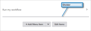
To add a divider between menu items:
-
Click
beside +Add Menu Item in the Map panel and then select Add Divider.The divider appears as a gray line at the bottom of menu item list.
-
Click Edit Items.
Icons appear before and after the gray line to indicate that you can move or delete it.
-
Click and drag the divider into position between the menu items.
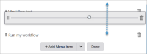
- Click Done.
-
Select Map in the Components panel.
-
Select the menu item in the Context Menu section.
-
Modify the settings.
-
Click Close.
-
Select Map in the Components panel.
-
Click Edit Items in the Context Menu section.
-
Click and drag the menu item to the position you want.
-
Click Done.
-
Select Map in the Components panel.
-
Click Edit Items in the Context Menu section.
-
Click the Delete icon
. -
Click Done.
GNSS Settings
GNSS Settings have been moved to the Coordinates Service.
Layout
-
Slot: The location of this component within its parent component, assuming the parent component has slots. The possible values depend on the parent component's slots.
-
Margin (px): The margin space around the component in pixels.
-
Initially Hidden: Specifies whether or not the component is initially hidden when the app loads. If selected, the component remains hidden unless activated, for example, by the
Showcommand.
Panel Settings 
The Panel component is a layout component that can contain other subcomponents, each of which are displayed successively. When the user clicks the Back button  , the panel displays the previous subcomponent. For more information, see Panel.
Main Settings
-
Title: Type a title to display for the component. If the Panel component is placed within a Taskbar component, the title appears in the Taskbar.
-
Icon: To select an icon to represent the component, click Select Icon, click the desired icon and click OK. To remove the icon, click Clear Icon. If the Panel component is placed within a Taskbar component, the icon appears in the Taskbar.
Layout
-
Slot: The location of this component within its parent component, assuming the parent component has slots. The possible values depend on the parent component's slots.
-
Margin (px): The margin space around the component in pixels.
-
Initially Hidden: Specifies whether or not the component is initially hidden when the app loads. If selected, the component remains hidden unless activated, for example, by the
Showcommand.
Result Details 
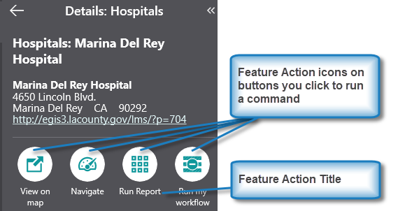
In the Results Details area. you can add a menu item that runs a result action from the feature Details panel.
In the Result Details panel, you can change the following:
Main Settings
-
Title: Type a title to display for the component.
-
Icon: To select an icon to represent the component, click Select Icon, click the desired icon and click OK. To remove the icon, click Clear Icon.
result actions
A list of result actions you can run from the Result Details panel.
When you configure and run a result action set in Result Details settings, it takes effect globally on all the layers of the map and the features on the layers. To set a result action that applies to a particular layer, see Map Settings.
-
Title: Change the name of the menu item as it will appear in the Result Details panel.
-
Description: Type an explanation of what this menu item will do when you click it.
-
Icon: Add an icon to appear beside the title in the Result Details panel.
-
Command: The command to run when a user taps the menu item. A command is an action the app should perform.
To add a menu item:
-
In the Components panel, select Map, and select the desired layer.
-
In the layer panel, click +Add Menu Item.
A window appears that lets you select a command or workflow.
-
Click one of the following tabs as appropriate:
-
Commands: Select the command you want to run, and click Select.
-
Workflows: Select the workflow you want to run, and click Select. Alternatively, to create a new Workflow, click Create a new Workflow. After adding the workflow, you can set its Title and Icon.
-
-
Click the new menu item to edit it.
-
In the Menu Item panel, set the following:
-
Title: Type a title for this menu item as it will appear in Result Details. For example, Zoom to and Pulse Feature.
-
Description: Type an explanation of what this menu item will do when you click it. For example, Zooms to feature and temporarily highlights it.
-
Icon: To select an icon to represent this menu item, click Select Icon, click the desired icon and click OK. You do not need to have an icon, you can just have words to represent the menu item. To remove the icon, click Clear Icon.
-
Command: The command to run when a user taps the menu item. A command is an action the app should perform.
To select the command you want, click the box that contains the current command followed by
. The list of available commands depends on the context of the component.Some commands have additional settings you can configure.
To turn your command into a custom command, click
. A code box appears in which you can manually edit the JSON code for the command. Turning your command into a custom command is a one-way operation.To run multiple commands, click
and, in the code box, type a sequence of commands in JSON format. While editing the custom command in the code box, press CTRL+Space to access code suggestions.For example, the following custom command zooms to the current feature and temporarily highlights it.
Copy[
"map.zoom-to-features",
"highlights.pulse"
]The above example demonstrates how to pass the current context - the current feature - as an argument into the
map.zoom-to-featuresoperation. The returned value ofmap.zoom-to-features, which is the same set of features, is then automatically passed into the next command,highlights.pulse. -
Hide when Disabled: Whether to hide the button when the command cannot be executed.
-
-
Events
-
Result Shown: The command to run when a result in the Result Details panel becomes the actively displayed result. A command is an action the app should perform.
Some commands have additional settings you can configure.
To add a command:
-
In the Components panel, select Result Details.
-
If necessary, in the Result Details panel, click
to expand the Events section. -
Under Result Shown, click +Add Command.
A window appears that lets you select a command or workflow.
-
Click one of the following tabs as appropriate:
-
Commands: Select the command you want to run, and click Select.
-
Workflows: Select the workflow you want to run, and click Select. Alternatively, to create a new Workflow, click Create a new Workflow. After adding the workflow, you can set its Title and Icon.
-
To turn your command into a custom command, click
. A code box appears in which you can manually edit the JSON code for the command. Turning your command into a custom command is a one-way operation.To run multiple commands, click
and, in the code box, type a sequence of commands in JSON format. While editing the custom command in the code box, press CTRL+Space to access code suggestions.To change the command:
-
In the Components panel, select Result Details.
-
If necessary, in the Result Details panel, click
to expand the Events section. -
Under Result Shown, click the box that contains the current command followed by
. -
Select a command and click Submit.
To delete the command:
-
In the Components panel, select Result Details.
-
If necessary, in the Result Details panel, click
to expand the Events section. -
Under Result Shown, beside the current command, click
.
-
-
Result Hidden: The command to run when a result in the Result Details panel no longer becomes the actively displayed result because the user views the previous or next result. A command is an action the app should perform.
Some commands have additional settings you can configure.
To add a command:
-
In the Components panel, select Result Details.
-
If necessary, in the Result Details panel, click
to expand the Events section. -
Under Result Hidden, click +Add Command.
A window appears that lets you select a command or workflow.
-
Click one of the following tabs as appropriate:
-
Commands: Select the command you want to run, and click Select.
-
Workflows: Select the workflow you want to run, and click Select. Alternatively, to create a new Workflow, click Create a new Workflow. After adding the workflow, you can set its Title and Icon.
-
To turn your command into a custom command, click
. A code box appears in which you can manually edit the JSON code for the command. Turning your command into a custom command is a one-way operation.To run multiple commands, click
and, in the code box, type a sequence of commands in JSON format. While editing the custom command in the code box, press CTRL+Space to access code suggestions.To change the command:
-
In the Components panel, select Result Details.
-
If necessary, in the Result Details panel, click
to expand the Events section. -
Under Result Hidden, click the box that contains the current command followed by
. -
Select a command and click Submit.
To delete the command:
-
In the Components panel, select Result Details.
-
If necessary, in the Result Details panel, click
to expand the Events section. -
Under Result Hidden, beside the current command, click
.
-
Rows Settings 
The Rows component is a layout component that can contain other components, each of which are displayed vertically. For more information, see Rows.
Main Settings
-
Title: Type a title to display for the component.
-
Icon: To select an icon to represent the component, click Select Icon, click the desired icon and click OK. To remove the icon, click Clear Icon.
Layout
-
Horizontal Alignment: Sets the horizontal position of any fixed-width components within. Has no visible effect on any component within whose width automatically grows to the size of the parent.
-
Vertical Alignment: Sets the vertical position of any fixed-height components within. Has no visible effect on any component within whose height automatically grows to the size of the parent.
-
Height: Specifies the height of the component. If Fixed Size is not selected, the height is an approximate percentage of the height of the parent component. If Fixed Size is selected, the height is in pixels and will not change when other component sizes are changed.
-
/
: Click to toggle whether the Width or Height of the component is unlocked or locked . When a size is locked, it will not change when other component sizes are changed. This setting only appears when there are three or more components whose sizes are not fixed.
-
Fixed Size: Whether the Width or Height of the component is a percentage relative to the size of the parent component or a fixed size in pixels. If Fixed Size is selected, the size will not change when other component sizes are changed.
-
Margin (px): The margin space around the component in pixels.
-
Initially Hidden: Specifies whether or not the component is initially hidden when the app loads. If selected, the component remains hidden unless activated, for example, by the
Showcommand.
Scale Bar Settings 
Main Settings
-
Title: Type a title to display for the component.
-
Icon: To select an icon to represent the component, click Select Icon, click the desired icon and click OK. To remove the icon, click Clear Icon.
Layout
-
Slot: The location of this component within its parent component, assuming the parent component has slots. The possible values depend on the parent component's slots.
-
Margin (px): The margin space around the component in pixels.
-
Initially Hidden: Specifies whether or not the component is initially hidden when the app loads. If selected, the component remains hidden unless activated, for example, by the
Showcommand. -
Map: The Map component this component affects. This setting cannot be modified if this component is either a subcomponent of a Map component or there is only a single Map component in the app.
Scroll Settings 
The Scroll component is a layout component that can contain another component, which is displayed with a scroll bar if the content is too long. Scroll components can only contain a single component. For more information, see Scroll.
Main Settings
-
Title: Type a title to display for the component.
-
Icon: To select an icon to represent the component, click Select Icon, click the desired icon and click OK. To remove the icon, click Clear Icon.
Layout
-
Slot: The location of this component within its parent component, assuming the parent component has slots. The possible values depend on the parent component's slots.
-
Margin (px): The margin space around the component in pixels.
-
Initially Hidden: Specifies whether or not the component is initially hidden when the app loads. If selected, the component remains hidden unless activated, for example, by the
Showcommand.
Search Settings 
The Search component allows you to find spatial data and locations on the map. When you click on a search result, the map zooms to that location.
You can configure the maximum number of search results to display from each feature source (for example, layer, sublayer, table, geocoder), and the number of suggestions to display based on the user's input. To include a specific layer in the search, enable the Included option in Layer List > Layer Extensions).
The search results come from either the:
-
geocoder service.
-
standard Esri search.
The extent that the Search component uses to perform searches depends on the map configuration and whether a mobile map package (MMPK) is present:
-
Online web map, no MMPK: Searches are limited to the visible map area.
-
Online web map, with MMPK: Searches are limited to the extent of the MMPK. Results outside the extent are not returned.
-
Active map area, no MMPK: Searches cover the entire extent of the offline map area. Results outside the extent are not returned.
-
Active map area, with MMPK: Searches cover both the MMPK extent and the full extent of the active map area. Results outside these combined extents are not returned.
For information on how to override the default search area, see Override Search Area in VertiGIS Studio Mobile.
Main Settings
-
Title: Type a title to display for the component.
-
Icon: To select an icon to represent the component, click Select Icon, click the desired icon and click OK. To remove the icon, click Clear Icon.
-
Maximum Results: The maximum number of items to return in any one search. The default number is 50 items per source, for example, a layer, sub-layer, table.
-
Search For: Select the types of results you want the component to return.
Events
-
Search Cleared: The command to run when the user clears the search box. A command is an action the app should perform.
Some commands have additional settings you can configure.
To add a command:
-
In the Components panel, select Search.
-
Expand the Events section.
-
Under Search Cleared, click +Add Command.
A window appears that lets you select a command or workflow.
-
Click one of the following tabs as appropriate:
-
Commands: Select the command you want to run, and click Select.
-
Workflows: Select the workflow you want to run, and click Select. Alternatively, to create a new Workflow, click Create a new Workflow. After adding the workflow, you can set its Title and Icon.
-
To turn your command into a custom command, click
. A code box appears in which you can manually edit the JSON code for the command. Turning your command into a custom command is a one-way operation.To run multiple commands, click
and, in the code box, type a sequence of commands in JSON format. While editing the custom command in the code box, press CTRL+Space to access code suggestions. -
-
Search: The command to run when the user performs a search. A command is an action the app should perform.
To add a command:
-
In the Components panel, select Search.
-
If necessary, in the Search panel, click
to expand the Events section. -
Under Search, click +Add Command.
A window appears that lets you select a command or workflow.
-
Click one of the following tabs as appropriate:
-
Commands: Select the command you want to run, and click Select.
-
Workflows: Select the workflow you want to run, and click Select. Alternatively, to create a new Workflow, click Create a new Workflow. After adding the workflow, you can set its Title and Icon.
-
To turn your command into a custom command, click
. A code box appears in which you can manually edit the JSON code for the command. Turning your command into a custom command is a one-way operation.To run multiple commands, click
and, in the code box, type a sequence of commands in JSON format. While editing the custom command in the code box, press CTRL+Space to access code suggestions. -
Layout
-
Slot: The location of this component within its parent component, assuming the parent component has slots. The possible values depend on the parent component's slots.
-
Margin (px): The margin space around the component in pixels.
-
Initially Hidden: Specifies whether or not the component is initially hidden when the app loads. If selected, the component remains hidden unless activated, for example, by the
Showcommand. -
Map: The Map component this component affects. This setting cannot be modified if this component is either a subcomponent of a Map component or there is only a single Map component in the app.
Search New Extent Settings 
Main Settings
-
Title: Type a title to display for the component.
-
Icon: To select an icon to represent the component, click Select Icon, click the desired icon and click OK. To remove the icon, click Clear Icon.
Layout
-
Slot: The location of this component within its parent component, assuming the parent component has slots. The possible values depend on the parent component's slots.
-
Margin (px): The margin space around the component in pixels.
-
Initially Hidden: Specifies whether or not the component is initially hidden when the app loads. If selected, the component remains hidden unless activated, for example, by the
Showcommand.
Taskbar Settings 
The Taskbar component is a layout component with two slots (areas):
-
Tasks: Subcomponents that use this slot are displayed in the taskbar as menu items that can be opened by clicking them. The titles and icons of subcomponents are displayed in the taskbar.
-
Main: Subcomponents that use this slot are displayed in the main area beyond the taskbar. Usually, a Map component is set to use this slot.
For more information, see Taskbar.
Main Settings
-
Title: Type a title to display for the component.
-
Icon: To select an icon to represent the component, click Select Icon, click the desired icon and click OK. To remove the icon, click Clear Icon.
Layout
-
Margin (px): The margin space around the component in pixels.
-
Initially Hidden: Specifies whether or not the component is initially hidden when the app loads. If selected, the component remains hidden unless activated, for example, by the
Showcommand. -
Orientation: Displays the Taskbar component in one of the following ways:
-
Auto: Automatically determines the orientation of the Taskbar depending on the form factor of the device. Typically, smartphones display a vertical Taskbar, while other devices such as tablets display a horizontal Taskbar. The default is Auto.
-
Vertical: Orients the Taskbar vertically.
-
Horizontal: Orients the Taskbar horizontally.
This setting only has an effect on Android and iOS devices. Windows devices always orient the taskbar vertically.
-
Text Settings 
Main Settings
-
Title: Type a title to display for the component.
-
Icon: To select an icon to represent the component, click Select Icon, click the desired icon and click OK. To remove the icon, click Clear Icon.
-
Text: Type the content for the component. You can include rich content, as this setting supports the original Markdown syntax.
You can include an image by typing something similar to the following: 
Layout
-
Horizontal Alignment: Sets the horizontal position of any fixed-width components within. Has no visible effect on any component within whose width automatically grows to the size of the parent.
-
Vertical Alignment: Sets the vertical position of any fixed-height components within. Has no visible effect on any component within whose height automatically grows to the size of the parent.
-
Slot: The location of this component within its parent component, assuming the parent component has slots. The possible values depend on the parent component's slots.
-
Margin (px): The margin space around the component in pixels.
-
Initially Hidden: Specifies whether or not the component is initially hidden when the app loads. If selected, the component remains hidden unless activated, for example, by the
Showcommand.
Workflow Settings 
The Workflow component runs workflows within it.
Main Settings
-
Title: Type a title to display for the component.
-
Icon: To select an icon to represent the component, click Select Icon, click the desired icon and click OK. To remove the icon, click Clear Icon.
Default Workflow
Default Workflow: The default workflow to run in this component. To select a workflow, click Select and select the desired workflow. To remove the workflow, click Remove.
Layout
-
Slot: The location of this component within its parent component, assuming the parent component has slots. The possible values depend on the parent component's slots.
-
Margin (px): The margin space around the component in pixels.
-
Initially Hidden: Specifies whether or not the component is initially hidden when the app loads. If selected, the component remains hidden unless activated, for example, by the
Showcommand.
Zoom Settings 
Main Settings
-
Title: Type a title to display for the component.
-
Icon: To select an icon to represent the component, click Select Icon, click the desired icon and click OK. To remove the icon, click Clear Icon.
Layout
-
Slot: The location of this component within its parent component, assuming the parent component has slots. The possible values depend on the parent component's slots.
-
Margin (px): The margin space around the component in pixels.
-
Initially Hidden: Specifies whether or not the component is initially hidden when the app loads. If selected, the component remains hidden unless activated, for example, by the
Showcommand. -
Map: The Map component this component affects. This setting cannot be modified if this component is either a subcomponent of a Map component or there is only a single Map component in the app.