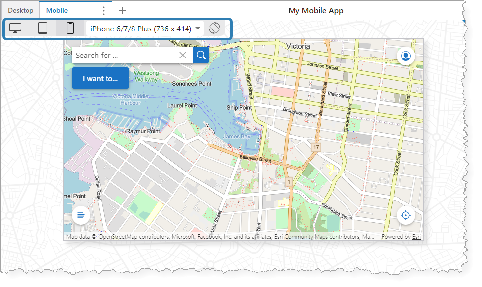
The device preview allows you to see your app as it would appear on different types of devices (i.e., desktop, tablet, and mobile). Previewing your app as you build it is convenient because you can see how it fits on a specific device and make adjustments accordingly.
For example, you could set up a multiple-layout app to have two layouts: one for Desktop and one for Mobile. As you build and configure your app in the Desktop layout, you can switch to the Mobile layout to see how your app fits on a specific mobile device, such as an iPhone 8 Plus.
Web Designer retains the device preview setting for your working session, so you can easily switch between layouts without re-selecting your preferences.

Example of a mobile device preview, rotated to landscape orientation
The table below describes the device preview controls.
Device Preview Controls
Control |
Description |
|---|---|
|
Desktop preview. When you select Desktop, you can specify the resolution from the list of display options. |
|
Tablet preview. When you select Tablet, you can specify the model from the list of display options. |
|
Mobile preview. When you select Mobile, you can specify the model from the list of display options. |
|
Display options. The contents of the drop-down list are dependent on the device you select. For Desktop, the list populates with resolution options. For Tablet and Mobile, it populates with device types and models. |
|
Rotate device. Allows you to switch between landscape and portrait orientation when you select either the Tablet or Mobile previews. This button is disabled for the Desktop preview. |


