The Filter Builder component provides a standalone interface (the Condition Definer) for your user to adjust what is visible on the map by using logical conditions to filter map layers.
You can add a Filter Builder component anywhere in your layout and then connect it to a toolbar or button for the user to invoke. You can also add the Clear Filter Effects command via a component such as a Context Menu or I Want To Menu.
The Filter Builder only supports layers that allow client-side queries and definition expressions. Server-rendered layers, such as Map Image Layers, are not supported.
Configuring the Filter Builder is the first step to create a one-click, predefined filter.
The figure below shows the Condition Definer you use to build your filter.
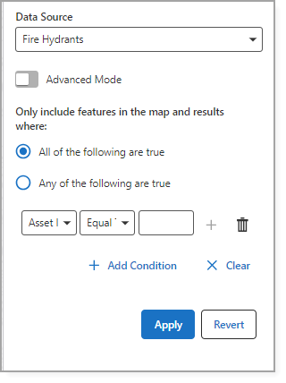
The table below describes the fields in the Filter Builder component.
Setting |
Description |
|---|---|
Main Settings |
|
Title |
The heading to display for the component. The title appears in both Web and Web Designer. |
Icon |
The symbol used to represent the component. |
Visibility Filters |
|
Visible To |
Determines which users and groups can access this component. If no users or groups are specified, all users can access this component by default. The Hidden From setting overrides this setting. |
Visible From |
Determines which users and groups are explicitly forbidden to access this component. This setting overrides the Visible To setting. |
Layout |
|
Slot |
Select the slot to position the component within the Map component. In addition to the various positions on the map, such as Top Left and Bottom Center, you can position the component within the map context menu, which appears when the user right-clicks the map. You can also position the component within the Popup slot, which appears at the mouse cursor. This setting only appears when the component is within the Map component. |
Margin |
The margin space around the component, measured in pixels. |
Padding (px) |
The space inside the component, measured in pixels. |
Visibility |
Determines how the component appears in the app. The options are as follows: •Default: Defers to each component's default "autoActivate" property, which determines the default behavior on startup. •Visible: Displays the component on app startup. •Hidden: Hides the component on app startup and requires an action or trigger to make it appear. |
Map |
The Map components this component affects. This setting cannot be modified if this component is either a subcomponent of a Map component or there is only a single Map component in the app. |
Show Cancel Button |
When enabled, the Cancel button appears on the Condition Definer, which will clear any changes. |
Show Autocompletes |
When enabled, autocomplete suggestions appear when the user starts typing a string value in the Condition Definer. |
A one-click filter enables users to adjust what is visible on the map with a single click. You set the filter conditions and parameters in advance, so your user does not need to input them manually. This simplifies the filter process, making it faster and more efficient for your users.
To create a one-click filter:
1.Add the Filter Builder component to your layout.
2.Open the Filter Builder and use the Condition Definer to set the conditions of your filter.
3.Enable Advanced Mode.
4.Copy the generated SQL syntax displayed in the text field.
5.Add a component to serve as the trigger for your predefined query (for example, a Button).
You can nest this component within another component, if needed.
6.Navigate to the Command section in the component and select the Workflows tab.
7.Select Create a New Workflow.
8.Choose Menu - Quick Filter from Select a Workflow Template.
9.Assign a Workflow Title, specify the Feature Source (the layer, sublayer, or table to query), and paste the SQL syntax you copied in Step 4 into the Filter WHERE Clause field.
10.Click Create.
The component (in our example, the Button) appears in the layout. When your user clicks the button, it automatically runs the preconfigured query.
You can enable the Can be Toggled setting in the Query Builder component and set a command for the toggled state. For example, if you set the Clear Results command for the toggled state, the query resets when it is toggled off.