The Results List component enables you to customize the appearance of results and define how the user interacts with them.
You can specify Feature Action menu items that are common to the Result Details, Result Summary, and Results Table settings. If you add, edit, or remove a menu item in one place, it affects the others.
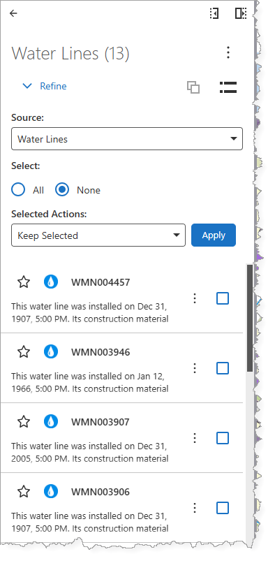
The example below shows a configured Results List component after we performed an Identify and refined the results to show only Water Lines.
Main Settings
Field |
Description |
|---|---|
Title |
Enter a title to display for the component. This title is used both in Web and Designer. |
Icon |
To select an icon to represent the component, click Select Icon, click the desired icon, and click OK. To remove the icon, click Clear Icon. |
Enable One-to-One Attribute Display |
When enabled, the attributes of a one-to-one Related Record feature display as an extension of a selected feature. When disabled, it appears just as a Related Record. |
Result Actions
Field |
Description |
|---|---|
Title |
Enter a title for this menu item as it will appear in the Result Details, Results List, and Results Table panels. |
Description |
Enter a summary of what this menu item does. If you don't want ta description of the menu item, leave it blank. |
Icon |
To select an icon to represent this menu item, click Select Icon, click the desired icon, and click OK. To remove the icon, click Clear Icon. |
Command |
The command to run when a user clicks the menu item. A command is an action the app should perform. |
Events
The table below defines the commands that run in response to user interaction or changes to a result added to the Result Details panel (for example, from a Search, Identify, or Workflow).
Field |
Description |
|---|---|
Result Added |
Runs when a result is added to the Results List. |
Result Removed |
Runs when a result is removed from the Results List. |
Result Clicked |
Runs when the user clicks a result in the Results List. |
Result Shown |
Runs when a previously hidden result in the Results List panel becomes visible (for example, when the filters are removed). |
Result Hidden |
Runs when a result is hidden from the Results List (for example, when a filter is applied). |
Result Hovering |
Runs when the user begins hovering the mouse cursor over a result in the Results List. |
Result Hovered |
Runs when the user stops hovering the mouse cursor over a result in the Results List. |
Result Selected |
Runs when the user selects a result in the Results List. |
Result Deselected |
Runs when the user deselects a result in the Results List. |
Visibility Filters
Field |
Description |
|---|---|
Visible To |
Determines which users and groups can access this component. If no users or groups are specified, all users can access this component by default. The Hidden From setting overrides this setting. |
Hidden From |
Determines which users and groups are explicitly forbidden to access this component. This setting overrides the Visible To setting. |
Layout
Field |
Description |
|---|---|
Margin (px) |
The space around the component (separating it from other elements), measured in pixels. |
Padding (px) |
The space inside the component (between the content and its border), measured in pixels. |
Visibility |
Determines how the component appear at startup: •Default: Defers to the component's default autoActivate property, which determines the default behavior at startup. •Visible: The component appears. •Hidden: The component does not appear. |
Show Star Controls |
When enabled, the control appears to add or remove the result(s) from the starred results list. |