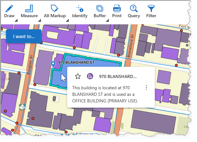
The Result Summary component displays a map tooltip with a view of basic information related to a single result, including the Title, Description, and Result Actions.
By default, the Result Summary appears when the user hovers the mouse cursor over a feature on the map.
See also: Result Details.
Main Settings
Field |
Description |
|---|---|
Title |
Enter a title to display for the component. This title is used both in Web and Designer. |
Icon |
To select an icon to represent the component, click Select Icon, click the desired icon, and click OK. To remove the icon, click Clear Icon. |
Result Actions
Result Actions set at this level are available for all features, unlike setting Result Actions on a particular layer within the Map settings.
Field |
Description |
|---|---|
Title |
Enter a title for this menu item as it will appear in the Result Details, Results List, and Results Table panels. |
Description |
Enter a summary of what this menu item does. If you don't want ta description of the menu item, leave it blank. |
Icon |
To select an icon to represent this menu item, click Select Icon, click the desired icon, and click OK. To remove the icon, click Clear Icon. |
Command |
The command to run when a user clicks the menu item. A command is an action the app should perform. |
Events
The command to run when a result is added to the Result Details panel, for example, from a search or identify operation. A command is an action the app should perform.
Some commands have additional settings you can configure.
Field |
Description |
|---|---|
Result Added |
The command to run when a result is added to the Result Summary. |
Result Removed |
The command to run when a result is removed from the Result Summary. |
Result Clicked |
The command to run when the user clicks a result in the Result Summary. |
Result Record Clicked |
The command to run when the user clicks a related record. |
Result Shown |
The command to run when a previously hidden result in the Results List panel is displayed, for example, when the filters are removed. |
Result Hidden |
The command to run when a result is hidden from the Result Summary, for example, when a filter is applied. |
Visibility Filters
Field |
Description |
|---|---|
Visible To |
Determines which users and groups can access this component. If no users or groups are specified, all users can access this component by default. The Hidden From setting overrides this setting. |
Hidden From |
Determines which users and groups are explicitly forbidden to access this component. This setting overrides the Visible To setting. |
Layout
Field |
Description |
|---|---|
Slot |
Select the slot to position the component within the Map component. In addition to the various positions on the map, such as Top Left and Bottom Center, you can position the component within the map context menu, which appears when the user right-clicks the map. You can also position the component within the Popup slot, which appears at the mouse cursor. This setting only appears when the component is within the Map component. |
Margin (px) |
The space around the component, measured in pixels. |
Padding (px) |
The space inside the component, measured in pixels. |
Visibility |
Determines how the component appear at startup: •Default: Defers to the component's default autoActivate property, which determines the default behavior at startup. •Visible: The component appears. •Hidden: The component does not appear. |