The Result Details component is related to the Results List, Results Table, and Results Summary components. It provides the most detailed view of a result when the user performs an Identify, Search, or Workflow operation.
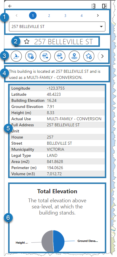
The figures below define the elements of a configured Result Details component.
|
|
1.Navigate and filter pages of results. 2.Web map pop-up configured "Title". 3.Result Actions for Result Details (all layers). 4.Web map Summary Popup Content configured "Text". 5.Web map Summary Popup Content configured "Fields". 6.Web map Summary Popup Content configured "Media". |
|
|
|
|
7.External links specific to a Layer Extension. These support search/replace tokens, which include coordinates and feature attributes. |
|
8.File attachments stored on a feature (when enabled and present). |
|
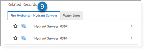
9.Related Records come from multiple places, including the following: •Related spatial features configured in the Esri map service. •Related non-spatial tables configured in the Esri map service. •One-to-many Data Links configured in a Layer Extension. |
Studio Web relies on the web map configuration to know what to include in your app. This means that if you have a spatial layer that has a related non-spatial table, you must add that table to your web map if you want Web to be aware of it. See Map for more information.
Main Settings
Field |
Description |
|---|---|
Title |
Type a title to display for the component. This title is used both in Web and Designer. |
Icon |
To select an icon to represent the component, click Select Icon, click the desired icon, and click OK. To remove the icon, click Clear Icon. |
Enable One-to-One Attribute Display |
If enabled, the attributes of a one-to-one Related Record feature are displayed as an extension of a selected feature. When enabled, linked attributes are hidden when you edit the feature and cannot be modified. If disabled, the related records display in dedicated tables. You can select a related record and edit its values. |
Result Actions
The Result Actions menu items for the Result Details are also linked to the Results List and Results Table. If you add, edit, or remove a menu item in one, it affects the others.
Result Actions set at this level are available for all features, unlike setting results actions on a particular layer within Map settings.
Field |
Description |
|---|---|
Title |
Type a title for this menu item as it will appear in the Result Details, Results List, and Results Table panels. |
Description |
Enter an explanation of what this menu item does. If you do not want a description of the menu item, leave it blank. |
Icon |
To select an icon to represent this menu item, click Select Icon, click the desired icon, and click OK. To remove the icon, click Clear Icon. |
Command |
The command to run when a user clicks the menu item. A command is an action the app should perform. |
Hide when Disabled |
When enabled, hides the menu item when the command cannot be executed. |
Can be Toggled |
When enabled, you can configure the menu item to toggle between a Default state and an Alternate state. You configure the icon, text, and behavior of the menu item for each state. |
Visible To |
Determines which users and groups can access this component. If no users or groups are specified, all users can access this component by default. The Hidden From setting overrides this setting. |
Hidden From |
Determines which users and groups are explicitly forbidden to access this component. This setting overrides the Visible To setting. |
Events
The command to run when a result is added to the Result Details panel, for example, from a search or Identify operation. A command is an action the app should perform.
Some commands have additional settings you can configure.
Field |
Description |
|---|---|
Result Added |
The command to run when a result is added to the Result Details panel, for example, from a search or identify operation. |
The command to execute when the user clicks the Edit button, which you must enable in Editing. |
|
Result Removed |
The command to run when a result is removed from the Result Details panel, for example, when the user clicks Remove Result(s). |
Related Record Clicked |
The command to run when the user clicks a related record. |
Result Shown |
The command to run when a result in the Result Details panel becomes the actively displayed result. |
Result Hidden |
The command to run when a result in the Result Details panel no longer becomes the actively displayed result because the user views the previous or next result. |
Editing
Field |
Description |
|---|---|
Allow Editing |
The Allow Editing setting determines whether the user can modify the supported results directly from the Result Details component. When enabled, this adds an Edit button to the bottom of the user's Result Details views. Changing the editing behavior for all features is done via Result Edited. |
Allow Deletion |
The Allow Deletion setting determines whether the user can permanently delete the supported results directly from their Result Details. When enabled, this adds a Delete button to the bottom of the user's Result Details views. |
Visibility Filters
Field |
Description |
|---|---|
Visible To |
Determines which users and groups can access this component. If no users or groups are specified, all users can access this component by default. The Hidden From setting overrides this setting. |
Hidden From |
Determines which users and groups are explicitly forbidden to access this component. This setting overrides the Visible To setting. |
Layout
Field |
Description |
|---|---|
Margin (px) |
The margin space around the component, measured in pixels. |
Initially Hidden |
Specifies whether or not the component is initially hidden when the app loads. If selected, the component remains hidden unless activated, for example, by the Show command. |
Button Style |
The style of the button. Choose either Rounded or Square. |


