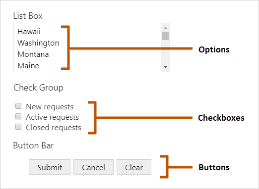
Some form elements present multiple items for the user to select from. For example, a List Box has options, a Check Group has checkboxes, and a Button Bar has buttons.
The following types of form elements have items:
▪Auto Complete elements have suggestions.
▪Button Bars have buttons.
▪Check Groups have checkboxes.
▪Drop Down Lists have options.
▪Item Pickers have items.
▪List Boxes have options.
▪Radio Groups have radio buttons.

Examples of form element items
Providing the values for a form element's items is called populating the element. For example, in the screen capture, the List Box is populated with the names of US states.
When you add a form element with items to a form, you must specify how to populate the element. There are two main ways to populate an element:
▪Manually: If the element will only have a few items and you know in advance what the items are, you can configure them in Workflow Designer by specifying the properties for each item.
You cannot configure Auto Complete suggestions or Item Picker items manually.
▪Dynamically: You can use a subworkflow to get the items when the workflow runs. This allows you to query a map service to get the items, or get the items from a collection that the workflow builds at run time.
VertiGIS Studio Workflow provides subworkflow templates that you use as the starting point for your subworkflow. The ArcGIS Query template queries an ArcGIS map service and converts the results to a form that can be used as form element items.
For information on configuring items, see:
•Configure Auto Complete Suggestions
•Configure the Buttons in a Button Bar
•Configure the Checkboxes in a Check Group
•Configure the Options in a Drop Down List
•Configure the Items in an Item Picker
•Configure the Options in a List Box
•Configure the Radio Buttons in a Radio Group
See also...
Access Form Element Items in Expressions
Properties of Form Element Items
The following table describes the properties of form element items.
Because every type of form element is different, form elements do not have every property that is listed in the table. The table indicates which form elements each property applies to.
The table gives the names for each property: its name in the Properties panel and its name in expressions. Sometimes the names only differ in capitalization, for example, Visible (in the Properties panel) and visible (in expressions).
Properties of Form Element Items
Causes Validation |
Applies to: Button Bar Type: Boolean Name in Properties Panel: Causes Validation Name to Use in Expressions: validates Indicates whether clicking the button causes the form to validate. |
Checked |
Applies to: Check Group, Item Picker, List Box Type: Boolean Name in Properties Panel: Checked Name to Use in Expressions: checked Indicates whether the item is currently selected. |
Default |
Applies to: Button Bar Type: Boolean Name in Properties Panel: Default Name to Use in Expressions: default Indicates whether the button is to be treated as clicked if the form is submitted automatically, for example, if the user presses Enter instead of clicking a button. |
Enabled |
Applies to: All form elements with items Type: Boolean This property does not appear in the Properties panel Name to Use in Expressions: enabled Indicates whether the item is enabled in the running workflow. When an item is enabled, the user can select the item. When an item is disabled, the user can see the item but cannot interact with it. Disabled items appear dimmed. You may want to change the enabled property at run time depending on the user's input in a previous form element. |
Label |
Applies to: All form elements with items Type: Text Name in Properties Panel: Label Name to Use in Expressions: label The item's text. |
Selected |
Applies to: List Box Type: Boolean Name in Properties Panel: Selected Name to Use in Expressions: checked Indicates whether the item is currently selected. |
Style Name |
Applies to: All form elements with items Type: String This property does not appear in the Properties panel Name to Use in Expressions: styleName Indicates the name of the style that will be applied to the item. |
Tooltip |
Applies to: Button Bar, Check Group, Drop Down List, List Box, Radio Group Type: String Name in Properties Panel: Tooltip This property cannot be used in expressions A message that displays when the user hovers the mouse pointer over the item. |
Value |
Applies to: All form elements with items Type: Any Name in Properties Panel: Value Name to Use in Expressions: value The value associated with the item. In a Button Bar, configuring a value for a button causes the form to submit (exit) after the user clicks the button and the form passes validation. You can also use the value to determine which button was clicked. |
Visible |
Applies to: All form elements with items Type: Boolean Name in Properties Panel: Visible Name to Use in Expressions: visible Indicates whether the item is visible in the running workflow. You may want to change the visible property at run time depending on the user's input in a previous form element. |