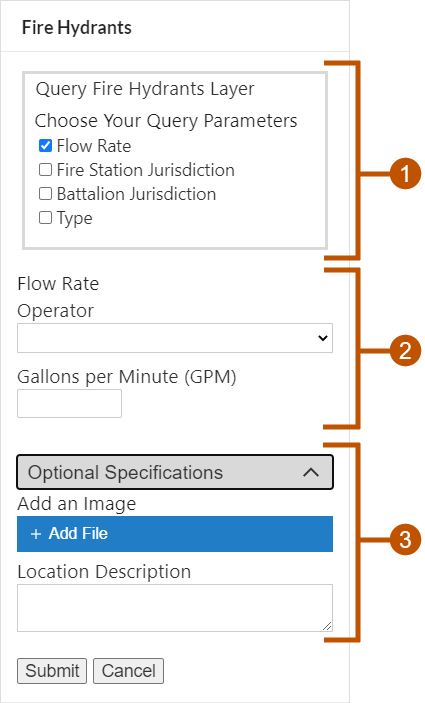
The Section form element allows other form elements to be grouped.
There are different styles of the Section form element:
▪Collapsible: Contents of collapsible Sections elements can be shown or hidden by clicking the Section header.
▪Fieldset: Fieldset Section elements are surrounded by a frame.
▪Group: Group Section elements have a bar at the left.
▪Unstyled: Unstyled Section elements are not styled in any special way.
The screen capture below shows  a Fieldset Section,
  an Unstyled Section, and
  a Collapsible Section.

Example of two Section form elements, shown in a viewer
Sections are useful for organizing a form into conceptually related parts. One of their advantages is that you can hide or show an entire Section, including all the Section's elements, by changing the Section's visibility. This saves you from having to change the visibility of each of the Section's elements individually.
Configure Sections
When you create a new form, the form contains header ( ) and footer (
 ) elements. You cannot add elements above the header or below the footer.
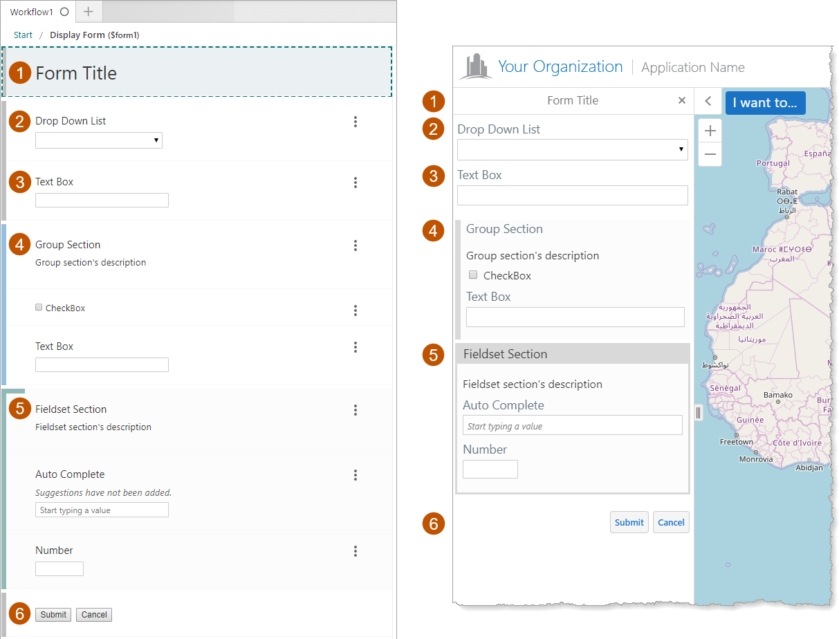
At the top of the form (below the header), you can have elements that are not in Sections. In the screen capture below, the Drop Down List ( ) and Text Box (
 ) are not in Sections.
Any Sections that you add to a form are below the elements that are not in Sections (above the footer). The screen capture below shows two Sections, a Group Section ( ) that contains a Check Box and a Text Box, and a Fieldset Section (
 ) that contains an Auto Complete element and a Number element.
To add elements to a Section, drag and drop the elements onto the Section one at a time.
You cannot nest Sections.

Form with Sections shown in Workflow Designer (left) and in the Geocortex Viewer for HTML5
Section Properties
The Properties table describes the properties of the Section form element.
The type of a property defines what types of values the property can have. Many properties are type string, which means that the property's value is text. Boolean properties can be true or false. Some properties have more than one possible type.
Property names in Workflow Designer's Properties panel are written using the capitalization and spacing of a title. Property names in expressions are valid JavaScript identifiers and start with a lower case letter.
In the table below:
▪If a property can be accessed in both the Properties panel and expressions, then the table gives both versions of the name.
▪If a property's name in the table starts with a lower case letter, then you can only access the property in expressions.
▪If a property's name starts with a capital letter and the table does not give a name to use in expressions, then you can only access the property in the Properties panel.
Expressions are case sensitive. When you access a form element property in an expression, you must use the correct capitalization.
Properties of the Section Form Element
Accessible Description |
Type: String Name in Properties Panel: Accessible Description Name to Use in Expressions: accessibleDescription An accessible version of the description of the element. The accesible description is not visible on the page; it is hidden. You can use the Accessible Description property to provide a description that can be used by assistive technologies, such as screen readers. |
Collapsed |
Type: Boolean Name in Properties Panel: Collapsed Name to Use in Expressions: collapsed
This property is visible only when Style is set to Collapsible
Indicates whether the Section is collapsed. When Style is set to Collapsible, the Collapsed property appears as a checkbox in the Properties Panel. By default, the Collapsed checkbox is not checked. To access the collapsed property in an expression: ${Display Form ID}.state.{Element ID}.collapsed For example: $form1.state.section1.collapsed |
Description |
Type: String Name in Properties Panel: Description Name to Use in Expressions: description A description of the element. The description appears below the element's title. You can use the Description property to describe what the element represents or to provide instructions to the user about how to use the element. You can format the description using Markdown. |
Element ID |
Type: String The element's ID, which is used in other form elements and activities to access the element's properties. The ID must be unique across all elements in the form. You cannot set the value of the Element ID property in an expression—you can only use the value that you configured for it. To use the Element ID property in an expression: ${Display Form ID}.state.{Element ID}.{property name} For example: $form1.state.section1.visible |
The style for presenting the Section. The possible styles are listed below. In Workflow Designer, the different styles are indicated by different colored bars at the left. ▪Collapsible: Allows the contents of a Section to be shown or hidden by clicking on the Section header. ▪Fieldset: Surrounds the Section with a frame and darkens the background. ▪Group: Marks the Section with a bar at the left and darkens the background. ▪Unstyled: Does not provide any styling to mark the Section. |
styleName |
Type: String Indicates the name of the style that will be applied to the element. To access the styleName property in an expression: ${Display Form ID}.state.{Element ID}.styleName For example: $form1.state.section1.styleName |
Title |
Type: String Name in Properties Panel: Title Name to Use in Expressions: title The element's title, which appears at the top of the element. By default, the title is blank. You may want to change the title to describe what the element represents in your workflow. You can format the title using Markdown. |
Title Location |
Type: String Name in Properties Panel: Title Location Name to Use in Expressions: titleLocation Specifies whether the element's title appears above (default) or beside the element. The value must be either "above" or "beside". |
type |
Type: String The variety of form element. Section elements are type "Section". Use the type property to find out the variety of a form element in a form with many elements. Loop through ${Display Form ID}.state, comparing each element to the known form types and performing some action on the elements that meet your type criteria. To access the type property in an expression: ${Display Form ID}.state.{Element ID}.type For example: $form1.state.section1.type |
Visible |
Type: Boolean Name in Properties Panel: Visible Name to Use in Expressions: visible Indicates whether the element is visible to the user. By default, Section elements are visible. If you want to hide the element, clear the Visible checkbox. You may want to change the visibility at run time depending on the user's input in a previous form element. Hiding a Section also hides the elements in the Section. When a Section is visible, you can hide individual elements in the Section by setting the individual element's Visible property to false. To access the visible property in an expression: ${Display Form ID}.state.{Element ID}.visible For example: $form1.state.section1.visible |
Section Events
The following table describes the events associated with the form element.
Events for the Section Form Element
load |
The load event fires when the element finishes loading. You can use the load event to set one or more of the element's properties at run time. For example, you could set the element's initial value. |