The underlying map for any Mobile app is a web map that is referenced from ArcGIS Online or an ArcGIS Server Portal.
Main Settings
•Title: Type a title to display for the component.
•Icon: To select an icon to represent the component, click Select Icon, click the desired icon and click OK. To remove the icon, click Clear Icon.
Map Settings
A group of settings where you define the web map to use in your app. You can also configure settings for each layer of the map and for the fields in each layer.
The following settings are included:
•Web Map: Click Select, and when the Select Items dialog opens, do any of the following:
•Type the name of your web map into the Search box, and then click Search.
If you want to use a map in a different Portal, paste the full URL to the portal into the Search box, and then click Search.
•Select the type of maps to display:
•My Content: Lists only the maps you have created in ArcGIS Online or Portal for ArcGIS and that are listed in your under My Content.
•Shared With Me: Lists maps others have been shared with you.
•Public: Lists maps that are publicly available.
•Click the List View icon  to change the display of web maps to a list format. The default view shows web maps in a Grid View
  with thumbnails of the available web maps.
Once the map is selected, the Map panel displays the name of the chosen map and its layers.
To refresh a web map to reflect any changes made in Esri software, click Refresh.
To remove the web map, click Remove.
•Use Esri Field Formatting: Turn off or on, the web map field settings for number formatting. When on, the Esri number formatting that is set in the Esri web map, are taken into account. When off, the number formatting that you set up in Mobile Designer is used.
Mobile Map Package
In addition to web maps, you can add a Mobile Map Package (MMPK) to your app. An MMPK is a zip file containing read-only information about one or more maps. Each map is represented by a Mobile Map file (.mmap) within. For more information, see Mobile Map Packages (MMPK).
•.mmpk Name: Type the name of the Mobile Map Package file (.mmpk) including the file extension. This file must be sideloaded onto the device.
•.mmap File: Unzip the .mmpk file, navigate to the p## folder, and select the .mmap file that represents the desired map.
Group Extensions
This section only appears if a group of map services have been defined in the web map using the Group function.
Groups provide an organized hierarchy in your Layers List.
When a map service has many layers, it can be overwhelming for your user to navigate through them individually. By grouping related layers together, you create a hierarchy that makes the Layers List more structured and easier to manage.
The Group Extensions settings are similar to those defined in Layer Extensions.
If you have a group of layers defined in a map service, they appear in the map service's Layer Extension as Sublayer Extensions rather than Group Extensions.
For more information on group layers, see Esri's documentation on group layers.
Layer Extensions
You can set the following settings for each layer of this map:
•Disable/Enable Identify  : Click the icon to toggle the identify function on or off for this particular layer. The setting controls whether or not a user can click a feature on the map to identify it.
•Disable/Enable Search  : Click the icon to toggle search on or off for this layer. The setting controls whether or not this layer is included in searches.
•Open a Sublayer  : Click a sublayer to open a panel of field extensions on this layer. You can also change settings for the fields, add a result action and configure tasks, zoom settings, and the number formatting for the layer.
Result Actions
A list of result actions you can run from the feature Details panel for a particular layer.
When you set a result action at this level, it affects only the features of this particular layer. To set a result action that applies to all layers, see Result Details Settings.
•Title: Change the name of the menu item as it will appear in the Feature Details panel.
•Description: Type an explanation of what this result action will do when you click it. For example, zoom to the currently selected feature.
•Icon: Add an icon to appear on the button in the result Details panel.
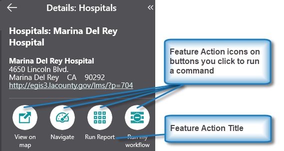
•Command: The command to run when a user taps result action button. A command is an action the app should perform.
To add a menu item:
1.In the Components panel, select Map, and select the desired layer.
2.In the layer panel, click +Add Menu Item.
A window appears that lets you select a command or workflow.
3.Click one of the following tabs as appropriate:
•Commands: Select the command you want to run, and click Select.
•Workflows: Select the workflow you want to run, and click Select. Alternatively, to create a new Workflow, click Create a new Workflow. After adding the workflow, you can set its Title and Icon.
4.Click the new menu item to edit it.
5.In the Menu Item panel, set the following:
•Title: Type a title for this menu item as it will appear in Result Details. For example, Zoom to and Pulse Feature.
•Description: Type an explanation of what this menu item will do when you click it. For example, Zooms to feature and temporarily highlights it.
•Icon: To select an icon to represent this menu item, click Select Icon, click the desired icon and click OK. You do not need to have an icon, you can just have words to represent the menu item. To remove the icon, click Clear Icon.
•Command: The command to run when a user taps the menu item. A command is an action the app should perform.
To select the command you want, click the box that contains the current command followed by  . The list of available commands depends on the context of the component.
Some commands have additional settings you can configure.
To turn your command into a custom command, click  . A code box appears in which you can manually edit the JSON code for the command. Turning your command into a custom command is a one-way operation.
To run multiple commands, click and, in the code box, type a sequence of commands in JSON format. While editing the custom command in the code box, press CTRL+Space to access code suggestions.
For example, the following custom command zooms to the current feature and temporarily highlights it.
[
"map.zoom-to-features",
"highlights.pulse"
]
The above example demonstrates how to pass the current context - the current feature - as an argument into the map.zoom-to-features operation. The returned value of map.zoom-to-features, which is the same set of features, is then automatically passed into the next command, highlights.pulse.
•Hide when Disabled: Whether to hide the button when the command cannot be executed.
•Can be Toggled: Whether the button can be toggled between two states. If the button can be toggled, you can specify the behavior of the button for both states as well as whether the button is toggled by default.
Field Extensions
•Disable Search : Click the icon to disable search for this field extension. When search is disabled on a field, it will not be included in search results.
•Open a Field: Click a field to open it and apply settings to that field only. The settings that are available vary depending on the type of field. You could see any of the following:
•Searchable: Turn search on or off for this field only.
Task Settings
Change the following tasks for this layer. Depending on the layer, some settings may not appear.
•Identify: Turn identify on or off for this layer.
•Search: Turn search on or off for this layer.
•Show Edit Button: Show the Edit button in Feature Details for this layer.
•Show Delete Button: Show the Delete button in Feature Details for this layer.
Zoom Settings
Change the way zoom works for this layer.
•Zoom Scale: Set the optimum scale to which the map should zoom for results in this layer. When zooming to results from multiple layers, the highest Zoom Scale is used. If both Zoom Scale and Zoom Factor are set, the higher of the two scale values is used.
•Zoom Factor: Set the Zoom Factor that is applied to the geometry of non-point results to calculate the scale at which to zoom. When zooming to non-point results from multiple layers, the highest Zoom Factor is used. The default is 1.5. If both Zoom Scale and Zoom Factor are set, the higher of the two scale values is used.
Overrides
•Show Related Records When Unconfigured: Controls whether related records are hidden or shown by default when none are found configured in the popup.
•Inherit Formatting: Turn inherited formatting options on or off for this layer.
Turn off Inherit Formatting to activate options to set custom formatting for this layer.
Where you inherit the formatting for these options depends on the Use Esri Field Formatting option. If that option is on, then the formatting is inherited from the web map. If that option is off, then the formatting is taken from settings you apply in Mobile Designer.
•Date Format: Select the format of the date to use for this layer. The default is Date Time Short.
•Number Format: Select the number format to use for numbers displayed by this layer. The default is Fixed Point. Select one of the following formats.
•Number: A localized representation of a number with a decimal separator, group separator and optional negative sign. For example, in the en-us locale: 12,345.67 or -42.
•Fixed Point: A localized representation of a number with a decimal separator and optional negative sign. For example, in the en-us locale: 12345.67 or -42.
•Currency: A localized representation of a monetary amount in a specific currency. For example, in the en-us locale: $123.45 for USD or £123.45 for GBP.
•Accounting: A localized representation of a monetary amount in a specific currency except negative values are displayed in brackets. For example, in the en-us locale, -$543.21 would be represented as: ($543.21) for USD.
•Percent: A localized representation of a percentage. For example, in the en-us locale, 0.99 would be represented as: 99%.
•Round Trip: An invariant representation of a number that guarantees the number can be parsed back into the same number, regardless of locale. For example, 12345.67.
•Custom: Use one or more numeric specifiers to define how to format numeric data. For more information, see Microsoft's Custom Numeric Format Strings.
•Currency: Select the currency you want to use for this layer. The default is USD.
•Decimal Places: Type in the number of digits to appear after the decimal point in fractions. If you do not set a number, the default applied to currency units depends on the currency.
For a number format, the default applied is 4.
Override Workflows
•Edit Feature Workflow: This selection overrides the default workflow that is run when a feature is edited. If this is not specified, the default Editing workflow is used.
•Add Feature Workflow: This selection overrides the default workflow that is run when a feature is added. If this is not specified, the default Add workflow is used.
Events
This section is hidden by default. Click  to expand the Events section.
•Map Clicked: The command to run when the map is clicked or tapped. A command is an action the app should perform.
Some commands have additional settings you can configure.
To add a command:
1.In the Components panel, select Map.
2.If necessary, in the Map panel, click to expand the Events section.
3.Under Map Clicked, click +Add Command.
A window appears that lets you select a command or workflow.
4.Click one of the following tabs as appropriate:
•Commands: Select the command you want to run, and click Select.
•Workflows: Select the workflow you want to run, and click Select. Alternatively, to create a new Workflow, click Create a new Workflow. After adding the workflow, you can set its Title and Icon.
To turn your command into a custom command, click . A code box appears in which you can manually edit the JSON code for the command. Turning your command into a custom command is a one-way operation.
To run multiple commands, click and, in the code box, type a sequence of commands in JSON format. While editing the custom command in the code box, press CTRL+Space to access code suggestions.
To change the command:
1.In the Components panel, select Map.
2.If necessary, in the Map panel, click to expand the Events section.
3.Under Map Clicked, click the box that contains the current command followed by .
4.Select a command and click Submit.
To delete the command:
1.In the Components panel, select Map.
2.If necessary, in the Map panel, click to expand the Events section.
3.Under Map Clicked, beside the current command, click  .
.
•Map Initialized: Select a command run when the map is initialized. A command is an action the app should perform.
The map is initialized when:
- An app loads.
- A map area is activated or deactivated.
- A user logs out and then in.
To add a command:
1.Beneath Map Initialized, click +Add Command.
The Map Initialized command runs after any Launch Link Workflow is run.
A window appears that lets you select a command or workflow.
2.Click one of the following tabs as appropriate:
•Commands: Select the command you want to run, and click Select.
•Workflows: Select the workflow you want to run, and click Select. Alternatively, to create a new Workflow, click Create a new Workflow. After adding the workflow, you can set its Title and Icon.
To turn your command into a custom command, click . A code box appears in which you can manually edit the JSON code for the command. Turning your command into a custom command is a one-way operation.
To run multiple commands, click and, in the code box, type a sequence of commands in JSON format. While editing the custom command in the code box, press CTRL+Space to access code suggestions.
Context Menu
The Context menu provides quick access to commands, which enable the user to accomplish tasks specific to the map location. The user accesses the menu by right-clicking (with a mouse) or long-pressing (for touch devices) on the map and chooses from a list of commands, which will execute using the selected location.
You can configure which items appear in the menu by either selecting from a list of existing, customizable commands or creating a new command.
The following is an example of a configured context menu.
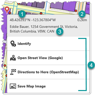
|
Coordinates: The latitude and longitude of the selected map location. The coordinates are included in the menu by default and is not a customizable menu feature. The user can select the coordinates and copy them to the clipboard to use in other apps. |
|---|---|
|
Distance: The distance from your current location to the selected map location. The distance is included in the menu by default and is not a customizable menu feature. |
|
Address: The street address of the selected map location. The address is included in the menu by default and is not a customizable menu feature. The user can select the address and copy it to the clipboard to use in other apps. |
|
Menu items: The list of configured items the user can choose from to perform a task. |


This section explains how to do the following:
•customize a menu item command
•add a divider between menu items
1.Select Map in the Components panel.
2.Click +Add Menu Item in the Context Menu section.
The Select Command dialog opens. The list of available commands depends on the context of the component.
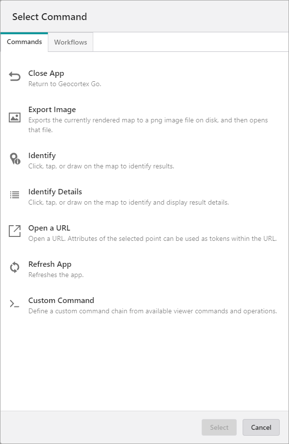
3.Select one of the following tabs, as appropriate:
•Commands: Select the command you want to assign to the menu item and click Select.
•Workflows: Select the workflow you want to assign to the menu item and click Select. Alternatively, to create a new workflow, click Create a new Workflow.
The Main Settings section opens in the Map panel.
4.Enter the settings for the menu item. The table below describes the fields in the Main Settings section.
Field |
Description |
|---|---|
Title |
The title for the menu item as it will appear in the context menu when the user right-clicks or long-presses the map. For example, "Run My Workflow". |
Description |
An explanation for what the menu item does. For example, "Runs my custom workflow". If you don't want to include a description of the menu item, leave it blank. |
Icon |
The image to represent the menu item. |
Command |
The action the app will perform when a user selects the menu item. Some commands have additional settings you can customize. See how to customize a menu item command below. |
Hide when Disabled |
The option to hide the menu item when it cannot be executed. |
5.Click Close.
To customize a menu item command:
•To turn your command into a custom command, click . A code box appears, in which you can manually edit the JSON code for the command. Turning your command into a custom command is a one-way operation. While editing the custom command in the code box, press CTRL + Spacebar to access code suggestions. You can specify a sequence of multiple commands.
•To convert commands in a workflow, first click to customize the commands, then click  . Converting commands into a workflow cannot be reversed. This option is not available of on-premise Workflow installations that are not installed in the default installation folder.
For example:
To create a menu item that runs a workflow, enter Run Workflow in the Command box and select the command when it appears. From the list of workflows that appears, select the workflow you want to run. The command becomes a custom command and code similar to the following appears in the code box:
{
"id": "1a2b3c4d-5e6f-1a2b-3c4d-5e6lucina14e",
"inputs": {},
"portalItem": "https://mycompany.maps.arcgis.com/sharing/rest/content/items/1c8eevee4b154mewsix894bff619a4d7",
"commandArgumentInput": "myGeometryParameter"
}
The above example uses the commandArgumentInput property to specify which workflow input should receive the current context as its value, that is, the geometry of the selected point. By default, the commandArgumentInput property is set to context.
You can also use the inputs property to supply values to workflow inputs. The inputs property is a key-value object, where the keys are the names of workflow inputs. The commandArgumentInput property overrides the inputs property.
For more information, see Use the Menu Context as a Workflow Input. The procedure explains how to add a menu item to the Result Details menu, but the concept is similar for the Context menu.
To add a divider between menu items:
1.Click  beside +Add Menu Item in the Map panel and then select Add Divider.
The divider appears as a gray line at the bottom of menu item list.
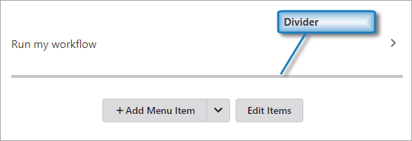
2.Click Edit Items.
Icons appear before and after the gray line to indicate that you can move or delete it.
3.Click and drag the divider into position between the menu items.
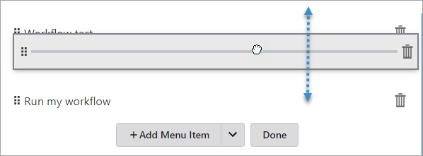
4.Click Done.
1.Select Map in the Components panel.
2.Select the menu item in the Context Menu section.
3.Modify the settings.
4.Click Close.
1.Select Map in the Components panel.
2.Click Edit Items in the Context Menu section.
3.Click and drag the menu item to the position you want.
4.Click Done.
1.Select Map in the Components panel.
2.Click Edit Items in the Context Menu section.
3.Click the Delete icon .
4.Click Done.
GNSS Settings
GNSS Settings have been moved to the Coordinates Service.
Layout
•Slot: The location of this component within its parent component, assuming the parent component has slots. The possible values depend on the parent component's slots.
•Margin (px): The margin space around the component in pixels.
•Initially Hidden: Specifies whether or not the component is initially hidden when the app loads. If selected, the component remains hidden unless activated, for example, by the Show command.