Print layouts are divided into sections called bands. These sections are predominantly horizontal, but some are vertical. Bands contain controls and determine where controls appear in a print layout.
The Band Reference documents each band available in VertiGIS Studio Printing. A band's documentation may include the following sections:
▪Description: A description of what the band does.
▪Properties Common to Most Bands: See Properties Common to Most Bands below.
▪Actions: Group of commonly used properties and actions for the band. These properties are aggregated at the top of the Properties panel, but also appear in their respective property groups. Changes made to the properties that appear in this panel will be reflected in the property group they belong to.
▪Styles: Group of properties that define the styles applied to the band. For more information see Styles.
▪Appearance: Group of properties for configuring the appearance of the contents of a band, such as background color or text formatting. See Inherit Settings from the Band or Report for more information on how bands and controls can share Appearance property settings.
▪Behavior: These properties enable a band and its contents to resize or reformat at run time.
▪Data: Group of properties that allow you to shape print template data.
▪Layout: Group of properties that determine the size of the band in the print template.
▪Printing: Supports right-to-left writing systems.
▪Related Tutorials: Links to any tutorials that document the use of the band.
Properties Common to Most Bands
Style
Style |
Type: String Can be configured in the Properties or Expressions panel. Sets the style used. |
Appearance
Background Color |
Type: Color Can be configured in the Properties or Expressions panel. Specifies the print item's background color. |
Border Color |
Type: Color Can be configured in the Properties or Expressions panel. Specifies the print item's border color. |
Border Dash Style |
Can be configured in the Properties or Expressions panel. Specifies the dash style for the print item's border. |
Border Width |
Type: Single Can be configured in the Properties or Expressions panel. Specifies the width of the border(s) in pixels, using a floating point value. |
Borders |
Can be configured in the Properties or Expressions panel. Applies a set of borders (top, right, bottom, left) to a control. |
Font |
Type: Font Can be configured in the Properties or Expressions panel. Sets the print item's font. Properties in this group include: ▪Font Name: The font type applied to the text. ▪Size: Size of the font measured in the units specified in the Unit property. ▪Unit: The unit of measure for the font. ▪Font Effects: Applies Bold, Italic, Strikeout, and/or Underline styling. |
Foreground Color |
Type: Color Can be configured in the Properties or Expressions panel. Specifies the print item's foreground color. |
Padding |
Can be configured in the Properties or Expressions panel. Defines the location of a print item's contents within the control by specifying the number of pixels by which the contents are spaced from each border. |
Text Alignment |
Can be configured in the Properties or Expressions panel. Specifies the alignment of the print item's text. |
Behavior
Keep Together |
Type: Boolean Sets whether an item can be split horizontally across pages. When false, the print item will be split across pages if all its contents do not fit on one page. When true, the contents of the item will be printed, as a whole, on the next page. |
Page Break |
Specifies where to make a page break. Options include: ▪None: No page breaks should be inserted before or after the current band. ▪Before Band: a page break is inserted before the band. ▪Before Band Except First Entry: A page break is inserted before the band with the exception of the first entry. ▪After Band: A page break is inserted after the band. ▪After Band Except Last Entry: A page break is inserted after the band with the exception of the last entry. |
Visible |
Type: Boolean Can be configured in the Properties or Expressions panel. Sets whether the band is visible at run-time. |
Data
Tag |
Type: Object Can be configured in the Properties or Expressions panel. Stores data that is closely associated with the control. |
Design
Name |
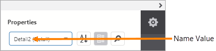
Type: String Name assigned to the band. The name can contain letters, numbers, and the underscore character. It cannot contain spaces or special characters. The value of the Name property can be used to identify the band in the report items list at the top of the Properties and Expressions panels.
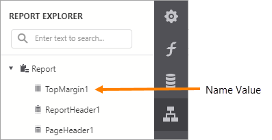
Name property value in the report items list A band's Name property is also used to identify the band in the Report Explorer panel.
Name property value in the Report Explorer |
Layout
Size |
Can be configured in the Properties or Expressions panel. Specifies the height and width of the print item. Measured using the Measure Units specified at the print template level. |