A control is an element that you add to a report to present a particular piece of information. For example, a Chart control presents a chart of the report's data. Controls can be static or dynamic. A static control gets its value when you design the report. A dynamic control gets its value when the report runs. For example, data fields and report parameters are dynamic controls.
The Control Reference documents each control offered by VertiGIS Studio Reporting. A control's documentation may include the following sections:
▪Description: A description of what the control does.
▪Properties Common to Most Controls: A list of properties that are shared by most controls. See Properties Common to Most Controls below.
▪Actions: Group of commonly used properties, and actions for the control. These properties are aggregated at the top of the Properties panel, but also appear in their respective property groups. Changes made to the properties that appear in this panel will be reflected in the property group they belong to.
▪Styles: Group of properties that define the styles applied to the control. For more information see Styles.
▪Appearance: Group of properties for configuring the appearance of the contents of a control, such as background color or text formatting. See Inherit Settings from the Band or Report for more information on how bands and controls can share Appearance property settings.
▪Behavior: These properties enable a control and its contents to resize or reformat at run time.
▪Data: Group of properties that allow you to shape report data.
▪Layout: Group of properties that determine the size, position etc of the control in the report.
▪Navigation: Together, these properties allow you to map report elements' hierarchy in a bookmark list or table of contents.
▪Printing: Supports right-to-left writing systems.
▪Related Tutorials: Links to any tutorials that document the use of the control.
Controls
VertiGIS Studio Reporting has the following controls:
▪Bar Code: Displays a bar code of a specified type.
▪Character Comb: Displays text so that each character is printed in an individual cell.
▪Chart: Provides 2D and 3D views to visualize data series in a chart format.
▪Check Box: Displays text along with a box that can display three states: unchecked, checked and indeterminate.
▪Cross-Band Box: Draws a box across bands.
▪Cross-Band Line: Draws a vertical line across bands.
▪Feature Picture Box: Displays a feature in a map.
▪Gauge: Embed graphical gauges into your report.
▪Label: Displays static or dynamic text.
▪Line: Draws a line in a specified direction, style, width, and color.
▪Map Info: Displays information about a map in the report output.
▪Map Picture Box: Includes the map from the user's session in the report output.
▪Multiple Feature Attachment: Shows multiple image attachments for each feature.
▪North Arrow: Displays a north arrow in the report output.
▪Overview Map Picture Box: Shows a feature's location within the larger geographic context.
▪Page Break: Defines a page delimiter in a report.
▪Page Info: Displays date and time or page numbers on a page.
▪Panel: Groups individual report controls into collections.
▪Picture Box: Displays an image populated by a file source or an image populated by a data source.
▪Pivot Grid: Creates a pivot table for multi-dimensional analysis of large amounts of data.
▪Rich Text: Displays text formatted by Hypertext Markup Language (HTML) or Rich Text Format (RTF).
▪Scale Bar: Displays a scale bar in the report output.
▪Shape: Draws a specified shape.
▪Single Feature Attachment: Displays a particular image attachment in a report, such as the feature's first image attachment.
▪Sparkline: Displays a compact chart.
▪Sub-Report: Embeds content from one report (child) in another report (parent).
▪Table: Displays information in a tabular format.
▪Table of Contents: Auto-generates the contents of a report based upon the hierarchy of bookmarks contained in a report's document map.
Properties Common to Most Controls
Actions
Actions |
Align to Grid Size to Grid Center Horizontally Center Vertically Bring to Front Send to Back Fit Bounds to Container A container includes a band or a panel. This property is only enabled if the control is the only item in the container. |
 Snaps the upper left corner of the control to the grid.
 Resizes the control so all four corners are snapped to the grid.
 Centers the control within the width of the parent container.
 Centers the control within the height of the parent container.
 Positions the control in front of any overlapping controls.
 Positions the control behind any overlapping controls.
 Resizes the control to occupy the entire parent container, excluding the borders.
Styles
Even Style |
Type: String Sets the style used when the report populates an even record from a bound dataset. Setting an Even Style overrides configurations set in the Style property. |
Odd Style |
Type: String Sets the style used when the report populates an odd record from a bound dataset. Setting an Odd Style overrides configurations set in the Style property. |
Style |
Type: String Sets the style used. |
Appearance
Background Color |
Type: Color Can be configured in the Properties or Expressions panel. Specifies the report item's background color. |
Border Color |
Type: Color Can be configured in the Properties or Expressions panel. Specifies the report item's border color. |
Border Dash Style |
Can be configured in the Properties or Expressions panel. Specifies the dash style for the report item's border. |
Border Width |
Type: Single Can be configured in the Properties or Expressions panel. Specifies the width of the border(s) in pixels, using a floating point value. |
Borders |
Can be configured in the Properties or Expressions panel. Applies a set of borders (top, right, bottom, left) to a control. |
Font |
Type: Font Can be configured in the Properties or Expressions panel. Sets the report item's font. Properties in this group include: ▪Font Name: The font type applied to the text. ▪Size: Size of the font measured in the units specified in the Unit property. ▪Unit: The unit of measure for the font. ▪Font Effects: Applies Bold, Italic, Strikeout, and/or Underline styling. |
Foreground Color |
Type: Color Can be configured in the Properties or Expressions panel. Specifies the report item's foreground color. |
Padding |
Can be configured in the Properties or Expressions panel. Defines the location of a report item's contents within the control by specifying the number of pixels by which the contents are spaced from each border. |
Behavior
Can Publish |
Type: Boolean Specifies whether a control is displayed in the document created at runtime. When checked, the control is shown in the document created at runtime. When unchecked, the control can only be seen in the design area. |
Keep Together |
Type: Boolean Sets whether an item can be split horizontally across pages. When false, the report item will be split across pages if all its contents do not fit on one page. When true, the contents of the item will be printed, as a whole, on the next page. |
Visible |
Type: Boolean Can be configured in the Expressions panel. Sets whether the control is visible at run-time. |
Data
Tag |
Type: Object Can be configured in the Expressions panel. Stores data that is closely associated with the control. |
Design
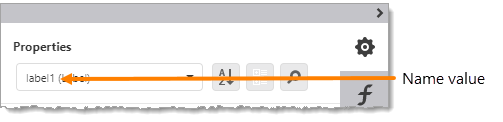
Name |
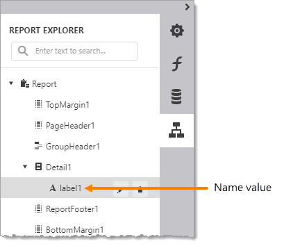
Type: String Name assigned to the control. The name can contain letters, numbers, and the underscore character. It cannot contain spaces or special characters. The value of the Name property can be used to identify the control in the report items list at the top of the Properties and Expressions panels.
Name property value in the report items list A control's Name property is also used to identify the control in the Report Explorer panel.
Name property value in the Report Explorer |
Layout
Location |
Specifies where the top left corner of the control is in the band. The origin (X=0, Y=0) is the upper left corner of the band. |
Size |
Specifies the height and width of the report item. Measured using the Measure Units specified at the report level. |
Navigation
Bookmark |
Type: String Can be configured in the Properties or Expressions panel. Specifies the text to appear in a bookmark. |
Parent Bookmark |
Declares which control's bookmark will be used as the parent for the selected control's bookmark. The selected control's bookmark is set using the Bookmark property. If this property is left empty, the selected control's bookmark will be shown as connected to the root bookmark in the document map. |
Navigation URL |
Type: String Can be configured in the Expressions panel. Specifies the URL that the web browser navigates to when the control is clicked. |