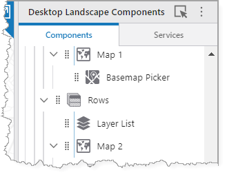
The Map is the key component in Web Designer. All other map-related components are dependent on the Map; if there is no Map, the other components do not work.
In the event that you have more than one Map component, the component hierarchy affects the map association as follows:
•If you add a nested sub-component to a Map (for example, the Basemap Picker), the Map is automatically detected in the Basemap Picker settings. If you move the Basemap Picker to be at the same hierarchical level as the Map, it retains the map association.
•If you add a component (for example, the Layer List) at the same hierarchical level as a Map component, you must specify which map it is associated with (in the Layer List settings).
Main Settings
Field |
Description |
|---|---|
Title |
The heading to display for the component. The title appears in both Web and Web Designer. |
Icon |
The symbol used to represent the component. |
Map Settings
Field |
Description |
|---|---|
Web Map |
Click Select, select a web map to use and click Select. You can search for a web map by name or portal item ID. You can search web maps you own, web maps shared with you, or public web maps. For a list of supported web maps, see 2D Web Map Support. All basemaps, reference layers, and base layers should use exactly the same spatial reference as the web map. If both a 2D web map and 3D web scene are configured in the Map component, the 2D web map must also use exactly the same spatial reference as the 3D web scene. By default, when you add a web map, Search and Identify are enabled for all visible layers. In apps with large data sets, this can negatively impact performance because queries are executed against every visible layer and field. See also: Link a Web Map and View. |
Use Esri Field Formatting |
Whether to use the field formatting configured in the Esri portal or the formatting defined within Web Designer. |
Web Scene |
Click Select, select a web scene to use and click Select. You can search for a web scene by name or portal item ID. You can search web scenes you own, web maps shared with you or public web scenes. For a list of supported web scenes, see 3D Web Scene Support. |
Default View |
Determines whether to display the 2D web map or 3D web scene when the app starts. This option is only available when you have configured both a web map and a web scene. |
Configure Layers for: |
Switches between the 2D web map or 3D web scene for both the app preview and configuration settings. This option is only available when you have configured both a web map and a web scene. |
Link a Web Map and View
You can configure a web map and view so that they remain synchronized.
This configuration must be made in the layout XML file.
For example, you can link a 2D map and 3D scene. When you pan, zoom, or rotate the 2D map, the 3D scene automatically updates to show the same extent and viewpoint.
This is useful if you want to provide both a 2D and 3D perspective of the same data side-by-side.
You can configure the link in either direction, but typically you designate one map as the primary and link the secondary map or view to it.
To link a web map and view:
1.Download the app from Designer.
2.In File Explorer, navigate to the downloaded zip file and extract it.
3.In the extracted files, open the layout XML file.
4.In the extracted files, open the layout xml.
5.Configure the XML file to link the web map and view.
6.Save the XML file.
7.Re-zip the files and upload the app back into Designer.
Group Extensions
This section only appears if a group of map services have been defined in the web map using the Group function.
Groups provide an organized hierarchy in your Layers List.
When a map service has many layers, it can be overwhelming for your user to navigate through them individually. By grouping related layers together, you create a hierarchy that makes the Layers List more structured and easier to manage.
The Group Extensions settings are similar to those defined in Layer Extensions.
If you have a group of layers defined in a map service, they appear in the map service's Layer Extension as Sublayer Extensions rather than Group Extensions.
For more information on group layers, see Esri's documentation on group layers.
Layer Extensions
Layer extensions include both individually-added feature layers and map services (which contain one or many sublayers).
You can create a Group in the web map, consisting of multiple layer extensions. This group then appears in the map service as a Group Extension.
Result Actions
Result Actions set at this level only appear for features of this particular layer. To add a Result Action for all features, see the Result Details, Results List, Results Table, or Result Summary settings.
Field |
Description |
|---|---|
Title |
Type a title for this menu item as it will appear in the Result Details, Results List, and Results Table panels. |
Description |
Enter a summary of what this menu item does. If you don't want ta description of the menu item, leave it blank. |
Icon |
To select an icon to represent this menu item, click Select Icon, click the desired icon, and click OK. To remove the icon, click Clear Icon. |
Command |
The command to run when a user clicks the menu item. A command is an action the app should perform. |
Hide when Disabled |
Whether to hide the menu item when the command cannot be executed. |
Can be Toggled |
Whether the menu item can be toggled between two states. If the menu item can be toggled, you can specify the behavior of the menu item for both states as well as whether the menu item is toggled by default. |
Visible To |
Determines which users and groups can access this component. If no users or groups are specified, all users can access this component by default. The Hidden From setting overrides this setting. |
Hidden From |
Determines which users and groups are explicitly forbidden to access this component. This setting overrides the Visible To setting. |
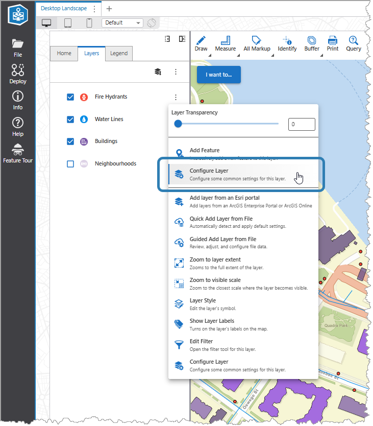
Layer Actions
The Layer Actions setting allows you to configure layer-specific actions directly within the context of the selected layer, without affecting the overall map configuration.
For our example in the procedure below, we configure the Fire Hydrants layer to include the Configure Layer menu item.
You can also use this procedure to configure and manage actions for sublayers.
To configure a layer-specific action:
1.Navigate to Map > Layer Extensions in the Component panel.
2.Select the layer you want to configure (for example, Fire Hydrants).
3.Click Add Menu Item in the Layer Actions section.
The Select Command window opens.
4.Select or create the action (Command, Workflow, or Report). In our example, we select Configure Layer from the list of Commands.
5.Click Select.
The configured action appears in the layer menu for the specified layer.
Field Extensions
Field |
Description |
|---|---|
Disable Search |
Click the icon to disable the search for this field extension. |
Open the Field Extension |
Click the arrow to open the settings for this field. |
Searchable |
Click the icon to turn off searching for this field extension. |
External Links
You can configure external links in a layer to open websites or apps outside of Web.
It is possible to add parameters to the URL, display text, and tooltip that represent information from Web, such as a user's location, the location of a feature, or the visible map area.
These parameters are defined through replacement tokens, which are placeholders that represent either a layer field, relationship field, or an arcade expression.
A replacement token is surrounded by curly braces {} and is case-sensitive. For example, {OBJECTID}.
Task Settings
Field |
Description |
|---|---|
Identify |
Determines whether you can view attribute values for a feature on this layer. |
Query |
Determines whether you can search for features in this layer using query expressions. |
Search |
Turns search on or off for this layer. |
Allows you to specify the search type you want to use for this layer. If you select VertiGIS Studio Search, Studio Web creates a search app in VertiGIS Studio Search and two additional controls appear: •Status: Shows the current state of the layer in VertiGIS Studio Search, which you can click to refresh. •Open in VertiGIS Studio Search: Opens the VertiGIS Search Designer to set up an advanced search configuration. See the VertiGIS Studio Search documentation for more information. |
Zoom Settings
Field |
Description |
|---|---|
Zoom Scale |
Set the scale to which the map should zoom for results in this layer. When zooming to results from multiple layers, the highest Zoom Scale is used. If both Zoom Scale and Zoom Factor are set, the higher of the two scale values is used. |
Zoom Factor |
Set the Zoom Factor that is applied to the geometry of non-point results to calculate the scale at which to zoom. When zooming to non-point results from multiple layers, the highest Zoom Factor is used. The default is 1.5. If both Zoom Scale and Zoom Factor are set, the higher of the two scale values is used. |
Display Settings
Field |
Description |
|---|---|
Icon |
An image file to display as the layer icon. This icon appears in the layer list, result summary and results list. The image file types supported are: JPG, JPEG, PNG and SVG. |
Summary Popup Content
Field |
Description |
|---|---|
Popup Elements |
Popup elements that have been configured on either the layer's endpoint or within the map/scene. You can control whether a particular popup element and its subset of visible fields is displayed in result summary views (Results List, Result Summary). Web does not support HTML markup in Popup Content. |
Attachment Settings
Field |
Description |
|---|---|
Attachment MIME Types |
The list of valid file MIME types that you can upload as attachments to features from this layer. For example, image/png, application/pdf. Click here for the list of file MIME types supported by ArcGIS. |
Performance Settings
Field |
Description |
|---|---|
Enable Client-Side Data |
Determines whether this layer's data should be available client-side, within the graphics that render on the map. Client-side data allows for fast identify operations to be performed, as no external queries are necessary; however, this can cause the map's load time to increase. When enabled, all fields that are configured in the layer's popup template will load client-side. |
Overrides
Field |
Description |
|---|---|
Show Related Records When Unconfigured |
When enabled, related records are shown by default when none are found configured in the popup. |
Inherit Formatting |
Turn inherited formatting options on or off. Turn off Inherit Formatting to activate options to set custom formatting for this layer. |
Date Format |
Select the format of the date to use for this layer. The default is Date Time Short. |
Number Format |
Select the number format to use for numbers displayed by this layer. For more information on number formats, see Standard Numeric Format Strings. The default is Fixed Point. Select one of the following formats: •Number: A localized representation of a number with a decimal separator, group separator and optional negative sign. For example, in the en-us locale: 12,345.67 or -42. •Fixed Point: A localized representation of a number with a decimal separator and optional negative sign. For example, in the en-us locale: 12345.67 or -42. •Currency: A localized representation of a monetary amount in a specific currency. For example, in the en-us locale: $123.45 for USD or £123.45 for GBP. •Accounting: A localized representation of a monetary amount in a specific currency except negative values are displayed in brackets. For example, in the en-us locale, -$543.21 would be represented as ($543.21) for USD. •Percent: A localized representation of a percentage. For example, in the en-us locale, 0.99 would be represented as 99%. •Custom: Use one or more numeric specifiers to define how to format numeric data. For more information, see Microsoft's Custom Numeric Format Strings. |
Currency |
Select the currency you want to use for this layer. The default is USD. |
Fractional Digits |
Type in the number of digits to appear after the decimal point in fractions. If you do not set a number, the default applied to currency units depends on the currency. For a number format, the default applied is 4. |
Data Links
See Data Links for more information.
Failure Behavior
Field |
Description |
|---|---|
Layer Failure Action |
Specify what VertiGIS Studio Web should do when this layer fails to load: •Halt Map Load: Stop loading the map and display an error. •Warn End User: Continue loading the map but warn the end user this layer failed to load. •Silent Failure: Continue loading the map and do not warn the user this layer failed to load. |
Events
Field |
Description |
|---|---|
Map Clicked |
The command to run when the map is clicked or tapped. A command is an action the app should perform. Some commands have additional settings you can configure. |
When enabled, the Identify tool returns results only from layers with pop-ups enabled. This setting is available only when Identify, Identify Details, or Identify Summary is selected as the command in Events. |
|
The command to run the first time the map finishes loading. A command is an action the app should perform. The command runs again if the page is refreshed but not when switching between a 2D web map and a 3D web scene, or vice versa. Some commands have additional settings you can configure. |
|
Map Hovering |
The command to run when the user begins to hover the mouse cursor over a location on the map. A command is an action the app should perform. Some commands have additional settings you can configure. |
Map Hovered |
The command to run when the user finishes hovering the mouse cursor over a location on the map, that is, when the mouse cursor is no longer hovering over the location. A command is an action the app should perform. Some commands have additional settings you can configure. |
Map Viewpoint Changed |
The command to run when the map viewpoint changes, for example, when the user pans or zooms the map. A command is an action the app should perform. Some commands have additional settings you can configure. Any command for Map Viewpoint Changed should be considered carefully for performance reasons. |
Context Menu
You can change any item in the context menu, which appears when the user right-clicks or long-presses the map. Add custom items to the menu or delete those you do not want.
Within each menu item, you can configure the fields in the table below.
Field |
Description |
|---|---|
Title |
Type a title for this menu item as it will appear in the context menu. |
Description |
Enter an explanation of what this menu item does. If you do not want a description of the menu item, leave it blank. |
Command |
The command to run when a user clicks the menu item. A command is an action the app should perform. To select the command you want, click the box that contains the current command followed by Some commands have additional settings you can configure. |
Icon |
To select an icon to represent this menu item, click Select Icon, click the desired icon and click OK. To remove the icon, click Clear Icon. |
Command |
The command to run when a user clicks the menu item. A command is an action the app should perform. |
Hide when Disabled |
When enabled, hides the menu item when the command cannot be executed. |
Can be Toggled |
When enabled, you can configure the menu item to toggle between a Default state and an Alternate state. You configure the icon, text, and behavior of the menu item for each state. |
Visible To |
Determines which users and groups can access this component. If no users or groups are specified, all users can access this component by default. The Hidden From setting overrides this setting. |
Hidden From |
Determines which users and groups are explicitly forbidden to access this component. This setting overrides the Visible To setting. |
 . The list of available commands depends on the context of the component.
Layer Comparison
For more information, see Layer Comparison Tool.
Field |
Description |
|---|---|
Flatten Layers |
When enabled, child layers are included in the comparison. Disabling the Flatten Layers option reverts to the previous behavior, where only top-level layers are considered in the comparison. |
Leading Layers Label |
The label for the leading layer side of the map. |
Leading Layers |
The layer to appear on the leading layer side of the map. |
Trailing Layers Label |
The label for the trailing layer side of the map. |
Trailing Layers |
The layer to appear on the trailing layer side of the map. |
Comparison Direction |
The direction in which the layer comparison slider moves and therefore how the map is split: •Horizontal: Split the map so that the leading layer is on the left and the trailing layer is on the right. •Vertical: Split the map so that the leading layer is at the top and the trailing layer is at the bottom. |
Label Position |
The position of the labels for the leading and trailing layers. This setting is affected by the Comparison Direction. •Start: Position the label at the start of the component. •Center: Position the label at the center of the component. •End: Position the label at the end of the component. |
Visible |
Determines whether the Layer Comparison tool is visible. You must enable this setting to use the Layer Comparison tool. |
Configurable |
When enabled, the Leading Layers Label and the Trailing Layers Label become buttons so your user can modify the layers. |
Constraints
Field |
Description |
|---|---|
Maximum Scale |
Set the maximum scale to which the map can be zoomed in. |
Minimum Scale |
Set the minimum scale to which the map can be zoomed out. |
Rotation Enabled |
Turn the ability to rotate the map on or off. When on, the map can be rotated using gestures on a touchscreen. The default is On. |
Snap to Zoom |
Turn the Snap to Zoom feature on or off. When on, and you zoom in or out, the map snaps to the closest incremental scale setting. The default is Off. |
Visibility Layers
Field |
Description |
|---|---|
Visible To |
Determines which users and groups can access this component. If no users or groups are specified, all users can access this component by default. The Hidden From setting overrides this setting. |
Hidden From |
Determines which users and groups are explicitly forbidden to access this component. This setting overrides the Visible To setting. |
Layout
Field |
Description |
|---|---|
Margin (px) |
The margin space around the component, measured in pixels. |
Initially Hidden |
Specifies whether or not the component is initially hidden when the app loads. If selected, the component remains hidden unless activated, for example, by the Show command. |