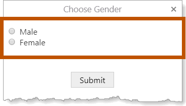
The Radio Group form element allows the user to select one option from a set of options.

Example of the Radio Group form element with two options, shown in a viewer
Radio Group Properties
The Properties table describes the properties of the Radio Group form element. For information about the properties ofa Radio Group'sitems, see Properties of Form Element Items.
The type of a property defines what types of values the property can have. Many properties are type string, which means that the property's value is text. Boolean properties can be true or false. Some properties have more than one possible type.
Property names in Workflow Designer's Properties panel are written using the capitalization and spacing of a title. Property names in expressions are valid JavaScript identifiers and start with a lower case letter.
In the table below:
▪If a property can be accessed in both the Properties panel and expressions, then the table gives both versions of the name.
▪If a property's name in the table starts with a lower case letter, then you can only access the property in expressions.
▪If a property's name starts with a capital letter and the table does not give a name to use in expressions, then you can only access the property in the Properties panel.
Expressions are case sensitive. When you access a form element property in an expression, you must use the correct capitalization.
Properties of the Radio Group Form Element
Accessible Description |
Type: String Name in Properties Panel: Accessible Description Name to Use in Expressions: accessibleDescription An accessible version of the description of the element. The accesible description is not visible on the page; it is hidden. You can use the Accessible Description property to provide a description that can be used by assistive technologies, such as screen readers. |
current |
Type: String The currently selected radio button. The topmost radio button is "0", the second radio button is "1", and so on. Use the current property to find out which radio button the user has selected. To access the current property in an expression: ${Display Form ID}.state.{Element ID}.current For example: $form1.state.radioGroup1.current You can use the Set Current Form Element Item activity to set the item that is currently selected. |
Type: String Indicates whether the radio buttons that appear in the Radio Group depend on the value that the user selected in a previous form element. When a Radio Group depends on a previous form element, the Radio Group is initially disabled. It becomes enabled when the element that it depends on gets a value. To configure the Depends On property, click the arrow For an example of a form in which one element depends on another element, see Use the Item Picker Form Element for Visualization. |
Description |
Type: String Name in Properties Panel: Description Name to Use in Expressions: description A description of the element. The description appears below the element's title. You can use the Description property to describe what the element represents or to provide instructions to the user about how to use the element. You can format the description using Markdown. |
Element ID |
Type: String The element's ID, which is used in other form elements and activities to access the element's properties, including the user's input. The ID must be unique across all elements in the form. You cannot set the value of the Element ID property in an expression—you can only use the value that you configured for it. To use the Element ID property in an expression: ${Display Form ID}.state.{Element ID}.{property name} For example: $form1.state.radioGroup1.visible |
Enabled |
Type: Boolean Name in Properties Panel: Enabled Name to Use in Expressions: enabled Indicates whether the Radio Group element is enabled in the running workflow. When a Radio Group element is enabled, the user can select and clear a radio button. When a Radio Group element is disabled, the user can see the Radio Group element, but cannot interact with it. Disabled elements appear dimmed or shaded in the running workflow. By default, Radio Group elements are enabled. To disable a Radio Group element, clear the Enabled checkbox. You may want to change the property's value at run time depending on the user's input in a previous form element. To access the enabled property in an expression: ${Display Form ID}.state.{Element ID}.enabled For example: $form1.state.radioGroup1.enabled |
error |
Type: String | MarkdownRef Indicates whether an error occurred in the element. We recommend using the Set Form Element Error and Clear Form Element Error activities to work with errors in form elements. |
Radio Buttons |
Type: { [key: string]: Item; } Name in Properties Panel: Radio Buttons Name to Use in Expressions: items The radio buttons in the Radio Group. For information on configuring the radio buttons, see Configure the Radio Buttons in a Radio Group. The radio buttons are stored in an object called items. Each radio button is a property of the items object. To access the items object: ${Display Form ID}.state.{Element ID}.items For example: $form1.state.radioGroup1.items For more information, see Form Element Items. |
Required |
Type: Boolean Name in Properties Panel: Required Name to Use in Expressions: require The Required checkbox is intended as a quick way to do simple validation without having to add a validate event. When you add a validate event, the Required check is not performed even if the checkbox is selected. To force the Required check to be performed when a validate event is configured, add a Propagate Form Event activity anywhere within the event's subworkflow. Indicates whether the user must select a radio button. When the Radio Group element is required, the user cannot submit the form until a radio button is selected. . By default, Radio Groups are not required. To require a Radio Group , select the Required checkbox. To access the require property in an expression: ${Display Form ID}.state.{Element ID}.require For example: $form1.state.radioGroup1.require |
Selected Index |
Type: Number The index of the radio button that is currently selected. The index indicates the radio button's position in the Radio Group. The index of the top radio button is 0; the second radio button's index is 1; the third radio button's index is 2; and so on. By default, the top radio button is selected. If you do not want a radio button to be selected initially, leave Selected Index blank. You can use the Set Current Form Element Item activity to set the item that is currently selected. |
styleName |
Type: String Indicates the name of the style that will be applied to the element. To access the styleName property in an expression: ${Display Form ID}.state.{Element ID}.styleName For example: $form1.state.radioGroup1.styleName |
Title |
Type: String Name in Properties Panel: Title Name to Use in Expressions: title The element's title, which appears at the top of the element. By default, the title is blank. You may want to change the title to describe what the element represents in your workflow. You can format the title using Markdown. |
Title Location |
Type: String Name in Properties Panel: Title Location Name to Use in Expressions: titleLocation Specifies whether the element's title appears above (default) or beside the element. The value must be either "above" or "beside". |
type |
Type: String The variety of form element. Radio Group elements are type "RadioGroup". Use the type property to find out the variety of a form element in a form with many elements. Loop through ${Display Form ID}.state, comparing each element to the known form types and performing some action on the elements that meet your type criteria. To access the type property in an expression: ${Display Form ID}.state.{Element ID}.type For example: $form1.state.radioGroup1.type |
value |
Type: any The value of the currently selected radio button. For information on configuring a radio group's buttons, see Configure the Radio Buttons in a Radio Group To access the value property in an expression: ${Display Form ID}.state.{Element ID}.value For example: $form1.state.radioGroup1.value |
Visible |
Type: Boolean Name in Properties Panel: Visible Name to Use in Expressions: visible Indicates whether the element is visible to the user. By default, Radio Group elements are visible. If you want to hide the element, clear the Visible checkbox. You may want to change the visibility at run time depending on the user's input in a previous form element. To access the visible property in an expression: ${Display Form ID}.state.{Element ID}.visible For example: $form1.state.radioGroup1.visible |
Radio Group Events
The following table describes the events associated with the Radio Group form element. As in Workflow Designer, the events are listed in the order that they fire.
Events for the Radio Group Form Element
load |
The load event fires when the element finishes loading. You can use the load event to set one or more of the element's properties at run time. For example, you could set the element's initial value. |
change |
The change event fires when the user selects a radio button. You can use the change event to create dependencies between form elements. For example, you could configure a change subworkflow that enables or disables other form elements depending on the user's selection. By default, if another form element is configured to depend on the Radio Group and the Radio Group has a change event, the configured dependency will be ignored. When an Radio Group has a change subworkflow, the workflow assumes that you want the change subworkflow to handle any dependencies. If you want the configured dependency to be respected, add a Propagate Form Event activity to the change subworkflow. The Propagate Form Event activity instructs the workflow to perform the dependency behavior after the change subworkflow completes. The change event fires every time the user's selection changes. This means that the change subworkflow can run multiple times. Because of this, you should make sure that the change subworkflow is not computationally intensive or long running. |
Configure the Radio Buttons in a Radio Group
As part of the configuration of a Radio Group, you must configure the radio buttons in the Radio Group. There are two ways to do this:
▪Manually: If you know exactly how many radio buttons you want and how you want them labelled, you can define the radio buttons manually when you configure the Radio Group.
▪Using a subworkflow: If you want to base the radio buttons on dynamic information like query results, you can add a subworkflow that creates the radio buttons when the workflow runs. If the Radio Group depends on another form element, you will use this method of configuring the radio buttons. Workflow Designer provides two templates to use as the starting point for the subworkflow: the ArcGIS Query template and a Blank template.
Configure Radio Buttons Manually
If you know exactly how many radio buttons you want and how you want them labelled, you can define the radio buttons manually when you configure the Radio Group.
To manually configure the radio buttons in a Radio Group:
1.In the Radio Buttons area of the Radio Group's properties, make sure Configure them manually is selected.
2.Configure a radio button:
a.Click the arrow  to show the radio button's properties.
b.Label: In the Label box, type the text that you want to appear beside the radio button.
c.Value: If you want to associate a value with the radio button, enter the value in the Value box.
You can use any text for the value, for example, New Zealand and 9630 are valid values. The value will be available in the radio button's value property.
If you enter digits for the value (for example, 9630), remember that the value is stored as text ("9630"), not as a number (9630).
3.Repeat the previous step for each radio button in the Radio Group. Click Add if you need to add a radio button.
You can reorder the radio buttons in a Radio Group by dragging each radio button to its new position in the list.
4.Remove any unconfigured radio buttons that are left over when you finish the configuration.
To remove a radio button, click the arrow  to show the radio button's properties and then click Delete.
Use a Subworkflow to Create Radio Buttons
If you want to base the Radio Group's radio buttons on dynamic information like query results, you can add a subworkflow that creates the radio buttons when the workflow runs. If the Radio Group depends on another form element, you will use this method of configuring the radio buttons.
Workflow Designer provides templates that you use as the starting point for the subworkflow:
▪ArcGIS Query: The ArcGIS Query template provides a subworkflow that queries ArcGIS Server for items to use as the radio buttons.
▪Blank: The Blank template provides a blank subworkflow to use as the starting point for the subworkflow.
Use the ArcGIS Query Template to Create Radio Buttons
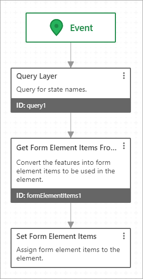
The ArcGIS Query template provides a subworkflow that queries ArcGIS Server for items to base the radio buttons on. You will need to adapt the subworkflow to work within your workflow.

Subworkflow for the ArcGIS Query template
The subworkflow has the following activities:
1.Query Layer: This activity queries an ArcGIS Server map service for features on a particular layer and filters the features. The query also gets the specified feature attributes that you want to use later in the workflow.
2.Get Form Element Items From Features: This activity converts the features returned by the query to items that can be used by the Radio Group. Form elements cannot use features directly—the features must be converted first.
3.Set Form Element Items: This activity associates the converted features with the Radio Group.
The ArcGIS Query template is based on a query for US state names. When the Radio Group loads, the subworkflow queries the States layer for US states. The subworkflow then converts the features and assigns them to the Radio Group. The Radio Group displays a radio button for each filtered feature, labelled with the state name.
To use the ArcGIS Query template:
This procedure presents one possible adaptation of the template which you can build on in many ways. To explore additional capabilities of an activity, refer to the activity's documentation.
1.In the Radio Buttons area of the Radio Group's properties, select Use a subworkflow and click ArcGIS Query.
The subworkflow opens.
2.Query Layer: Adapt the Query Layer activity to work in your workflow:
a.Update the Description property to describe what you are querying for.
b.Set the Url input to the URL of the layer that you want to query.
Click the Expand icon  to open a larger input area.
c.In the Where box, enter a SQL WHERE clause to filter the features that the query returns.
For example, if you only want to show sparsely populated states, you could use a Where input similar to this:
POP2007 < 1000000
Setting the Where input to 1=1 gets all the features.
To do a literal text search on the display field, configure the Text input instead of the Where input.
To perform a spatial query, configure the Geometry input. You can filter on both attribute values and location by configuring the Geometry input and the Where or Text input.
d.Change the Output Fields input to specify the fields that you want the query to return. Use commas to separate the field names.
If you want to get all the fields, enter an asterisk (*) in the Output Fields input.
e.If you plan to use the feature geometries later in the workflow, set Return Geometry to true and set Output Spatial Reference to the spatial reference of the map.
This ensures that the geometries can be drawn in their correct locations on the map.
If you leave Output Spatial Reference blank, the spatial reference of the map service is used.
f.Configure any other properties and inputs that you want to customize. See Query Layer Activity for information.
3.Get Form Element Items From Features: Adapt the Get Form Element Items From Features activity to work in your workflow:
You should not need to change the Features input. The Features input specifies the features returned by the query.
a.Configure the Label input:
▪If you want the radio buttons' labels to consist of a single field, set the Label input to the name of the field.
For example, to use the value of the STATE_NAME field as the labels, set Label to STATE_NAME.
or
▪If you want the radio buttons' labels to contain formatting or multiple fields, set the Label input to the Markdown-formatted information that you want to include in each item. Surround each field name with curly brackets.
For example, suppose you set Label to the following:
**{STATE_NAME}** ({STATE_ABBR})
The labels will have the state's name in bold, followed by the state's abbreviation. For example:
▪Maryland (MD)
If a field placeholder such as {STATE_NAME} appears in the items at run time instead of being replaced by the field's value, the workflow could not find the field. This can be caused by a spelling or capitalization error in the placeholder or by forgetting to include the field as an output field in the Query Layer activity.
You will be able to access the value of Label using an expression similar to this:
=$form1.state.radioGroup1.label
b.If you want the value of one of the query's output fields to be available in each radio button's value property, set the Value Field Name input to the name of the field.
For example, if you specify AREA in Value Field Name, then you will be able to access the area using an expression similar to this:
=$form1.state.radioGroup1.value
If you leave the Value Field Name blank, value will be an object that contains the feature.
c.Configure any other properties that you want to customize. See Get Form Element Items from Features Activity for information.
4.Set Form Element Items: You should not need to change the inputs. The Items input specifies the items created by the Get Form Element Items From Features activity. Leaving the Element input blank assigns the items to the form element that the subworkflow belongs to.
5.To return to the form designer, click Display Form in the breadcrumbs.
If you need to re-open the subworkflow, click Edit in the Properties panel or double-click the Radio Group in the form preview.
Use the Radio Group's Blank template
The Blank template provides a subworkflow with an Event block and nothing else in it. You will have to create the subworkflow from scratch.

Subworkflow for the Blank template
By its very nature, the Blank template can be used to create a wide variety of subworkflows that get labels for radio buttons. The two most common scenarios are:
▪Collection: You have a collection (array) that contains the items you want to use for the radio button labels.
▪Feature Set: You have a feature set that contains the items you want to use for the radio button labels.
If the feature set doesn't exist in the workflow yet, you may want to use the ArcGIS Query template.
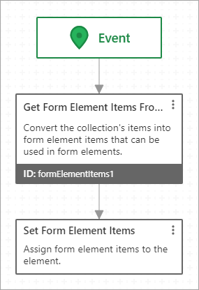
You can create the subworkflow using the following activities:
1.Get Form Element Items From Collection: This activity converts the collection to items that can be used by the Radio Group element.
or
Get Form Element Items From Features: This activity converts the features to items that can be used by the Radio Group element.
Form elements cannot use collections or feature sets directly—the collection or feature set must be converted first.
2.Set Form Element Items: This activity associates the converted items with the Radio Group element.

Subworkflow that labels radio buttons based on the items in a collection
To use the Blank template:
This procedure assumes that the collection or feature set already exists in the workflow.
This procedure presents one possible adaptation of the template which you can build on in many ways. To explore additional capabilities of an activity, refer to the activity's documentation.
1.In the Radio Buttons area of the Radio Group's properties, click Blank.
The blank subworkflow opens.
2.Collection:
a.Add a Get Form Element Items From Collection activity.
b.Set the Collection input to the collection whose items you want to use as labels.
For example, if you created the collection using a Create Value activity, enter an expression similar to this:
=$value1.result
c.If the collection contains objects, set the Label Field Name input to the name of the field used for the radio button labels.
You will be able to access the value of Label Field Name by entering an expression similar to this:
=$form1.state.radioGroup1.label
d.If the collection contains objects, set the Value Field Name input to the field that you want to be available in each radio button's value property.
For example, if you specify the AREA field, then you will be able to access the area by entering an expression similar to this:
=$form1.state.radioGroup1.value
If you leave Value Field Name blank, the workflow uses the field that you specified in Label Field Name.
e.Configure any other properties that you want to customize. See Get Form Element Items From Collection Activity for information.
or
Feature Set:
f.Add a Get Form Element Items From Features activity.
g.Set the Features input to the feature set that will provide the radio button labels.
For example, if you created the features using a Create Value activity, by entering an expression similar to this:
=$value1.result
h.Set the Label input to the name of the field used for the radio button labels.
You will be able to access the value of Label by entering an expression similar to this:
=$form1.state.radioGroup1.label
i.Set the Value Field Name input to the field that you want to be available in each radio button's value property.
For example, if you specify the AREA field, then you will be able to access the area by entering an expression similar to this:
=$form1.state.radioGroup1.value
If you leave Value Field Name blank, value will be an object that contains the feature.
j.Configure any other properties that you want to customize. See Get Form Element Items from Features Activity for information.
3.Set Form Element Items:
a.Add a Set Form Element Items activity to the bottom of the flowchart and connect the previous activity to it.
b.Leave the Element input blank.
This assigns the items to the form element that the subworkflow belongs to.
c.Set the Items input to the items created by the Get Form Element Items From Collection or Get Form Element Items From Features activity. For example:
=$formElementItems1.items
d.Configure any other properties and inputs that you want to customize. See Set Form Element Items Activity for information.
4.To return to the form designer, click Display Form in the breadcrumbs.
If you need to re-open the subworkflow, click Edit in the Properties panel or double-click the Radio Group in the form preview.
